內容簡介
Toast Mobile Menu 是一款輕量級的行動導航外掛,旨在提升行動裝置的使用體驗,減少介面雜亂,並保持快速的頁面載入速度,適合開發者、代理商及網站擁有者使用。
【主要功能】
• 現代化漢堡式行動菜單設計
• 平滑的開關動畫
• 支援子菜單功能
• 完全響應式設計
• 輕量級性能優先的程式碼
• 與大多數 WordPress 佈景主題相容
外掛標籤
開發者團隊
② 後台搜尋「Toast Mobile Menu – Fast & Lightweight Responsive Navigation」→ 直接安裝(推薦)
原文外掛簡介
Toast Mobile Menu helps you instantly improve mobile navigation, reduce UI clutter, and maintain fast page load speeds — without bloated features or complex setup.
Built for performance and simplicity, it’s perfect for developers, agencies, and site owners who want a mobile menu that just works.
🚀 Why Toast Mobile Menu?
Most mobile menu plugins are feature-heavy, complex, or performance-heavy.
Toast Mobile Menu focuses on simplicity, speed, and usability.
⚡ Faster Mobile Performance – no unnecessary scripts or bloat
📱 Better Mobile UX – smoother navigation increases engagement
🚀 Instant Setup – works in minutes, not hours
🧩 Theme Compatible – works with most WordPress themes out of the box
🎯 Conversion-Friendly Navigation – helps users find content faster
❌ The Problem with Most Mobile Menu Plugins
Too many unnecessary features
Slower page performance
Overcomplicated setup
Poor mobile UX and cluttered navigation
✅ The Toast Solution
Lightweight, performance-first design
Clean, distraction-free mobile menus
Works instantly with most themes
Built for speed-focused WordPress sites
✨ Features
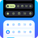
Modern hamburger mobile menu designs
Smooth open/close animations
Submenu support
Fully responsive design
Lightweight performance-focused code
Works with most WordPress themes
Customisable and next-gen AJAX search
No page builder required
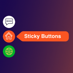
Icon and menu item support
Developer-friendly structure
👥 Perfect For:
WordPress developers building performance-focused sites
Agencies managing client websites
Bloggers who care about mobile UX
WooCommerce store owners
Anyone optimizing for Core Web Vitals
👉 Lightweight. Fast. No bloat. Just works.