內容簡介
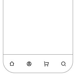
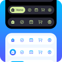
MenuVerse 是一款專為行動裝置設計的外掛,提供應用程式風格的底部導航欄和漢堡選單,讓訪客能更輕鬆地訪問重要頁面,無需撰寫任何程式碼。
【主要功能】
• 應用程式風格的底部導航欄
• 支援漢堡選單和底部選單同時使用
• 內建圖示庫,無需外部請求
• 自訂按鈕連結和標籤
• 多種當前頁面標記方式
外掛標籤
開發者團隊
② 後台搜尋「MenuVerse – Mobile Bottom Menu & App-Style Navigation Bar」→ 直接安裝(推薦)
原文外掛簡介
MenuVerse adds an app-style mobile bottom menu — the fixed bottom navigation bar your visitors already know from every phone app — and a proper off-canvas hamburger mobile menu, from one dashboard, with no code.
Most mobile visitors never open a hamburger menu. A bottom navigation bar puts your important pages one thumb-tap away instead: shop, cart, search, account, call. MenuVerse gives you both patterns and lets you use either one, or both together.
It builds them from the menus you already maintain under Appearance → Menus and the block Navigation menus WordPress stores as posts. Nothing is copied and nothing is rebuilt in a second admin screen. You keep editing menus where you always did; MenuVerse only controls how they appear on the frontend.
Switch a module off and it registers no hooks, enqueues no assets, and outputs nothing. A page with no MenuVerse menu on it downloads no MenuVerse bytes.
Available now
Bottom Menu — an app-style bottom navigation bar pinned to the viewport on mobile.
Four buttons free, with a More drawer for overflow items or a bar that scrolls sideways; more buttons with Pro.
Built-in icon library — no icon font, no CDN, no external requests. Pro can use your own images instead, including a second image for the current page.
Buttons can link to a URL, open a page, or launch a search sheet scoped to the site, WooCommerce products, or Easy Digital Downloads. Pro adds WhatsApp, phone, Popup Maker, and a slide-up panel of your own content.
Five ways to mark the current page: colour, pill, top line, underline, or a raised button — the line and the raised button are Pro.
Optional per-button labels above or below the icon, custom badges, and safe-area padding for notched phones.
Ready-made looks to start from, then fine-tune colours, spacing, and behaviour in a step-by-step dashboard.
Pro adds the finishes beyond one colour (gradient, frosted glass, a background picture, shadows, padding, alignment), a second palette for dark mode, per-button colours, live cart and wishlist counts, per-button visibility by role or sign-in state, and page rules.
Mobile Menu — a responsive hamburger menu and off-canvas panel for phones and small tablets.
Slides in from the left or the right; overlays the page (full screen and push are Pro).
Animated trigger icons (bars, dots) with a squeeze transition; spin and arrow are Pro.
Optional top bar with your logo or site title; custom wording, sticky and hide-on-scroll are Pro.
Accordion submenus that open at the branch the visitor is already on.
Body scroll lock, focus trap, and focus return for keyboard and screen-reader users.
Configurable breakpoint, and a choice of menu per module.
Pro adds the search field, a row of social profile links, free-text inside the panel, swipe-to-close, page visibility rules, and hiding your theme’s own menu on small screens.
Works on block themes, not just classic ones
Block themes (Twenty Twenty-Four, Twenty Twenty-Five and every full site editing theme) do not register Appearance → Menus at all — WordPress hides that screen unless the theme asks for it, so on a block theme there is normally no way to build a classic menu, and no way to reach the per-item icon and badge fields WordPress only offers there.
MenuVerse puts that screen back when your theme leaves it out, and leaves it alone when your theme already has it. Nothing is added twice, no fake menu location is registered, and classic themes are untouched. So the same setup works whether you run a block theme, a classic theme, or a hybrid.
Coming soon
Mega Menu — horizontal navigation whose items open full-width panels you build with blocks, folding to an accordion on small screens. Already visible in the dashboard as a preview of what is next.
Works with the menus and tools you already use
Classic menus (nav_menu) and block Navigation menus (wp_navigation) — both normalised to the same tree shape.
Per-item extras in the menu editor: icon, badge, mega-panel link, and hide-on-mobile or hide-on-desktop flags.
WooCommerce — live cart count badge on a bottom-bar button (Store API).
YITH WooCommerce Wishlist — live wishlist count badge.
Easy Digital Downloads — scope a search button to downloads only.
Popup Maker — open a popup from a bottom-bar button.
Four ways to place any menu
Every module supports the same four entry points, all rendering through one pipeline so they never drift apart:
Block — drop a MenuVerse block in the Site Editor, a page, or a template.
Shortcode — [menuverse_mobile_menu] or [menuverse_bottom_menu].
PHP template tag — menuverse_the_mobile_menu() or menuverse_render( 'bottom_menu' ).
Automatic insertion — optional; off by default so nothing is silently injected into your theme.
Dashboard built for non-developers
One admin screen with a live phone preview beside every setting step.
Guided onboarding on first run: pick a module, choose a menu, place it, save.
Import and export settings as JSON under MenuVerse → Tools (settings only — menus and media stay on the site).
Optional Delete data on uninstall, off by default.
Fast, accessible, and self-contained
Conditional loading. Assets enqueue only when markup is actually rendered.
Tiny. Each frontend module is under 6 KB gzipped (JavaScript and CSS combined); most are under 4 KB.
Vanilla JavaScript on the frontend — no jQuery, no React, no framework.
Accessible. Correct ARIA roles, keyboard navigation, focus management, and prefers-reduced-motion on every animation.
RTL-ready. Styled with CSS logical properties; one stylesheet works in both directions.
Self-hosted. Icons are SVG geometry shipped with the plugin. No CDN calls anywhere.
Extensible
Module registration, settings schemas, the render pipeline, REST routes under menuverse/v1, and dashboard SlotFill points are documented in docs/extension-points.md for companion plugins and a Pro tier.