內容簡介
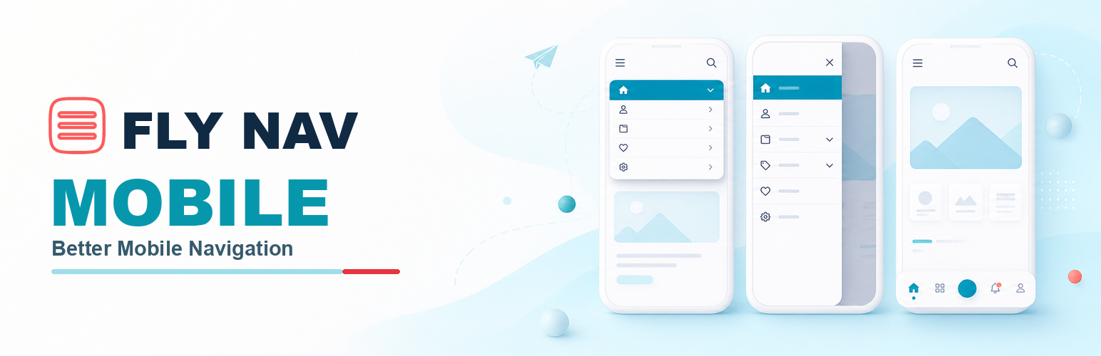
Fly Nav Mobile 是一款輕量級的 WordPress 外掛,旨在取代佈景主題的行動標頭,提供可自訂的導航體驗。用戶可以選擇多種佈局,並無需額外的前端框架或第三方庫,確保流暢的使用體驗。
【主要功能】
• 三種完整佈局選擇:上方下拉、側邊抽屜、底部導航
• 無限子菜單深度:獨立的子菜單切換
• 安全的快取交付:無需伺服器端裝置檢測
• 可視化主題標頭選擇器:輕鬆選擇標頭元素
• 原生可存取控制:友好的鍵盤與螢幕閱讀器支援
• 靈活的底部操作:自訂左、中、右位置的功能
外掛標籤
開發者團隊
原文外掛簡介
Fly Nav Mobile replaces your theme’s mobile header with a lightweight navigation experience that you control. Choose a compact top dropdown, an off-canvas drawer, or an app-style bottom bar—without adding a frontend framework, third-party library, or public JavaScript.
Version 3 is a ground-up rebuild focused on reliable caching, accessible native controls, safer setup, deeper menu support, and cleaner theme integration. The same stable navigation markup is rendered for every visitor, while CSS applies your chosen mobile breakpoint. This avoids the desktop/mobile cache mismatch caused by server-side device detection.
What’s new in Fly Nav Mobile 3
Three complete layouts — top dropdown, off-canvas drawer, and configurable bottom navigation.
Accessible native controls — menu, search, and nested submenus use semantic disclosure elements with visible focus and screen-reader labels.
Unlimited submenu depth — recursive WordPress menus receive independent submenu toggles at every level.
Cache-safe delivery — responsive CSS replaces server-side mobile detection, with no public JavaScript.
Safer first-time setup — new installations stay disabled until you select a menu, confirm the theme-header selector, and explicitly enable the replacement.
Improved visual selector — choose theme header elements visually, review match counts, use presets, combine selectors, or enter them manually.
Flexible bottom actions — assign Home, Search, Logo, Menu, Account, or an empty slot to the left, center, and right positions.
Stronger compatibility — legacy settings, logo URLs, classic menus, old-theme footer fallback, RTL layouts, safe areas, and multisite uninstall are handled deliberately.
Refined in version 3.0.1
Lighter menu and search panels with softer borders, shadows, and spacing after mobile installation testing.
44px submenu and search controls for more comfortable touch interaction.
Fresh-install enable safeguards that preserve active behavior for configured upgrades.
Expanded verification across WordPress 5.0, 6.0, and 7.0.2; PHP 7.4 and 8.4; classic themes, block themes, page caching, fallback rendering, and uninstall cleanup.
Choose your mobile layout
Top dropdown — A compact logo, search, and hamburger header with a dropdown panel.
Off-canvas drawer — A sticky header with a scrollable side navigation panel.
App-style bottom bar — A safe-area-aware bottom bar with configurable left, center, and right actions.
Key features
No frontend JavaScript or third-party libraries.
Cache-safe responsive rendering without server-side mobile detection.
Native keyboard- and screen-reader-friendly disclosure controls.
Unlimited WordPress menu levels with independent submenu toggles.
Configurable mobile breakpoint and panel width.
Visual theme-header selector with selector match feedback.
Multiple theme-header selectors and common theme presets.
Media Library logo selection with legacy URL compatibility.
Search, Home, Logo, Menu, Account, or empty bottom-bar slots.
Sticky navigation, safe-area support, visible focus styles, and reduced-motion support.
Scoped CSS variables for colors, typography, sizing, and custom CSS.
Works alongside classic and block themes using your selected registered WordPress menu.
Publicly disabled on fresh installs until you are ready to switch it on.
Credits
Developed by WPGeared.