

內容簡介
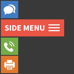
Responsive Vertical Icon Menu 是一款可在小工具中顯示垂直圖示選單的 WordPress 外掛,操作簡單且完全響應式,提供豐富的樣式與字型設定選項,適合需要側邊欄圖示導覽的網站使用。
【主要功能】
• 完全響應式設計,相容所有 WordPress 版本
• 可為選單項目新增自訂圖示
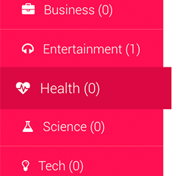
• 可設定子選單展開方式與動畫時間
• 自訂主選單、子選單及啟用狀態的樣式
• 支援字型家族、字型大小與字型樣式設定
• 支援邊框樣式與背景色彩自訂(Pro 版)
外掛標籤
開發者團隊
② 後台搜尋「Responsive Vertical Icon Menu」→ 直接安裝(推薦)
📦 歷史版本下載
原文外掛簡介
WordPress Responsive Vertical Icon Menu plugin is an nice and handy plugin for showing your menus in widget. It’s very simple to use. There are a lot of style and font settings that you will like.
View our plugin demo page:
Demo Page
You can check some of our plugin features below.
Features of Free version
Easy install and use
Works without problem with all WordPress versions
Fully Responsive
Ability to add Icons
Ability to choose Submenu opening type and set the duration
Ability to choose icon function when clicking on it
User friendly back-end
Tested on popular WordPress themes
You can upgrade the free version to Vertical menu Pro to add some great features.
The features of Pro version
Ability to change Main, Sub and Active menus styles
Ability to select Font family
Ability to set border styles
Ability to set Background color
If you have any type of question occuring our plugin contact us at [email protected].
Step by step guide
General Settings
Submenu opening type – Select when to display the submenu
Submenu opening duration – Type the submenu opening duration
Icon option when clicking on it – Choose the option when clicking on it
Main(Parent) menu style options
Padding – Type the padding parameters
Icon size – Type the size
Background color – Select the Background color
Font size – Type the Font size
Font family – Choose the Font family
Font style – Select the Font style
Text color – Choose the Text color
Background color when hovering – Choose the Background color when hovering
Font size when hovering – Type the Font size when hovering
Font family when hovering – Select the Font family when hovering
Font style when hovering – Select the Font style when hovering
Text color when hovering – Choose the Text color when hovering
Active Background color – Select the Background
Active Font size – Type the Font size
Active Font family – Select the Font family
Active Font style – Select the Font style
Active Text color – Select the Text color
Border width – Type the Border width
Border color – Select the Border color
Border color when hovering – Select the Border color when hovering
Active Border color – Select the Border color
Submenu icons size – Type the icons size
Submenu opening icon padding – Type the opening icon padding
Submenu closing icon padding – Type the closing icon padding
Submenu style options
Padding – Type the padding parameters
Background color – Select the Background color
Font size – Type the Font size
Font family – Choose the Font family
Font style – Select the Font style
Text color – Choose the Text color
Background color when hovering – Choose the Background color when hovering
Font size when hovering – Type the Font size when hovering
Font family when hovering – Select the Font family when hovering
Font style when hovering – Select the Font style when hovering
Text color when hovering – Choose the Text color when hovering
Active Background color – Select the Background color
Active Font size – Type the Font size
Active Font family – Select the Font family
Active Font style – Select the Font style
Active Text color – Select the Text color
Border width – Type the Border width
Border color – Select the Border color
Border color when hovering – Select the Border color when hovering
Active Border color – Select the Border color