
內容簡介
「Unlimited Elementor Inner Sections」是一個讓使用者可以創建無限制 Inner Sections 的 Elementor 擴充套件,這也是 Elementor 最受歡迎卻缺乏的功能之一。
這是唯一可以在 Elementor 中添加無限制 Inner Sections 的外掛程式,而不需要其他冗餘的外掛程式。
由 BoomDevs 熱情開發 ❤️
如果您喜歡這個外掛程式,請不要忘記給我們評分。非常感謝!⭐⭐⭐⭐⭐
隱私政策
「Unlimited Elementor Inner Sections By BoomDevs」會在使用者確認後收集一些遙測數據,這可以協助我們快速解決問題並改進產品。
BoomDevs 預設不會收集任何數據。只有在使用者透過管理提示允許時,追蹤 SDK 才會開始收集基本的遙測數據。我們收集這些數據是為了確保所有使用者都能擁有出色的使用體驗。
在任何情況下,BoomDevs 的追蹤 SDK 都不會在未經使用者確認的情況下立即開始收集數據。
了解有關 BoomDevs 如何收集和使用這些數據 的更多信息。
技術支援
如果您有任何問題,請發送電子郵件至 ([email protected]) 聯繫我們。
外掛標籤
開發者團隊
② 後台搜尋「Prime Elementor Addons – Lightweight Elementor Widgets for Faster Pages」→ 直接安裝(推薦)
原文外掛簡介
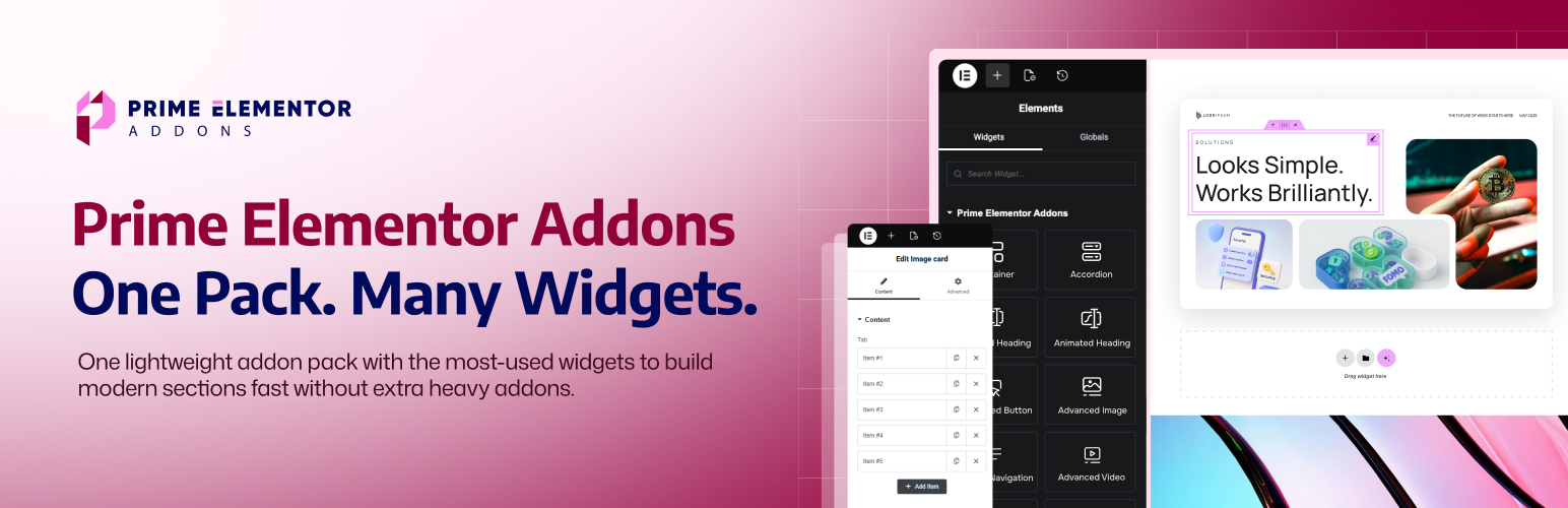
Prime Elementor Addons is a lightweight Elementor addon plugin for WordPress that gives you a focused set of Elementor widgets to build modern pages faster. Instead of installing many separate Elementor extensions, you can design key sections using one clean widget pack.
It includes the widgets most websites actually need – like Advanced Accordion, Advanced Tabs, Advanced Heading, Call to Action, Pricing Table, Testimonial, Team Member, Countdown, Counter Number, Progressbar, Post Grid, Social Icons, and more – so you can create complete landing pages and business pages with drag-and-drop.
Everything works inside the Elementor editor with simple controls. Add a widget, write your content, style it, and publish – no extra setup, no complicated steps, and no coding required.
If you’re looking for addons for Elementor that are easy to use and built for real layouts, Prime Elementor Addons is a smart choice. It helps you create clean sections, keep your design consistent, and build WordPress sites quicker.
Build full-page sections with ready widgets (not just “decorations”)
Instead of installing many small plugins, Prime gives you the common building blocks most websites need:
Content sections (Accordion, Tabs, Navigation)
Conversion sections (CTA, Buttons, Pricing)
Social proof (Testimonials, Team)
Growth elements (Countdown, Counters, Progressbar)
Blog layout (Post Grid)
Form embedding (Contact Form 7, Fluent Forms)
Media (Image, Video, Gallery)
Social links (Social Icons)
Key features (what you can build)
FAQ and collapsible content using Accordion
Tabbed content sections for neat layouts
Strong headings and content blocks for modern sections
Call-to-action areas that drive clicks
Pricing and testimonials to sell services/products
Counters, countdowns, and progress bars for stats and urgency
Image, video, and gallery sections for visuals
Post Grid to show blog posts or portfolio items
Social Icons and Navigation for better site experience
Form embedding widgets for popular form plugins
Widget-based features (with clear benefits)
FAQ, Tabs & Navigation
These widgets help visitors find answers faster and keep your pages clean.
Advanced Accordion (freemium)
Purpose: Create collapsible content sections (FAQ, details, steps).
Best for: FAQ pages, service explanations, product feature breakdowns.
Key controls: Accordion items, titles, content, spacing, icon/indicator styling.
Advanced Tabs
Purpose: Organize content into tabs so the page looks shorter and cleaner.
Best for: Features vs pricing, plans comparison, specifications, multi-step info.
Key controls: Tab labels, tab content, active tab styling, alignment, spacing.
Advanced Navigation
Purpose: Add a styled navigation/menu area for better browsing.
Best for: One-page layouts, section navigation, landing pages, headers.
Key controls: Menu styling, layout alignment, spacing, hover/active states.
Headings & Content Building Blocks
These widgets shape your page structure and improve readability.
Advanced Heading (freemium)
Purpose: Create modern headings with stronger style control.
Best for: Hero sections, section titles, feature headings, page headers.
Key controls: Typography, spacing, alignment, decorative styles (where applicable).
Info Box
Purpose: A quick “icon + title + description” section block.
Best for: Services, benefits, highlights, product features.
Key controls: Icon settings, title/description, layout spacing, hover styles.
Icon Box
Purpose: A clean card-style widget for a single feature/service.
Best for: Service grids, feature sections, “why choose us” blocks.
Key controls: Icon position, typography, spacing, box styling.
Features List
Purpose: Display feature points in a simple, readable list layout.
Best for: Product features, plan benefits, checklist sections.
Key controls: List items, icons/bullets, spacing, typography.
Buttons & Conversion Sections
These widgets are built for clicks, leads, and actions.
Advanced Button
Purpose: A flexible button widget for actions and links.
Best for: Contact buttons, pricing actions, section jump links.
Key controls: Text, link, icon, size, spacing, hover styles.
Dual Button
Purpose: Two buttons together for primary + secondary actions.
Best for: “Get Started” + “Learn More”, “Buy Now” + “View Demo”.
Key controls: Button pairing layout, spacing, individual styling for each button.
Call to Action
Purpose: A complete CTA section to guide visitors to one action.
Best for: Landing pages, signups, contact sections, product promos.
Key controls: Heading + text + button(s), layout alignment, background styling.
Pricing, Trust & Business Sections
These widgets help you sell services/products and build credibility.
Pricing Table
Purpose: Show pricing plans in a clear layout.
Best for: SaaS plans, service packages, membership tiers.
Key controls: Plan name, price, features, highlight badge, CTA button.
Testimonial
Purpose: Display customer feedback and reviews.
Best for: Service pages, homepages, product landing pages.
Key controls: Name, role, review text, rating layout (if included), card styling.
Team Member
Purpose: Present team profiles to build trust.
Best for: Agency sites, company pages, about pages.
Key controls: Name, role, image, social links, layout spacing.
Flip Box
Purpose: Interactive card (front/back) for compact information display.
Best for: Services, features, creative showcases.
Key controls: Front content, back content, flip direction, styling.
Stats, Progress & Urgency
These widgets make numbers and timelines more visual.
Counter Number
Purpose: Highlight key metrics in an engaging way.
Best for: “Projects completed”, “Happy clients”, “Years of experience”.
Key controls: Number value, label text, typography, spacing.
Progressbar
Purpose: Show progress or skill levels visually.
Best for: Skills sections, milestone progress, performance stats.
Key controls: Percentage/value, labels, thickness, spacing.
Countdown
Purpose: Show time-based urgency for offers or events.
Best for: Launch pages, sale deadlines, event countdown sections.
Key controls: Date/time, layout style, labels, spacing.
Media Widgets
These help you present visuals cleanly inside Elementor layouts.
Advanced Image
Purpose: Display images with better layout control.
Best for: Hero images, feature images, banners, section visuals.
Key controls: Image settings, alignment, spacing, styling.
Advanced Video
Purpose: Add videos for demos, intros, tutorials.
Best for: Product pages, course pages, landing pages.
Key controls: Video source/embed, layout, spacing, styling.
Image Gallery
Purpose: Show multiple images in a gallery layout.
Best for: Portfolio, product images, event photos, brand showcases.
Key controls: Gallery layout, spacing, styling.
Blog, Forms & Social
These widgets help with content marketing, lead capture, and social links.
Post Grid
Purpose: Display posts in a grid layout.
Best for: Blog sections, news pages, portfolio-style grids.
Key controls: Post query/layout options (where applicable), spacing, styling.
Contact Form 7
Purpose: Insert CF7 forms via an Elementor widget area.
Best for: Contact pages, lead forms, request-a-quote forms.
Key controls: Form selection + styling container around it.
Fluent Form
Purpose: Insert Fluent Forms into Elementor layouts.
Best for: Signups, contact forms, surveys, lead capture.
Key controls: Form selection + section styling.
Social Icons
Purpose: Add social profile icons anywhere on the page.
Best for: Headers, footers, contact sections, team cards.
Key controls: Icon list, links, size, spacing, hover styles.
Best use cases (where this addon shines)
Business websites: Services (Info Box/Icon Box), Team, Testimonials, Pricing
Landing pages: Call to Action, Dual Button, Countdown, Counter Number
Portfolios: Post Grid + Gallery + strong headings
Agency sites: Tabs, Accordion, Pricing, Social proof sections
Work faster inside Elementor (the same workflow you already use)
Prime Elementor Addons is designed to fit the Elementor workflow- so you can build faster using Elementor’s own productivity features:
Responsive controls (desktop, tablet, mobile)
Copy & Paste styles (save time across widgets)
Global colors and fonts (consistent design)
All Your Favorite Plugins – Supported
WooCommerce
Yoast SEO
Rank Math
All in One SEO
SEOPress
The SEO Framework
WP Rocket
WP-Optimize
Smush
Imagify
Contact Form 7
WPForms
Fluent Forms
Mailchimp for WordPress
Advanced Custom Fields (ACF)
LearnDash
Tutor LMS
WPML
And More
Documentation
Start with the Prime Elementor Addons documentation for quick setup, guides, and best practices. Clear steps, screenshots, and tips to help you build faster in the Gutenberg editor.
Support
Need help after checking the docs? Send us a message via the Prime Elementor Addons documentation. Share your WordPress version, theme, and steps to reproduce – we’ll reply fast.
Say Hello, Get Help – Connect with the WP Messiah
We’re just a message away. Follow us for quick tips, release news, 60-second tutorials, and fast help from real humans. Got a question about Prime Elementor Addons documentation or your setup? DM us – we’ll jump in.
Facebook Group
Discord
YouTube Tutorials