內容簡介
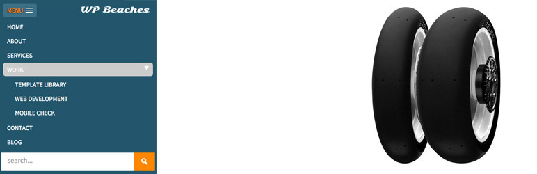
SlickNav Mobile Menu 外掛為 WordPress 提供響應式行動菜單功能,支援多層次菜單,並確保跨瀏覽器相容性。此外掛可提升使用者體驗,並可選擇添加搜尋欄位及品牌標誌。
【主要功能】
• 支援多層次菜單
• 跨瀏覽器相容性
• 鍵盤可存取性
• 可選擇添加搜尋欄位
• 可選擇添加品牌標誌
• 自訂開關菜單速度
外掛標籤
開發者團隊
📦 歷史版本下載
原文外掛簡介
This plugin adds SlickNav Responsive Mobile Menu functionality to WordPress.
SlickNav Responsive Menu has multi level menu support.
Cross browser Compatible.
Keyboard Accessible.
Degrades gracefully without JavaScript.
Creates ARIA compliant menu.
Option to add a search field.
Option to add a logo.
Internationalized.
Advanced Filter.
Combine multiple menus.
Usage
The settings are found via the dashboard Settings > SlickNav Menu
Here you choose your Menu to be used as Mobile Menu – original has to already be on page
Maximum width for the menu to appear, default is 600px
Menu Label, MENU is default
Parent links, true or false, whether a parent link that has a submenu is clickable to a page
Show Child Links, false by default
Open/close Menu speed option
Fix Menu to Head, using position fixed to body tag
Option for branding logo opposite menu label – smaller works better such as 40px in height and up to 140px in width
Option to hide header with a ‘.site-header’ class when Slicknav Menu is visible
Option to add in a search field at the bottom of the menu
Search icon background color
Options to change the opening and closing symbols
Advanced filter to adjust Slicknav values – https://wpbeaches.com/slicknav-wordpress-filter-to-adjust-values/
Demo – https://wpbeaches.com (resize browser window to below 600px)
Please note that SlickNav jQuery plugin is the work of Josh Cope, he is not responsible for the working or support of this plugin.