外掛標籤
開發者團隊
② 後台搜尋「Purplish – Block Design Toolkit for WooCommerce」→ 直接安裝(推薦)
原文外掛簡介
Purplish is a block design toolkit for WooCommerce. It adds design options to the blocks your store already uses, right in the block sidebar, so you design the store in the editor and not on a settings page. Nothing gets replaced and nothing needs rebuilding. It works with block themes and classic themes, and it’s made with the free Purple block theme in mind. It’s free and open source, with no account to sign up for.
What’s in it today
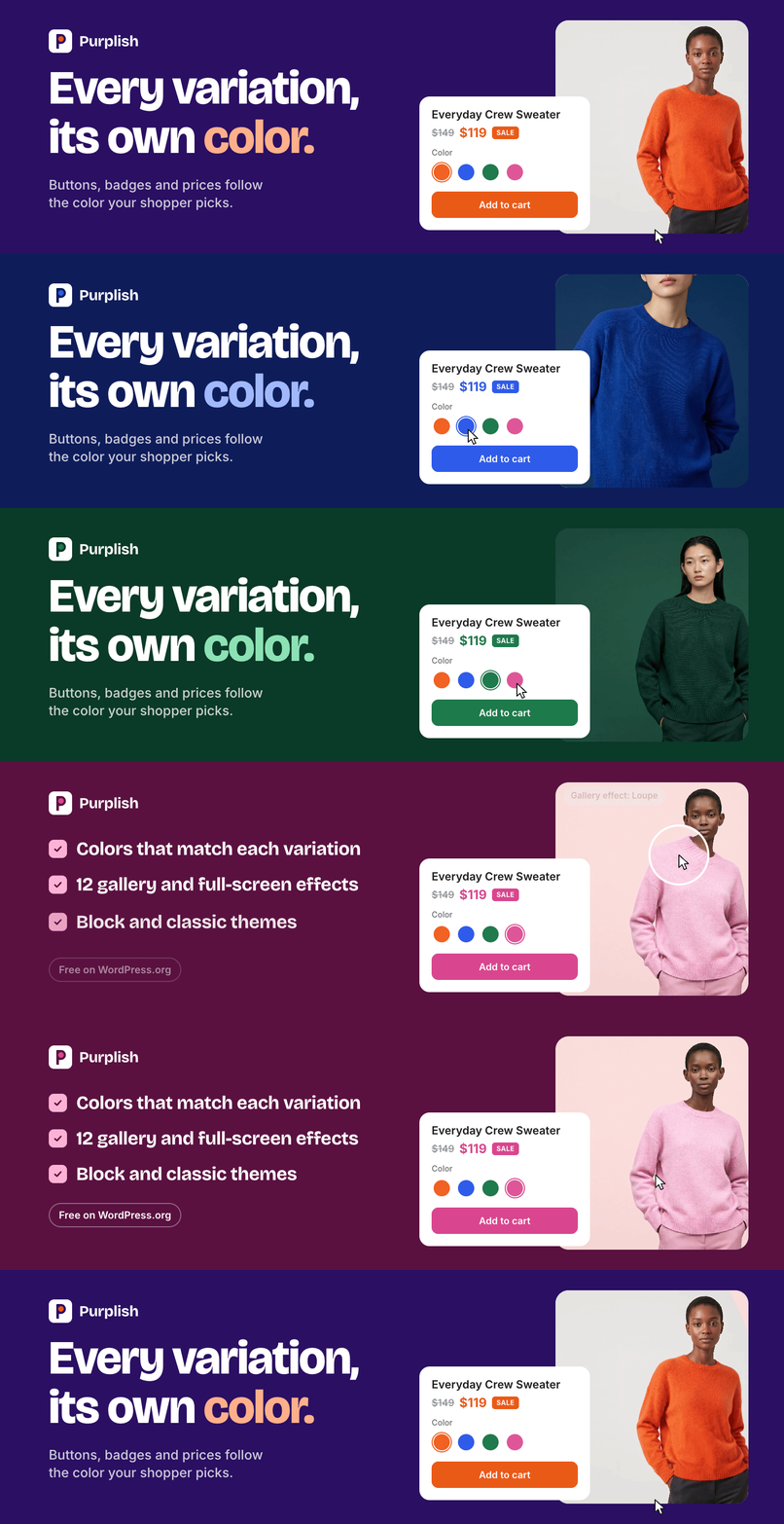
Product page color: the add to cart button, the selected option, the sale badge and the sale price take the color of the variation a shopper picks, and the photo changes with a soft transition.
Product gallery: hide thumbnails, rounded corners, frosted arrows, seven hover styles, five full-screen styles and four slide styles.
Product cards: add to cart on the photo, button motion and fourteen card effects on the Product Collection block.
Motion pack: title and price rise, a glow ring, a halo after adding to cart and a mesh background on the Add to Cart + Options block.
Color dots: a dot in each option’s own color on the option buttons.
Accordions and sections: a soft style for the Accordion block, and Group blocks that take the page color.
The product page follows the color
On a default WooCommerce product page, picking another color changes the photo and nothing else. The button, the badge and the background look the same for the orange sweater and the navy one.
With Purplish, each variation has a Page color. Pick blue, and the page turns blue. Pick orange, and it turns orange.
Automatic: Purplish reads the color from the variation photo, in the background, so saving a product stays fast.
Custom: pick a color, or type a hex code.
Off: the variation keeps your theme’s colors.
Swatches first: in Automatic mode, a swatch color set on the color attribute comes before the photo.
Simple products: a simple product gets one color for its whole page.
You choose which parts take the color:
Add to cart button: on by default.
Selected option: the option button the shopper picked, on by default. Block themes only, since classic themes show a dropdown.
Sale badge: on by default.
Sale price: in a darker shade of the color.
Page background tint: a pale wash of the color behind the page.
The photo changes with a Photo transition: Blur (the default), Fade, Zoom, Slide, Flip, Wipe, Circle reveal, Color wash or None.
Colors that look designed
Purplish looks for the product in the photo, not the wall behind it, and it handles a green sweater shot against a green backdrop.
A color taken straight from a photo is often too dark or too pale for a button. Purplish keeps the hue and adjusts it for each use: a button color with readable black or white text, a darker shade for the sale price, and a pale tint for the background. A color you set by hand is used exactly as you set it.
The page opens in the default variation’s color, so there’s no flash of the theme’s colors first.
Product gallery
Hide thumbnails: one big photo, with no thumbnail strip.
Rounded corners: on the main photo.
Frosted arrows on hover: round frosted arrows that show when the mouse is over the photo.
Hover style: what the photo does under the mouse. 3D tilt leans it toward the mouse, Zoom magnifies the spot the mouse points at, Lift raises it on a soft shadow, Parallax lets it drift, Glare runs a light across it, Loupe shows a round magnifier, and Slow zoom pushes in. Any hover style replaces WooCommerce’s own hover zoom.
Full-screen style: the view that opens when a shopper clicks the photo. Snap stack is tinted to the page color, Classic fade is a plain fade, Zoom from photo grows the photo out of its own place, Filmstrip adds a row of small photos along the bottom, and Cinema puts the photos on a dark screen. It needs the gallery’s “Open pop-up when clicked” setting.
Slide style: how the next photo comes in. 3D media gallery turns like a cube, Circular slider swings like a wheel, Reel slider runs like a film reel, and Image tunnel comes out of the distance.
Touch screens get no hover style. Visitors who ask their device for reduced motion see the plain photo and WooCommerce’s own slide.
Product cards
On shop and collection pages, the Product Collection block gets these options:
Button on the photo: title and price sit on one line, and add to cart becomes a small frosted button on the photo. It shows on hover, and always on touch screens.
Button motion: a bag icon slides in and a light sweeps across on hover. After adding to cart, the button fills and pops.
Card effect: one effect for the whole collection, from the lists below.
Effect color: the color for the button fill, the magnetic panel, the color reveal, the clothes line pegs and the card folder. On a product page with a variation color, that color wins.
Card effects on hover:
Magnetic panel: a soft panel in your effect color slides under the card.
Spotlight: the card under the mouse grows a little while the rest blur and fade back.
Color reveal: the photos sit in a color wash until the mouse brings one to full color.
Fan deck: cards rest a little off straight; the one under the mouse straightens and its neighbors lean away.
Expanded cards: each photo shows as a narrow band and opens to full under the mouse.
Card folder: each card sits in a soft folder with a tab, and the photo lifts out on hover.
In a carousel (a grid stays as it is):
Deck: the cards at the edges turn away and the one under the mouse faces you.
Arc: the cards sit on a curve, highest in the middle.
Spotlight carousel: the card in the middle is full size and the rest fade back.
Grow: cards grow as they reach the middle.
Tilt: cards lean as they travel across.
As cards scroll in:
Clothes line: each card hangs from a peg on a line and swings as it comes in or when the mouse touches it.
Parallax: the photo moves slower than its card.
Zoom reveal: each card grows in as it appears.
Add to cart and page details
On the Add to Cart + Options block:
Title on a color change: with Title and price rise, both rise in after the new photo. With Title comes into focus, the title sharpens into view. Or pick None.
Glow ring on the button: a soft ring of the page color around the add to cart button.
Halo after adding to cart: a ring leaves the button and fades each time the product goes into the cart.
Mesh background: with the page background tint on, soft blobs of the color sit over the tint and move to a new place each time the color changes.
Color dots on options: each color option shows a dot in its own color. An option gets a dot only when every variation with it has the same color, like Orange or Blue. A size, or any option that comes in several colors, gets none. On the picked option, the dot turns the button’s text color so it stays visible.
On other blocks:
Soft style (Accordion): each item becomes a soft card, and the plus turns into an x that fills with the page color when the item is open.
Take the page color (Group): on product pages, the section’s background becomes a soft version of the color the shopper picks.
Nothing moves on its own: every effect plays on a hover, a scroll, a color change or an add to cart, then stops. Every motion turns off for visitors who ask their device for reduced motion.
Block and classic themes
On block themes, every option sits in a Purplish panel on the block it changes, in the Site Editor. Each template keeps its own settings, so one product can have its own look.
Classic themes get the color parts (all but the selected option), the photo transition, the title and price rise, and three gallery options: hide thumbnails, rounded corners and the hover style. They’re under WooCommerce > Settings > Products > Purplish. The full-screen and slide styles, frosted arrows, product cards, the title focus, glow ring, halo, mesh background, color dots, accordions and sections need a block theme.
Turn Purplish off, and the page goes back to exactly how WooCommerce draws it.
Performance and privacy
Loads only where it’s used: the color script loads only on variable products, and the effects load only on pages that use them. A simple product page with no effects needs no script at all.
Photos stay on your server: Purplish reads them with the image tools PHP already has. It makes no outside requests and adds no tracking.
No admin noise: no banners, notices or upsells.
Compatible with WooCommerce features: High-Performance Order Storage (HPOS) and the cart and checkout blocks.
Source code
The code is on GitHub. The readable source of the scripts ships in assets/src, next to the built files in build. To build them, run npm ci and npm run build.
Privacy
Purplish doesn’t collect, store or send personal data. It sets no cookies and makes no outside requests.
Credits
Thanks to Luigi Teschio for the idea, from a discussion on X: set each variation’s color by hand, or read it from the photo.