
內容簡介
此外掛只做一件事:建立一個簡單(但看起來不錯)的 CSS3 進度條,您可以使用自己的 CSS 进行樣式設計,並使用一個簡單的 shortcode 在任何地方使用。現在支援自訂顏色和漸層。
要在文章或頁面中添加一個進度條,只需使用此 shortcode :
[wppb progress=50]
在以上示例中,“50”代表50%的完成度。簡單、輕量、跨瀏覽器兼容(對於不支援 CSS3 的瀏覽器進行優雅降級)。
欲瞭解更多範例和所有可用選項的詳細描述,請點選選項標籤。
如需所有選項的演示,請前往此處:https://jazzsequence.com/progress-bar/
選項
此頁面說明了 shortcode 中所有可用參數。這些參數可以任意組合使用。唯一必需的參數是 progress。所有參數均區分大小寫(例如,“progress”可以工作,但“Progress”則無法)。
progress(必需)
這決定了進度條的填滿程度。進度可以是2種形式之一,一是數字(0-100),在這種情況下會被解析為百分比;二是分數(例如25/100)。自1.1版以來,您也可以使用美元符號(例如$63/$180),例如創建籌款進度條。如果使用美元符號,您只需要在兩個值中的一個添加美元符號(例如63/$180或$63/180)-插件將輸出相同的選項($63/$180)。進度也可以超過100%(例如150/100或123%),但顯示可能有所差異。例如,不建議與全寬選項一起使用,因為您的進度將溢出主體容器。
範例
[wppb progress=50] 進度條已完成50%
[wppb progress="50/100"] 進度條已完成50/100
[wppb progress="$45/$50"] 集資進度條已完成$45/$50
[wppb progress=110] 進度條已超過100%
[wppb progress=150/100] 進度條已超過目標
[wppb progress=$125/100] 集資風格的進度條已超過目標
option
這會將數個支援的選項之一添加到進度條中。對於熟悉 CSS 的使用者,可以通過將新樣式添加到您的 style.css 中來添加新的“選項”。有關創建新 CSS 類的詳細信息,請參閱常見問題頁面。可以通過在 shortcode 中使用引號將選項結合在一起。進度條自然會被設置內陰影。添加了flat選項以刪除陰影並顯示“平面”顏色,最好與color參數一起使用。
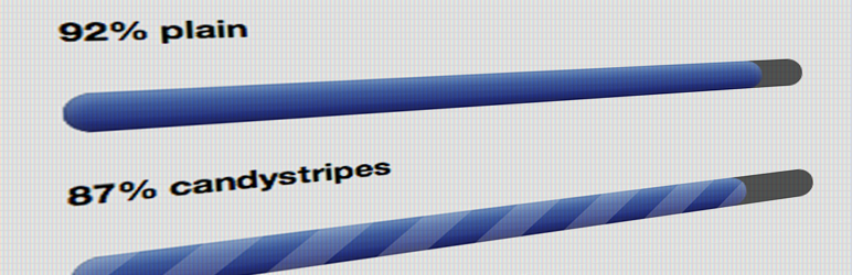
支援的值:candystripe,animated-candystripe,red,orange,green,yellow,flat
範例
[wppb progress=50 option=red] 顯示紅色進度條
[wppb progress=50 option="animated-candystripe green"] 顯示帶有動畫粉紅色扁平條的進度條
[wppb progress=50 option="candystripe orange"] 顯示帶有靜態竖浮條的橙色進度條
[wppb progress=50 option=candystripe] 顯示帶有静态竖浮條的默认進度條(藍色)
[wppb progress=50 option=flat color=red] 顯示紅色進度條,無内陰影或渐层
[wppb progress=50 option="flat candystripe" color=gray] 顯示帶有靜態竖向浮條的灰色進度條,無内陰影或渐层
外掛標籤
開發者團隊
📦 歷史版本下載
原文外掛簡介
This plugin does one thing: it creates a simple (but nice-looking) CSS3 progress bar that you can style with your own CSS and use wherever you want with a simple shortcode. Now with support for custom colors and gradients.
To add a progress bar to a post or a page, simply use this shortcode:
[wppb progress=50]
where “50” in the example above is a progress bar that is 50% complete. Simple, lightweight, cross-browser compatible (degrades nicely for browsers that don\’t support CSS3).
For more examples and full descriptions of all the available options, click on the options tab.
For demos of each of the options, go here: https://progressbar.jazzsequence.com
Options
This page describes all the available parameters for the shortcode. These can be used in any combination. The only required parameter is progress. All parameters are case-sensitive (e.g. “progress” will work but “Progress” will not).
progress (required)
This determines how full the progress bar will be. Progress can be in 2 forms, either a number (0-100), in which case it will be interpreted as a percentage, or as a fraction (e.g. 25/100). Since 1.1, you can also use dollar signs (e.g. $63/$180), for example to create a fundraising progress bar. If using dollar signs, you only need to add a dollar sign to one or the other of the two values (e.g. 63/$180 or $63/180) — the plugin will output either option the same ($63/$180). Your progress can go over, too (e.g. 150/100 or 123%), but your mileage may vary for the display. It’s not recommended to use this with the fullwidth option, for example, because your progress will spill outside of your main body container.
Examples
[wppb progress=50] A progress bar that is 50% complete
[wppb progress="50/100"] A progress bar that is 50/100 complete
[wppb progress="$45/$50"] A dollar value progress bar that is $45/$50 complete
[wppb progress=110] A progress bar that has gone over 100%
[wppb progress=150/100] A progress bar that has exceeded its goal
[wppb progress=$125/100] A fundraising-style progress bar that has exceeded the goal
option
This adds one of several supported options to the progress bar. For those that know CSS, new “options” can be added simply by adding new styles to your style.css. See the Frequently Asked Questions page for more information on creating new CSS classes. Options can be combined by wrapping them in quotes in the shortcode. The progress bar will naturally have an inner shadow applied to it. The flat option was added to remove the shadow and display a “flat” color, best when used in conjunction with the color parameter.
Supported values: candystripe, animated-candystripe, red, orange, green, yellow, flat
Examples
[wppb progress=50 option=red] Displays a red progress bar
[wppb progress=50 option="animated-candystripe green"] Displays a green progress bar with an animated candystripe
[wppb progress=50 option="candystripe orange"] Displays an orange progress bar with a static candystripe
[wppb progress=50 option=candystripe] Displays a default progress bar (blue) with a static candystripe
[wppb progress=50 option=flat color=red] Displays a red progress bar with no inner shadow or gradient
[wppb progress=50 option="flat candystripe" color=gray] Displays a gray progress bar with no inner shadow or gradient and a static candystripe
location
Displays the percentage, text or fraction either inside or outside the progress bar.
Note: It is not recommended to use location=after if you are displaying a progress bar that exceeds its goal.
Supported values: inside, after
Examples
[wppb progress=50 option=red location=after] Displays a red progress bar with the progress displayed to the right of the progress bar.
[wppb progress=50 option="red candystripe" location=inside] Displays a red progress bar with a static candystripe and the progress displayed inside the progress bar.
[wppb progress=85 location=after text="foo"] Displays a progress bar with the text "foo" displayed after the progress bar.
text
Displays arbitrary text instead of the progress bar. Can be used with the location parameter to define whether the text appears inside or outside the progress bar (default is inside). Must be used inside double quotes. HTML code is stripped from the final output.
Supported values: any plain text string
Examples
[wppb progress=75 text="My awesome text"] Displays "My awesome text" inside a 75% progress bar.
[wppb progress=85 location=after text="foo"] Displays "foo" after an 85% progress bar
[wppb progress=85 location=inside text="hello!"] Displays "hello!" inside an 85% progress bar (note, default location for text is inside, so it isn't required to specify "inside").
fullwidth
Makes the progress bar take up 100% of the container. (Good for responsive layouts.) Not recommended for progress bars that exceed their goal.
Note: As of 2.2.4, fullwidth will only take truthy values. Previously, it would accept any value, e.g. fullwidth=foo would output the same as fullwidth=true. This is no longer the case.
Supported value: true
Examples
[wppb progress=50 fullwidth=true] Displays a full-width (responsive) progress bar
[wppb progress=50 fullwidth=foo] Identical to the above progress bar
color
Defines a color for the progress bar. This is useful for creating new progress bar colors on the fly without having to edit CSS. Cannot be used in conjunction with any of the pre-existing color options (red, yellow, orange or green).
Supported values: any hexadecimal color value, any rgb/rgba color value, any css-supported color name
Examples
[wppb progress=50 color=rgb(123,50,87)]
[wppb progress=55 color=rgba(123,64,99,0.3)]
Note: Since the background color for the progress bar is dark gray, any opacity applied to the rgba color will make the color darker, since it’s adding to the dark gray background.
[wppb progress=22 color=#ff3257]
[wppb progress=68 color=lightYellow]
endcolor
Defines an end color for a custom gradient when used with color.
Supported values: any hexadecimal color value, any rgb/rgba color value, any css-supported color name
Examples
[wppb progress=72 color=turquoise endcolor=teal]
[wppb progress=83 color=#ff2222 endcolor=#ff9984]
[wppb progress=50 color=rgb(203,96,179) endcolor=rgb(173,18,131)]
gradient
Determines an end-color on the fly for a gradient based on the color parameter. As such, gradient requires color to be present, otherwise the color and gradient will be set to the default color (blue). Cannot be used in conjunction with any of the pre-existing color options (red, yellow, orange or green). When using gradient the color value must be in hexadecimal form.
Supported values: any positive or negative decimal value from 0.0 to 1.0 or -1.0.
Examples
[wppb progress=22 color=#ff0000 gradient=0.2] Displays a red progress bar that gets lighter at the bottom
[wppb progress=22 color=#ff0000 gradient=-0.2] Displays a red progress bar that gets darker at the bottom
This does not work:
[wppb progress=34 color=rgb(22,18,99) gradient=0.2]