
內容簡介
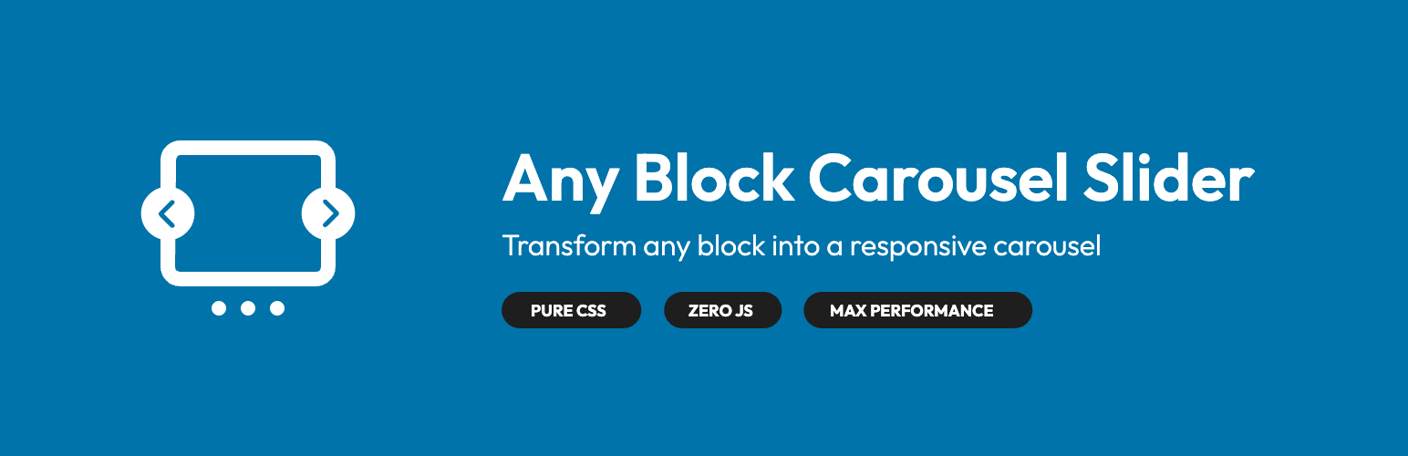
Any Block Carousel Slider 是一款 Gutenberg 旋轉木馬滑塊外掛,能將支援的 WordPress 原生區塊(如查詢循環/文章範本、群組、畫廊)即時轉換為響應式滑塊,無需新增專用區塊或載入 JavaScript 函式庫。
【主要功能】
• 將原生區塊轉換為旋轉木馬滑塊
• 無需額外的 JavaScript 載入
• 支援 WooCommerce 產品列表展示
• 保持輕量級的 DOM 結構
• 兼容經典佈景主題與區塊佈景主題
• 提供無障礙與 SEO 支援
外掛標籤
開發者團隊
📦 歷史版本下載
原文外掛簡介
Any Block Carousel Slider is a Gutenberg carousel slider block plugin that instantly converts supported native WordPress blocks (Query Loop/Post Template, Group, Gallery) into a responsive carousel slider without adding a dedicated block or loading a JavaScript library. Simply enable the “Carousel” toggle in the Gutenberg editor: your content stays 100% native, your DOM stays lightweight, and your Lighthouse performance scores remain intact. This includes WooCommerce product listings rendered via the Query Loop/Post Template block, so you can showcase products without relying on the legacy Products block.
Try it out
Experience the plugin in seconds without installing anything! Launch our interactive demo:
Launch Playround Demo
Unlike many all-in-one carousel slider blocks that require you to add a dedicated “Carousel” block and rebuild every slide, Any Block Carousel Slider hooks straight into the Gutenberg blocks you already use. The result: a Query Loop/Post Template, Group, or Gallery block can become a carousel slider in one click, without content duplication or extra maintenance.
Why Any Block Carousel Slider instead of a dedicated carousel slider block?
WordPress loops without friction – Transform Query Loop and Post Template Gutenberg blocks into a “loop slider” without creating a block per slide.
Familiar editorial experience – Content editors keep the Gutenberg interface they know (patterns, global styles, alignments, inner blocks).
Zero JavaScript on the frontend – Native scroll, scroll-snap, GPU-friendly, no Swiper/Slick bundle to load.
Full compatibility – Works with classic themes and block themes while respecting the structure of your Query Loop/Post Template, Group, and Gallery blocks.
Accessibility + SEO – Keyboard navigation, respects prefers-reduced-motion preferences, clean DOM for crawling.
What you can do in 30 seconds
Blog / Magazine: Display your latest posts in a Query Loop carousel with native filters and badges.
Portfolios & testimonials: Keep your Group blocks and make them scrollable without rebuilding every slide.
Advanced galleries: Turn the Gallery block into a responsive slider while keeping all native settings.
Landing sections: Chain complex sections (image, title, buttons, forms) inside the same Group block and scroll them horizontally.
WooCommerce highlights: Use a Query Loop configured for products (featured, on sale, custom taxonomy) and convert it into a CSS-only product carousel.
Quick comparison
Activation: Any Block Carousel Slider – toggle an existing Gutenberg block. Classic carousel slider blocks – add a dedicated slider block and rebuild every slide.
WordPress loop: Any Block Carousel Slider – works with Query Loop and Post Template blocks without duplication. Competitor carousels – require one block per slide or custom code.
Frontend JavaScript: Any Block Carousel Slider – zero JavaScript, 100% CSS carousel slider. Competitor carousels – load Swiper/Slick and additional scripts.
Performance: Any Block Carousel Slider – lightweight DOM, no external assets. Competitor carousels – multiply files, reflow, and downloads.
Content maintenance: Any Block Carousel Slider – single Gutenberg block to update. Competitor carousels – duplicate content in dedicated slides.
Security & upkeep: Any Block Carousel Slider – no third-party libraries to monitor. Competitor carousels – depend on external JS libraries like Swiper/Slick.
Key features
100% CSS – Smooth carousel slider with scroll-snap, ::scroll-button, and ::scroll-marker. No script to bundle.
Loop functionality – Enable infinite scrolling with seamless reset to start/end when reaching boundaries.
Autoplay support – Automatic slide progression with configurable delay and pause on hover/interaction.
Smart responsive – Automatically handles visible columns, spacing, and control sizes according to WordPress breakpoints (1280, 1024, 782, 600, 480, 375).
Two width modes – Manual mode (fixed column count) and Auto mode (fixed width like 320px) with automatic detection.
Gutenberg block spacing detection – Respects gap and padding values defined in the block editor, including presets.
Theme colors – Buttons automatically inherit your theme’s colors and radii (via CSS variables).
Intact semantics – Your Gutenberg block’s tags and classes remain unchanged: perfect for SEO, schemas, and E2E testing.
WooCommerce friendly – Query Loop can target the product post type, so WooCommerce grids become CSS-only carousels without a dedicated Products block integration.
Native Gutenberg block workflow
Add or edit one of the supported blocks (Gallery, Group, or Query Loop/Post Template).
Enable the Carousel option in the Gutenberg sidebar panel (Layout or Block section depending on the block).
Adjust your usual settings (column count, minimum width, spacing, alignment).
Save: your block becomes a touch-friendly, accessible, and SEO-friendly carousel slider.
Advanced customization
Loop mode – Enable infinite scrolling: when reaching the end, the carousel seamlessly resets to the beginning (and vice versa). Navigation buttons remain active at all times.
Autoplay – Automatic slide progression with configurable delay (default: 3000ms). Autoplay pauses on hover and user interaction, and stops at the end when loop is disabled.
Manual mode (fixed columns) – Ideal for article carousel sliders: 1 to 6 columns depending on screen sizes.
Auto mode (fixed width) – Perfect for card-based sliders (posts, testimonials, product highlights) with pixel-perfect widths like 280px, 320px, or 360px.
Padding and gaps – Automatic management via CSS vars --carousel-padding-*, --wp--style--block-gap.
Themes & theme.json – Override variables to align controls with your design system.
Graceful degradation – If a browser doesn’t support ::scroll-button, users keep touch and mouse scrolling.
Technical architecture
render_block hook to inject variables based on context (block type, columns, gaps).
Dedicated service for translating labels and help messages.
Separate editor/frontend styles for a transparent Gutenberg experience.
Code organized by PSR-4 services (see ARCHITECTURE.md for details).
How to use the plugin
Install and activate Any Block Carousel Slider from the Plugins screen (Plugins → Add New → search → Install → Activate).
Open the block editor, insert one of the supported blocks (Query Loop/Post Template, Group, Gallery), and toggle the Carousel option in the sidebar.
Ensure the carousel-enabled block sits inside a parent Group (or similar container) so the wrapper can manage overflow, spacing, and arrow positioning properly.
Switch the block layout to Grid then adjust the column count to match your design.
Developer Notes
GitHub Repository
Source code is available on GitHub: https://github.com/WEBLAZER/native-blocks-carousel
Contributions
Contributions are welcome! You can:
* Open a GitHub ticket to report a bug or suggest an improvement.
* Propose a Pull Request.
* Help with translation (.po files available in languages/).
Available hooks
The plugin uses the render_block hook to dynamically inject CSS variables based on the current block.
Main CSS Variables
Layout & Spacing:
* --wp--style--block-gap – Spacing between elements (responsive).
* --carousel-min-width – Minimum width for grids in Auto mode.
* --carousel-grid-item-width – Item width in Manual mode.
* --carousel-padding-left, --carousel-padding-right, --carousel-padding-top, --carousel-padding-bottom – Detected padding.
Navigation buttons:
* --carousel-button-bg, --carousel-button-color – Colors auto-detected from theme.
* --carousel-button-size – Button size (3rem → 1.75rem).
* --carousel-button-offset – Lateral offset based on container width.
* --carousel-shadow – Shadow applied to controls.
Markers (dots):
* --carousel-marker-size – Marker size.
* --carousel-marker-gap – Horizontal spacing.
* --carousel-marker-bottom-offset – Vertical position.
Miscellaneous:
* --carousel-z-index – Display priority (default 999999).
* --carousel-transition-duration, --carousel-transition-easing – Animation smoothness.
Credits
Developed with ❤️ by Arthur Ballan (WEBLAZER)