
內容簡介
在行動裝置已成為網路流量使用的主宰時代,讓您的網站符合行動裝置友善的標準是很有意義的。行動裝置友善度是決定您網路成功的關鍵因素之一,因此重要的是要確保您的網站能夠通過用戶與搜尋引擎的行動友善度測試。
您需要知道的事情:
行動裝置在網路流量市佔率每年成長30%,而且這種成長大多集中在開發中國家(Hootsuite)。
超過一半的搜尋現在是透過行動裝置完成,而這個數字繼續增加(Search Engine Land)。
57.3%的網路流量來自行動裝置/平板電腦,42.7%來自桌上型電腦(Stat Counter)。
只使用桌面電腦的美國用戶數量正在減少。該數量從2015年的2500萬降至2017年的1800萬。到2021年應該會降至1100萬(Wiredseo)。
相反地,過去兩年移動網路用戶的數量增加了28%,在2017年達到了4100萬人(在美國) (eMarketer)。
快速概述:
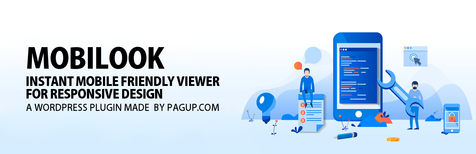
關於 MOBILOOK (Mobile View)。這個外掛是Google DEVTOOL的擴充版本,它可以讓您在行動裝置上立即檢查您的頁面、文章或產品的視覺響應式設計,並支援不同格式(蘋果,三星,Google裝置)(PRO版本包括可折疊屏幕手機,例如三星Galaxy Fold)。
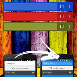
安裝MOBILOOK (Mobile View)後,其會在您每個頁面上展開,一個在WordPress內容編輯器正下方的區域,當您的內容發佈後,立即顯示您在行動裝置上的渲染,並且符合您所定義的格式。
現在您不需要檢查您的網站在行動裝置上的外觀,以確保它適合手機,平板電腦和其他媒體(響應式)。
PRO功能
MOBILOOK PRO(Mobile View)提供幾個功能:
啟用外掛以生成WooCommerce商品頁面,讓您立即查看是否可以響應式設計您的產品頁面。
啟用其他格式-PRO版本讓您訪問大量的手機/平板電腦格式(15),包括可折疊式螢幕手機(DualScreen)。
啟用三個非常有用的功能
LinkedIn文章檢查器讓您的頁面被LinkedIn的機器人爬行以生成最新的OpenGraphs
Google行動裝置友善度測試工具讓您的頁面被Google分析以識別是否符合所有標準。
行動SEO(將網站縮放到行動裝置)-此功能在所有頁面上添加了優化的視口元標記,允許在行動瀏覽器中進行縮放許可。
可用的設備格式(Mobile View)
三星Galaxy S9=360 x 740
iPhone 6/7/8=375 x 667
Google Pixel 2=441 x 731
三星Galaxy FOLD(Dualscreen - Exp)=585 x 668
iPhone 6/7/8 plus=414 x 736
三星Galaxy S8 Plus=360 x 740
iPhone XS Max=414 x 896
Google Pixel 3 XL=411 x 823
三星Galaxy S8=360 x 740
三星Galaxy Note 9=414 x 846
iPhone X=375 x 812
外掛標籤
開發者團隊
② 後台搜尋「MOBILOOK — Mobile View & Mobile‑Friendly Test」→ 直接安裝(推薦)
原文外掛簡介
In an era where mobile usage dominates internet traffic, it is crucial to have a mobile-friendly website. Ensuring your website meets mobile-friendly criteria is a key factor in online success, both for users and search engines.
What You Should Know:
Mobile web traffic currently represents 60.67% of global internet traffic, while desktop traffic accounts for 39.33% (StatCounter, 2024) (DataReportal – Global Digital Insights).
Mobile searches constitute over 60% of all Google searches (Google, 2024) (DemandSage).
The use of mobile devices to access the internet continues to grow, with over 92% of internet users preferring to use a mobile phone for browsing (DataReportal, 2024) (DemandSage).
In 2024, there are more than 5.3 billion mobile internet users worldwide, and this number is expected to reach 5.8 billion by 2026 (DemandSage, 2024) (DemandSage).
Overview:
The MOBILOOK (Mobile View) plugin, an extension of Google DEVTOOL, allows you to instantly check the responsive design of your pages, articles, or products on mobile in various formats (Apple, Samsung, Google devices).
Once installed, MOBILOOK (Mobile View) is deployed on each of your pages. A section appears just below the WordPress Content Editor; once your content is published, it immediately shows you the mobile rendering based on the format you have defined.
There’s no longer a need to check what your site looks like on your mobile to see if it’s well suited to phones, tablets, and other media (responsive).
PRO Features
MOBILOOK PRO (Mobile View) offers several features:
Activation of the plugin for all custom post types, including WooCommerce products, to instantly see if the product page design is responsive.
Activation of additional formats – The PRO version gives you access to a large list of mobile/tablet formats (17).
Activation of three very useful features:
Facebook Debugger allows your pages to be crawled by Facebook’s bots to generate up-to-date OpenGraphs.
Pagespeed.dev analyzes your page to identify if it meets all efficiency criteria.
Mobile SEO (site zoom on mobile) – This feature adds an optimized viewport meta tag on all your pages, allowing users to zoom with mobile browsers.
Available Device Formats (Mobile View)
(FREE) iPhone 13 Pro Max – 428 x 926
(FREE) Samsung Galaxy S22 Ultra – 308 x 720
(FREE) Google Pixel 6 Pro – 412 x 915
(PRO) iPhone 12 – 390 x 844
(PRO) Google Pixel 5 – 393 x 851
(PRO) OnePlus 9 Pro – 321 x 711
(PRO) Samsung Galaxy Note 20 Ultra – 308 x 720
(PRO) iPhone 11 – 414 x 896
(PRO) Samsung Galaxy S21 – 320 x 720
(PRO) Xiaomi Mi 11 – 320 x 720
(PRO) Huawei P40 Pro – 264 x 1200
(PRO) iPad Air (2022) – 820 x 1180
(PRO) iPad Pro 12.9 inches (2021) – 1024 x 1366
(PRO) Samsung Galaxy Tab S8 Ultra – 1848 x 2960
(PRO) Microsoft Surface Pro 8 – 1368 x 912
(PRO) iPad Mini (2021) – 744 x 1133
Why Is a Responsive Site Important for SEO?
Since April 2015, Google has officially rewarded mobile-friendly websites and penalized sites that are not mobile-friendly in its search rankings. A non-mobile-friendly site risks seeing its traffic drop significantly due to a decrease in its SEO ranking.
A responsive web design ensures that your site functions properly on all devices and screen sizes, offering an intuitive and satisfying user experience.
Explanation of the Tools:
LinkedIn Post Inspector: This tool allows your pages to be crawled by LinkedIn bots to generate up-to-date OpenGraphs. When you share a link on LinkedIn, LinkedIn bots fetch images and other content information to generate a correct preview. This tool ensures that your content is correctly displayed with appropriate metadata, enhancing the visibility and appearance of your posts on LinkedIn.
Pagespeed.dev: This tool analyzes your page to identify if it meets all of Google’s efficiency criteria. Unlike Google DEVTOOL, Pagespeed.dev provides insights into how Googlebot (Google’s spider) views your page, which is crucial for SEO. If your site passes the test, it means it is optimized for a mobile experience, which can improve its ranking in Google’s search results.
What Is a Responsive Site?
Responsive web design is the practice of building websites that work properly on every device and screen size, whether large or small, mobile or desktop. Responsive design focuses on providing intuitive and gratifying experiences for everyone. Google has increasingly pushed to ensure all websites are mobile-friendly because mobile searches have consistently risen since 2009 and finally surpassed desktop searches in 2018.