

內容簡介
WordPress Mobile Menu Builder 外掛專為手機裝置而設計,具備易用、客製化與高度靈活的特點。透過建立響應式選單,使手機瀏覽體驗更加簡化,提供簡易的手機導覽功能。
請注意,此外掛目前處於 Beta 階段,感謝您的使用。
外掛操作簡介
WordPress Mobile Menu Builder:提升手機瀏覽體驗
WordPress Mobile Menu Builder 讓用戶可以輕鬆尋找您的網站內容,而不會犧牲網頁載入時間。這款響應式選單最多可設定四個主要選單,簡化手機導覽功能。這款 WordPress 手機選單隨著手機螢幕的各種尺寸而完美適應,因此使用上不會產生相容性問題。
透過此 WordPress 選單,您可使用預先設計好的手機選單佈景主題,並根據您的設計喜好進行修改。您可以更改字型、圖示、背景樣式和顏色,以完美符合您的網站品牌。這適用於任何 WordPress 佈景主題,因此,外掛相容性問題將不再是問題。
專為手機而設計
WordPress Mobile Menu Builder 專為手機介面而設計,提供了更好的使用者體驗。
易於修改
可輕易設置選單的文字和圖示,根據網站需要精選出選單中要突顯的重要部分,如首頁、部落格、聯絡詳細資訊和主要網站選單,讓您完全掌握此響應式選單,根據您的網站需求選擇要顯示的菜單。
輕易與您的網站品牌風格相符合
由於您對樣式選項擁有完全掌控,因此您可以輕鬆地將手機選單設計更符合您的網站品牌和風格。您可以輕鬆修改選單欄的設計,使其更能配合您網站的設計和排版。
更改選單欄的位置
選單欄的預設位置是在螢幕底部,讓使用者的大拇指輕鬆接觸到各個選單選項。但是,如果您想模仿桌面版中選單欄的位置,也可以將選單欄放在螢幕頂部。
當使用者滾動頁面時,啟用動畫效果
您可以選擇固定選單欄或啟用用戶滾動頁面時的動畫效果。啟用用戶滾動頁面時的動畫效果可以隱藏和顯示選單欄,這將有助於增加屏幕空間,最大限度地提供使用者的手機檢視畫面。
透過快顯選單顯示更多導覽選項
WordPress Mobile Menu Builder 允許您為快顯內容建立圖示,您可以將現有的小工具整合作為快顯選擇項目。此 WordPress 選單已準備好使用小工具,因此您可以包含任意數量的現有小工具。
快速和最佳化的手機體驗
啟用 WordPress 手機選單,絕不會影響您的網站在手機上的表現。
想要體驗自定義的 WordPress Mobile Menu 嗎?立即安裝外掛,為您的使用者提供卓越的手機體驗,讓他們更輕鬆地瀏覽您的網站!
更多資訊
追蹤開發人員的 @Twitter
訪問 官方網站
外掛標籤
開發者團隊
② 後台搜尋「Mobile Menu Builder for WordPress」→ 直接安裝(推薦)
原文外掛簡介
WordPress Mobile Menu Builder plugin is specially designed for mobiles. It is easy to use, customizable, and is highly flexible. It allows you to create a responsive menu that will boost the mobile user experience in your website through providing a simplified mobile navigation experience.
Note that this plugin is currently on beta. Thanks!
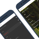
A Short Preview on How the Plugin Works
WordPress Mobile Menu Builder: Better Mobile Navigation Experience
WordPress Mobile Menu Builder allows users to easily navigate your website without compromising the loading time. Up to four main menu options can be set to simplify the mobile navigation of this responsive menu. Compatibility is not an issue since this WordPress mobile menu is designed to fit perfectly to any mobile screen dimension.
With this WordPress menu, you can work on a predesigned mobile menu theme and modify it according to your design preference. You can change the font, icon, and background styles and colors to perfectly match your website’s brand. This is applicable to any WordPress theme. Thus, plugin compatibility issue is never a problem.
Specially designed for mobiles
WordPress Mobile Menu Builder is particularly designed to perfectly match the interface of any mobile phone. This provides a better user experience since it is exclusively designed for mobile.
Ease of modification
Easily set the menu’s texts and icons based on the menu options that you want to feature in your site. You can choose to highlight important portions of your blog such as Home, Blog, Contact details, and main website menu. With this responsive menu, you have the complete control to choose whatever you want to display as menus depending on your website’s need.
Easily match the style of your website brand
Since you have the full control over the styling options, it will be easier for you to match the mobile menu design based on your website’s brand and style. You can easily modify the menu bar’s design to make it complementary to your website’s design and layout.
Change menu bar placement
The menu bar’s default position is at the bottom of the screen to make it easier for the user’s thumb to reach the menu options. But you can also place the menu bar at the top position if you want to mimic the placement of menu in desktop view.
On User Scroll Animation
You have the option to fix the menu bar or turn on the user scroll animation. Turning the user scroll animation on lets you hide and show the menu bar upon scrolling. This will help increase the screen space and maximize the user’s mobile view.
Show more navigation options through a Popup menu
The WordPress Mobile Menu Builder allows you to create an icon for pop-up contents where you can include more navigation options. You can integrate your existing widgets as selections to choose from. This WordPress menu is already widget-ready so can include as many as existing widgets as you like.
Fast and optimized mobile experience
WordPress mobile menu can be enabled without compromising your website’s performance on mobile.
Want to experience customizing your own WordPress Mobile Menu? Install the plugin now to give your users a great mobile experience by giving them the ease of navigating your website!
More information
Follow the developer @Twitter
Visit Main Website