內容簡介
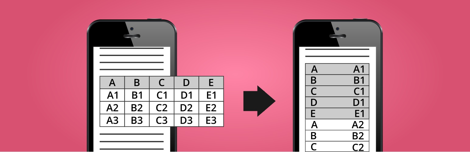
Make Tables Responsive 外掛自動將 WordPress 文章、頁面及小工具中的 HTML 表格轉換為響應式設計,讓小螢幕設備能以兩欄格式顯示表格,提升使用者體驗。
【主要功能】
• 自動轉換 HTML 表格為響應式
• 支援自訂螢幕大小設定
• 可選擇奇偶行的背景及邊框顏色
• 可依 HTML 類別或 ID 停用功能
• 不改變資料庫中的原始內容
外掛標籤
開發者團隊
📦 歷史版本下載
原文外掛簡介
Automatically makes the HTML tables in your WordPress posts, pages, and widgets responsive (mobile-friendly). Devices with a small screen will see the tables in a new layout with two columns. In the first column will be the data from the first row (the column names), and in the second column will be the data from the other rows.
WordPress Plugin Demo
HTML and CSS Demo for Non-WordPress Sites
Make Tables Responsive – HTML and CSS example for Non-WordPress sites
Features
Affect post/page content, excerpts, category descriptions, and text/HTML widgets
Choose affected screen size
Choose the cell background and border color for even and odd rows
Disable for tables by HTML class or ID
Disable or enable only for posts and pages by ID
Pros 🙂
Fully automatic
Does not change the actual post/page content in the database
Easily reverse changes by deactivating the plugin
No jQuery or JavaScript on the front-end
Cons 🙁
The first row must contain the column names
Skips tables with merged cells
Skips posts/pages with tables inside tables
Skips multi-row tables when only some columns use “th” tags
In multi-row tables, HTML code is stripped from the cells with the column names, when displayed in the responsive version (as the left column)