
內容簡介
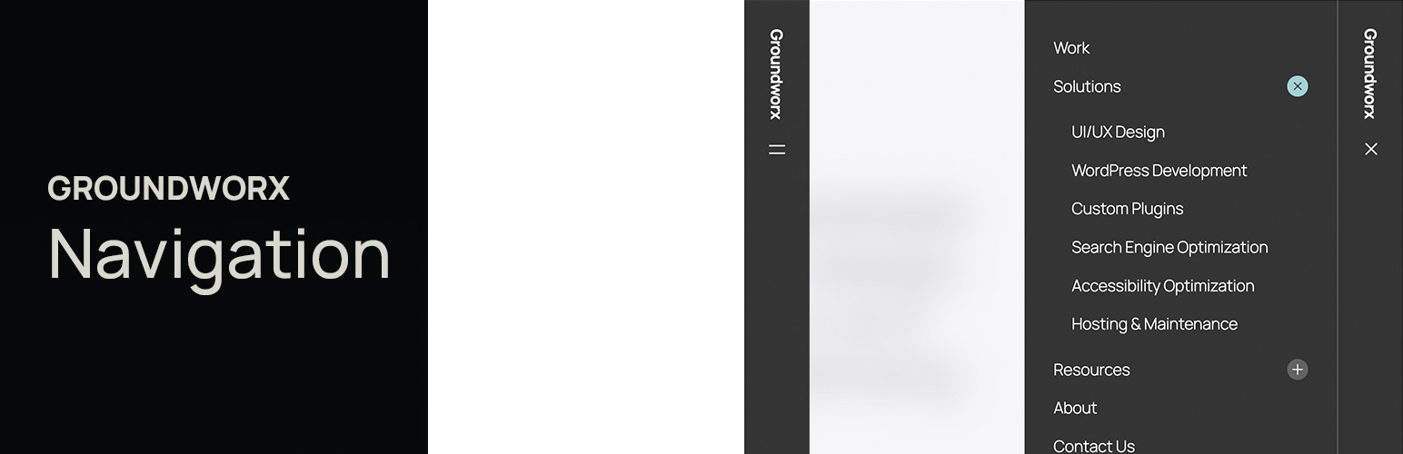
Groundworx Navigation 是一款強大的響應式導航區塊,專為 WordPress 區塊佈景主題設計。它允許使用者輕鬆建立專業的導航選單、響應式漢堡選單、模態覆蓋、下拉導航及固定標頭,無需編寫程式碼。
【主要功能】
• 原生 Gutenberg 導航區塊
• 四種響應式佈局範本
• 多種選單顯示樣式
• 智能響應行為設定
• 無障礙導航設計
• 品牌整合功能
外掛標籤
開發者團隊
② 後台搜尋「Groundworx Navigation – Responsive Menu & Mobile Navigation Block」→ 直接安裝(推薦)
原文外掛簡介
Groundworx Navigation is a powerful responsive navigation block for WordPress block themes. Build professional navigation menus, mobile-responsive hamburger menus, modal overlays, dropdown navigation, and sticky headers—all with native Gutenberg blocks. No coding required.
Perfect for theme.json block themes, this navigation block gives you complete control over your site’s header navigation, mobile menu behavior, and responsive breakpoints.
Why Choose Groundworx Navigation?
Replace complex navigation plugins with a native Gutenberg block solution. Whether you need a simple navigation bar, mobile hamburger menu, full-screen modal overlay, or off-canvas slide-in drawer—Groundworx Navigation handles it all.
Perfect for:
* Block theme developers building custom navigation headers
* Sites requiring mobile-first responsive navigation menus
* Accessibility-focused WordPress navigation
* Portfolio and business sites with sticky navigation headers
* Multi-level navigation structures and deep site menus
Key Features
Native Gutenberg Navigation Block
Build your navigation menu entirely in the WordPress Block Editor—no shortcodes, no legacy menu screens, just blocks.
Four Responsive Layout Templates
– Modal Navigation – Full-screen overlay menu for mobile devices
– Modal Dropdown – Dropdown header navigation on desktop, modal on mobile
– Slide-In Navigation – Off-canvas drawer navigation from right edge
– Classic Navigation – Traditional navigation bar with hamburger menu collapse
Multiple Menu Display Styles
Accordion menus · Accordion Alt · List navigation · Vertical menus · Horizontal navigation bars — mix and match with any layout template.
Smart Responsive Behavior
Set responsive breakpoints (tablet, laptop, desktop, large-desktop) and watch your navigation automatically collapse to a hamburger menu or modal overlay at your chosen screen size.
Flexible Position Controls
Relative, Sticky Header, Fixed Navigation, or Scroll-Up Reveal—create sticky navigation headers without writing custom CSS.
Accessibility-First Navigation
Built-in focus traps, ESC key close, arrow-key navigation, and proper ARIA attributes make your menu accessible by default.
Branding Integration
Add Site Logo, Site Title, or Site Tagline blocks anywhere in your navigation header for seamless branding.
Lightweight & Fast
No jQuery bloat. Powered by WordPress’s native Interactivity API with vanilla JavaScript—no external libraries needed for responsive navigation.
Submenu Controls
* Control nesting depth (1-5 levels) for complex navigation structures
* Indent or flatten submenu display
* Hover or click to open dropdown submenus
* Icon controls for submenu indicators
Navigation Templates In Detail
Modal Navigation
Perfect for mobile-first sites. Creates a full-screen overlay navigation menu that slides in from the top or side. Ideal for clean, distraction-free mobile navigation.
Modal Dropdown Navigation
Best of both worlds: traditional dropdown navigation on desktop, modal overlay on mobile devices. Great for sites with many navigation items.
Slide-In Navigation
Off-canvas navigation drawer that slides in from the right edge. Popular for modern web apps and mobile-optimized sites.
Classic Navigation
Traditional horizontal navigation bar that collapses to a hamburger menu icon on smaller screens. The most familiar navigation pattern for users.
Block Theme Ready
Groundworx Navigation is built specifically for theme.json block themes. Works perfectly with:
* Twenty Twenty-Four
* Twenty Twenty-Five
* Blockbase
* Frost
* Any FSE (Full Site Editing) block theme
Note: Requires a theme.json-ready block theme. Not compatible with classic PHP themes.