
內容簡介
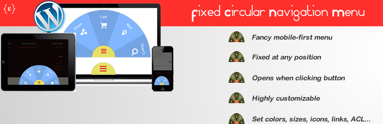
這是一個固定式的華麗導覽列外掛,非常適合作為額外選單、手機輔助導覽,或是吸引訪客點擊連結。
採圓形造型,外觀吸睛、時尚,在點選菜單按鈕時開啟。可在現代流覽器中使用,支援桌上型電腦及行動裝置(設計時以行動裝置為首要考量)。
透過後台選項面板,可進行完全地客製化:顏色、大小、圖示、位置、連結等等。請至官方網站查看功能列表,或查看一些範例和示範。
本插件靈感來自於 Codrops 文章,已進一步開發,讓其在每個現代流覽器和行動裝置中獲得良好的使用體驗。
快速獲取,安裝於 WordPress 後台,成為與眾不同的網站。
此插件提供免費版和專業版。
功能列表(兩個版本都包括以下):
提供網站華麗導覽列。
採用首要考量為行動裝置開發並進行測試。
全屏幕導航,既適用於筆記型電腦,也適用於桌上型電腦。
標籤輕巧,不影響網站前端效能。
底部固定。
可選擇 12 種內建顏色方案(包括透明色)。
菜單按鈕靜態文字呈現。
設定菜單按鈕顏色以及懸停時的顏色。
可設定相對大小,進行圖示和文字調整以符合元素要求,或嘗試不同的菜單體驗。
可完全自訂每個導航元素:
設定標題屬性、是否包含圖示、文字、URL 連結或 WordPress 文章/頁面連結,以及是否在新分頁中開啟。
可選擇 400 多個FontAwesome 圖示工具組中的圖示(已包含)。
拖拽重排導航元素。
支援翻譯,並已翻譯成西班牙文(已包含語言文件)。
支援WP多站點。
在所有主要現代流覽器和行動流覽器中進行測試並相容。
提供解答問題的論壇。
請至官方網站查看一些範例和示範,並比較功能,或在問答論壇中提出問題。
專業版功能列表:
高度自訂:
4 個固定位置:下方、左方、上方、右方。
建立你自己的導航元素顏色方案。
提供 4 種內建款式的開啟菜單按鈕:
文本和符號(+和-),僅文字、僅符號(+和-)或標準導航圖示。
或上傳和使用自定義圖示/圖像作為菜單按鈕。
或使用 FontAwesome 圖示的任何圖示作為按鈕。
可以設定菜單按鈕文字。
可選擇圖示和文字的顏色。
提供更多相對大小,從微小到大型,以讓您的圖示和文字更適合或嘗試不同大小的菜單體驗。
設定並使用自定義上傳的圖示/圖像作為導航元素。
依據螢幕大小來顯示菜單:
對於所有螢幕,僅顯示畫面小於768像素(智能手機和小型平板電腦),或畫面大於768像素(常見平板電腦,筆記型電腦以及更大)。
儲存角色控制邏輯,以便控制使用者的存取權限:
僅對特定 WP 使用者角色或自訂使用者角色顯示菜單。
優先客戶支援。
免費的終身更新。
如需個別客製化服務,可隨時提出要求。
外掛標籤
開發者團隊
② 後台搜尋「Fixed Circular Navigation Menu」→ 直接安裝(推薦)
📦 歷史版本下載
原文外掛簡介
A fixed fancy navigation for your wordpress website. Perfect as an extra menu, or mobile auxiliar navigation, or to attract visitors to click those links.
Circular shaped with an appealing and modern look that opens when menu button is clicked. Works in modern browsers, both desktop and mobile (it was designed mobile-first).
Fully customizable through backend option panel: colors, sizes, icons, position, links, and much more. Visit official website to check feature list and view some demos and examples.
It was inspired by a codrops article, and now it has been fully developed to work in every modern browser and mobile devices.
Get it, install it in your wordpress backend and become different than the rest.
There is a free version and a pro version.
Feature list (both free and pro):
Fancy menu for your WordPress site.
Mobile-first developed and tested
Fully responsive for laptop and desktop big screens.
Light non-heavy scripted addition for your front-end site.
Fixed at bottom.
Choose from 12 built-in color schemes (inlcuding a transparent one),
Static text for the menu button
Set menu button color and color on hover
Set and play with relative sizes for icons and text so you can fit elements or try different menu experiences.
Each navigation element is fully customizable:
Set title attribute, icon or not, text or not, URL link or link to a WP post or link to a WP page and open in a new tab or not
Choose from more than 400 icons from the famous FontAwesome icon toolkit (already included)
Drag & drop to reorder navigations elements.
Translation ready and already translated to Spanish (languages files included)
WP Multisite compatible
Tested and compatible in all major modern browsers and mobile browsers.
Question & Answers forum available.
Visit some demos and examples in the official site and compare features or ask in the Q&A forum.
Feature list (Only Pro version):
Highly customizable:
4 fixed positions: bottom, left, top, right.
Build your own color scheme for navigation elements.
4 built-in styles for the menu button that opens the menu:
text & symbol (+ and -), only text , only symbol (+ and -) or a standard navigation icon.
Or upload and use you custom icon/image for the menu button
Or use any FontAwesome icon for the button
You can set the text for the menu button
Choose colors for icons and texts
More relative sizes for your icons and texts, from tiny to huge.
Set and use a custom uploaded icon/image for navigation elements
Show the menu depending on screen size:
For all screens, only less than 768px (smartphones and small tablets) or more than 768px (common tablets, laptops and beyond).
Access Control Logic for users depending on their role:
Show menu to selected WP user roles or custom user roles.
Priority customer support
Free lifetime updates
Customization services are available on request.