

內容簡介
聲明:插件正在開發中,我們正在不斷改進程式碼。如果您認為程式碼可以改進或有任何建議,請隨時發送 PR 或打開問題。
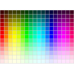
快速在您的網站上創建和分享顏色調色板
使用方式
只需啟用,新的「Color Palette」區塊將被添加到區塊插入器中
插入區塊並添加您的顏色
在您的編輯器中實時預覽調色板
路線圖
更多自定義選項
如果您有任何建議/功能請求,希望在即將推出的版本中看到,請隨時在問題區域讓我們知道
外掛標籤
開發者團隊
原文外掛簡介
Color Palette Block helps you create and showcase curated color collections directly in the WordPress block editor.
It is ideal for design systems, brand documentation, UI references, and visual style guides.
With Color Palette Block, you can add multiple swatches, switch between unique display styles, and copy each color in common code formats for development and handoff.
Key Features
Multiple display styles – Choose from Square, Polaroid, Circle, and Droplet swatch presentations.
Flexible color code output – Copy color values in HEX, RGB, HSL, and CSS variable formats.
Zero Dependencies No jQuery or heavy JS frameworks powered by the Interactivity API.
Theme color integration – Pull colors directly from your active theme palette.
Random palette generation – Quickly generate swatches and auto-suggest names.
Responsive by Default – Palettes adapt cleanly across desktop and mobile.
Why Choose BlaBlaBlocks Color Palette Block?
Because color decisions need to be both visual and usable.
Color Palette Block makes it easy to present colors clearly for designers, clients, and developers while keeping everything inside the native Gutenberg workflow.
No shortcodes or custom HTML required.
Editor-first workflow with instant visual feedback.
Great for brand kits, style guides, and component libraries.
How It Works
Insert the Color Palette block in any post or page.
Add swatches manually, import from theme colors, or generate random swatches.
Select your preferred display style and swatch sizing.
Copy color values in the format you need while previewing changes instantly.
Use Cases
Build a brand color reference page for teams or clients.
Publish design system palettes with reusable values.
Share developer-ready color specs with copyable code formats.
Create inspiration boards with quick random generation.
Available Display Styles
1. Square
Classic rectangular swatches for clean, structured palette layouts.
2. Polaroid
Card-style swatches with a framed visual treatment.
3. Circle
Rounded swatches for compact, modern palette presentations.
4. Droplet
Teardrop-inspired swatches for a more expressive visual style.
Customization Options
Swatch display style
Swatch sizing controls
Theme color import
Random palette generation
Auto-generated swatch naming
Per-swatch code copy in multiple formats
Performance & Optimization
Designed for the block editor workflow with straightforward controls.
Keeps palette management simple for both content creators and developers.
Responsive output helps maintain consistent presentation across devices.
Open Source and Free
BlaBlaBlocks Color Palette Block is open source and free to use. Contributions and feedback are welcome.
Source Code:
https://github.com/lubusIN/color-palette-block
Report Issues:
https://github.com/lubusIN/color-palette-block/issues
Changelog:
https://github.com/lubusIN/color-palette-block/blob/master/CHANGELOG.md