

內容簡介
Carousel Slider Block for Gutenberg 是一款現代化的響應式輪播滑塊外掛,專為 Gutenberg 編輯器設計,允許用戶在滑塊中添加任意區塊,提升網站的互動性和視覺吸引力。
【主要功能】
• 支援無限滑塊數量
• 可在滑塊中添加任意區塊
• 編輯器中即時預覽輪播效果
• 響應式設計,支援觸控操作
• 自訂滑塊速度與間距
• 自動播放與無限循環滑動
外掛標籤
開發者團隊
② 後台搜尋「Carousel Slider Block for Gutenberg」→ 直接安裝(推薦)
📦 歷史版本下載
原文外掛簡介
A responsive modern carousel slider for the Gutenberg block editor that lets you add any blocks to your slides.
🚀 Carousel Slider Version 2 is built on the modern Swiper.js library for improved performance and compatibility.
Features
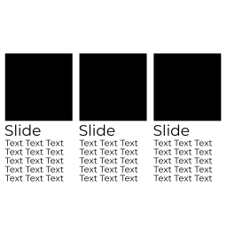
Add unlimited slides
Add any blocks to the slides
Preview the carousel in the editor
Responsive and touch enabled
Settings
Slides per view
Slides to scroll at a time
Slide speed
Slide padding
Prev/next arrows
Dots navigation
Infinite loop sliding
Autoplay
Responsive settings: slides to show and scroll at given screen size
RTL
Requirements
PHP 5.6+ is recommended, WordPress 5.8+, with Gutenberg active.
Documentation
Select the Carousel Slider block from the Design category. Click the + button located at the end of the carousel to add slides. Add any block within the slides. Use the horizontal scrollbar to preview the slides in the editor.
You can reorder the slides by using the left and right arrow buttons in the toolbar.
To remove a slide, select the slide and click the three dots right above it. Click the option to remove that slide.
Click the Carousel Block (the block nesting all the slides) to show the carousel settings.
Upgrading from Legacy Carousel
See the support topic for upgrading legacy blocks to Carousel Slider Version 2.
Customizing v2 Styles
Carousel Slider v2 supports custom styling via CSS variables:
Navigation
--wp--custom--carousel-block--navigation-size: Arrow icon size
--wp--custom--carousel-block--navigation-sides-offset: Distance from edge
--wp--custom--carousel-block--navigation-color: Arrow color
--wp--custom--carousel-block--navigation-hover-color: Arrow hover color (falls back to navigation-color)
--wp--custom--carousel-block--navigation-alignfull-color: Arrow color when carousel is full width
Pagination (dots)
--wp--custom--carousel-block--pagination-top: Top offset
--wp--custom--carousel-block--pagination-bottom: Bottom offset
--wp--custom--carousel-block--pagination-bullet-size: Bullet size
--wp--custom--carousel-block--pagination-bullet-active-color: Active bullet color
--wp--custom--carousel-block--pagination-bullet-inactive-color: Inactive bullet color
--wp--custom--carousel-block--pagination-bullet-inactive-hover-color: Inactive bullet hover color (falls back to active-color if set)
--wp--custom--carousel-block--pagination-bullet-active-opacity: Active bullet opacity
--wp--custom--carousel-block--pagination-bullet-inactive-opacity: Inactive bullet opacity
--wp--custom--carousel-block--pagination-bullet-inactive-hover-opacity: Inactive bullet opacity on hover (falls back to inactive-opacity if not set)
--wp--custom--carousel-block--pagination-bullet-horizontal-gap: Space between bullets (horizontal)
--wp--custom--carousel-block--pagination-bullet-vertical-gap: Space between bullets (vertical)
Block Spacing
--wp--custom--carousel-block--image-margin-top: Top margin for image blocks
--wp--custom--carousel-block--image-margin-bottom: Bottom margin for image blocks
--wp--custom--carousel-block--cover-margin-top: Top margin for cover blocks
--wp--custom--carousel-block--cover-margin-bottom: Bottom margin for cover blocks
Theme JSON Support
All the CSS variables can also be defined directly inside your theme’s theme.json under the settings.custom key.
For example:
{
"settings": {
"custom": {
"carousel-block": {
"navigation-size": "22px",
"navigation-color": "#000",
"pagination-bullet-active-color": "#000"
}
}
}
}
Frontend API
Carousel Slider exposes a small frontend API for integrations with tabs, accordions, modals, or other hidden UI.
window.CarouselSliderBlock.init( container ): Initializes carousel instances inside the given container.
window.CarouselSliderBlock.update( container ): Updates existing carousel instances inside the given container and initializes any that are not yet initialized.
![Swiper – 3D Coverflow Effect for visual composer [WPBakery Page Builder]](https://ps.w.org/swiper-for-visual-composer/assets/icon.svg?rev=2295909)