
內容簡介
Visualizer 是一款功能強大且易於使用的 WordPress 圖表與表格外掛,可在文章和頁面中嵌入互動式、響應式的圖表及資料表,支援 Google Visualization API、DataTables.net 及 ChartJS 等視覺化引擎。
【主要功能】
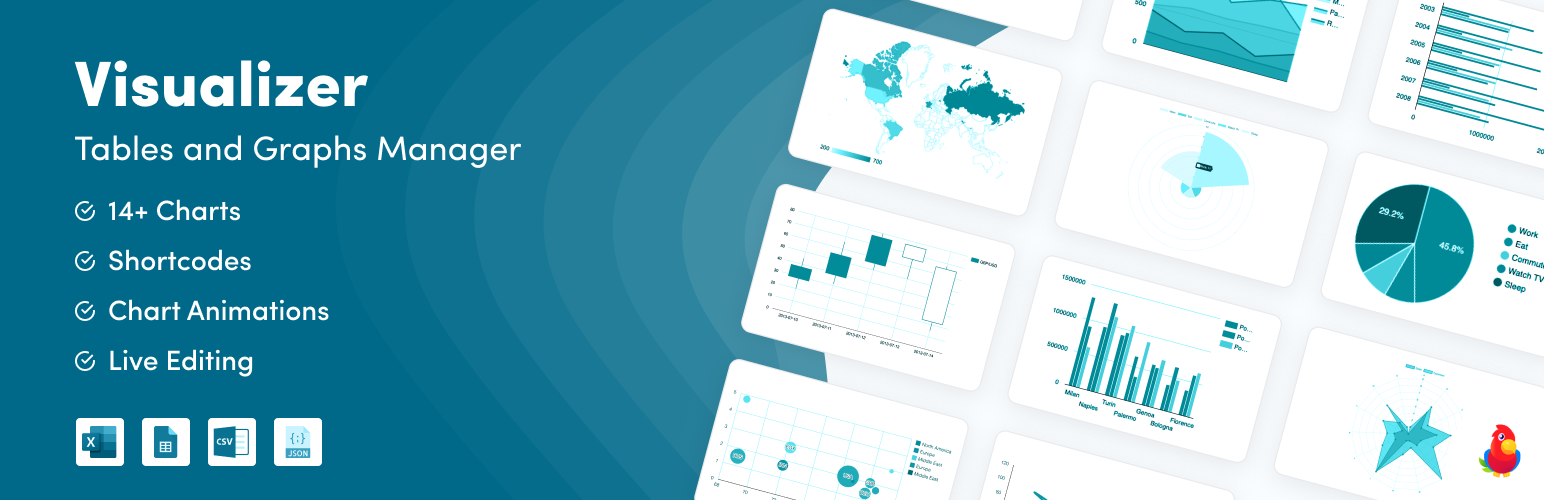
• 支援折線圖、圓餅圖、長條圖、表格等多種圖表類型
• 可手動輸入資料快速建立視覺化圖表
• 採用 HTML5/SVG 技術,完美支援各種裝置響應式顯示
• 內建互動式響應式資料表格功能
• 跨瀏覽器相容性佳,行動裝置體驗流暢
• PRO 版支援從 Excel、CSV、Google Sheets 匯入資料
外掛標籤
開發者團隊
② 後台搜尋「Visualizer: Tables and Charts Manager for WordPress」→ 直接安裝(推薦)
📦 歷史版本下載
原文外掛簡介
Visualizer: Tables and Charts Manager for WordPress is a powerful and easy to use plugin used to create, manage and embed interactive, responsive charts & tables into your WordPress posts and pages.
The plugin leverages the Google Visualization API, DataTables.net, and ChartJS libraries to deliver responsive and animated charts, graphs, and tables, ensuring excellent cross-browser compatibility and a seamless mobile experience. You can fully customize all aspects of the charts and tables to suit your needs. For enhanced data management features, including importing from Excel, CSV, Google Sheets, and more, consider exploring the PRO version.
🔗 HELPFUL LINKS
Want to see Visualizer in action before installing? View Visualizer Demo [You can also try Live Preview button above]
Need any help with setup? Check Documentation
Don’t like reading? Check YouTube Playlist
Interested in Visualizer Pro? Know more about Visualizer PRO
Why You’ll Love Visualizer
Diverse Chart Options: Begin with essential chart types like line, pie, bar, and table in the free version. Elevate your data presentation with advanced chart types such as scatter, area, and geo available in the Pro version. The free version offers a comprehensive range of options that are perfect for various visualization needs.
Manual Data Entry: Input data manually for quick visualization tasks. This method provides ultimate control over the content and structure of your charts, making it simple to tailor data presentation directly within the plugin interface.
Ultimate Responsiveness: Crafted using HTML5/SVG technology, Visualizer charts ensure flawless functionality across all devices. This commitment to responsiveness guarantees that your data is not only accessible but also optimally displayed on desktops, tablets, and smartphones, enhancing user interaction and engagement.
Data Table Capabilities: In addition to our responsive charts and graphs, you can also add responsive tables to your posts and pages and customize them to your liking. Visualizer Pro lets you enhance them with features such as sorting capabilities, pagination, and search functions. From pricing tables to product tables, the possibilities are vast and customizable to meet any data presentation need.
Seamless Integration and Compatibility: Whether you’re using the Gutenberg editor or other page builders, Visualizer integrates effortlessly into your WordPress environment. This seamless compatibility allows for straightforward chart insertion and management.
Flexible and Customizable: Make the charts and tables truly your own. Visualizer offers an extensive set of configuration options to perfectly match the look and feel of your website. Utilize Google Chart Tools with their default settings for simplicity, or dive into customization if your site’s style requires a unique approach. Every chart and table exposes numerous options that customize its appearance and functionality, ensuring your visualizations integrate seamlessly into your pages.
These versatile data handling capabilities ensure that Visualizer Free is equipped to meet a wide range of data visualization requirements right out of the box. Perfect for bloggers, educators, small businesses, and more, Visualizer helps you turn raw data into compelling, interactive charts that engage and inform your audience.
The above descriptions were partially taken from the Google Visualization API site
CHECK OUT A QUICK OVERVIEW OF VISUALIZER
✨ YOU SHOULD USE VISUALIZER IF:
You Own a Personal or Small Business Website: You need a straightforward, powerful tool to enhance your website’s visual appeal with interactive charts and tables. Visualizer makes complex data understandable and engaging.
You Run an Educational or Financial Institution: For organizations that require regular reporting and data display, Visualizer offers comprehensive options for creating dynamic and informative charts and tables. This helps in better data analysis and presentation, aiding in decision-making and reporting.
You Aim to Enhance SEO and User Engagement: Using Visualizer’s interactive and responsive charts can significantly improve user engagement, keeping visitors on your site longer, which can positively impact your SEO rankings.
You are a Non-Profit Organizations: Non-profits can use Visualizer to display the impact of their initiatives through data. Create pie charts to show the distribution of spending or line charts to track donation trends over time, which can be powerful visuals for fundraising campaigns and annual reports.
You are Financial Advisors and Economists: Visualizer allows for detailed financial reporting and economic analyses with advanced chart types like candlestick and radar charts. These tools can be used to depict stock performances, economic cycles, or budget allocations, providing clients with clear insights into financial matters.
Regardless of Industry: With over 30,000 happy active users and 160+ 5-star ratings, Visualizer has been employed across a broad range of industries, including healthcare, marketing, education, and finance, demonstrating its versatility and effectiveness in any field.
Types of charts you can create with Visualizer: Visualizer WordPress graph and charts plugin provides a variety of charts that are optimized to address your WordPress data visualization needs. In the free version, it has line charts, bar charts, pie charts, table charts. These charts are based on pure HTML5/SVG technology (adopting VML for old IE versions), so no extra plugins are required. Adding these charts to your page can be done in a few simple steps.
Table: Tables are extremely useful tools for displaying organized data. We use the datatable library to offer you endless customization options for any table needs you might have. Click here to see demo.
Pie Chart: Pie charts are simple visualizations that allow you to easily illustrate the proportion of your data to your users. Click here to see demo.
Line Chart: You can display a series of data points connected with line segments using the line chart. Click here to see demo.
Bar Chart: You can show grouped data with bars proportional to the values they represent using the bar chart. Click here to see demo.
Area Chart [PRO]: You can visually display quantitative data using the area chart. Click here to see demo.
Geo Chart [PRO]: You can display a map of countries, continents, or regions with areas identified by the values you specify. Click here to see demo.
Column Chart [PRO]: You can use a column chart to show comparisons among different categories. Click here to see demo.
Bubble Chart [PRO]: A bubble chart is a type of chart that displays three dimensions of data. Bubble charts can be considered a variation of the scatter plot, where data points are replaced with bubbles. Click here to see demo.
Scatter Chart [PRO]: You can display values in Cartesian coordinates using the scatter chart. Click here to see demo.
Gauge Chart [PRO]: You can build different gauge charts to indicate metrics like speed, performance, progress, or similar measures. Click here to see demo.
Candlestick Chart [PRO]: A candlestick chart is a style of financial chart used to describe price movements of a security, derivative, or currency. Click here to see demo.
Timeline Chart [PRO]: You can group time-based values using the timeline chart. Click here to see demo.
Combo Chart [PRO]: You can combine data series using different types of charts with the combo chart. Click here to see demo.
Polar Area Chart [PRO]: Polar charts are data visualizations best used for displaying multivariate observations with an arbitrary number of variables in the form of a two-dimensional chart. Click here to see demo.
Radar/Spider Chart [PRO]: A radar chart is a graphical method of displaying multivariate data in the form of a two-dimensional chart of three or more quantitative variables represented on axes starting from the same point. Click here to see demo.
🤝 ELEVATE YOUR DATA WITH VISUALIZER PREMIUM FEATURES
If you’re already benefiting from Visualizer, why not take your website to the next level with more powerful tools to enhance your data visualization capabilities and keep your audience engaged longer?
Advanced Data Synchronization: Automatically sync your data sources to ensure your charts are always current without manual input.
USE CASE: 🔍 Sarah, a market analyst, leverages Advanced Data Synchronization to streamline her workflow. She sets her data sources to auto-update, ensuring her market trend charts are always accurate, saving her hours each week and enhancing her reports’ credibility.
Multi-Language Support: Automatically translate your charts and data presentations into multiple languages, broadening your audience reach.
USE CASE: 🌍 Elena, who manages a multilingual educational platform, uses Multi-Language Support to provide data visualizations in several languages, effectively increasing her site’s global usability and accessibility.
Advanced User Permissions: Control who can view or edit your charts, perfect for teams needing to manage access at various levels.
USE CASE: 🛠️ Rachel, a project manager, configures user permissions to ensure that only relevant team members can edit financial forecasts, maintaining data integrity and security.
Import Data from Files: Upload CSV files directly into Visualizer. This feature is ideal for those who prepare data in spreadsheet tools like Microsoft Excel or Google Sheets, allowing for quick and easy data visualization.
Import Data from URLs: Keep your charts updated by importing data dynamically from external sources in CSV or JSON formats via URLs. This powerful feature is essential for displaying real-time or frequently updated data, reducing the need for manual updates.
Import from Other Charts: Seamlessly integrate data from other charts into new visualizations, facilitating easy data consolidation and comparison.
Import from WordPress: Directly pull data from your WordPress posts, pages, or custom post types to create dynamic charts that automatically update as your content changes.
USE CASE: ✍️ Benjamin, a digital marketing manager, uses this feature to track engagement across blog posts in real-time. He creates charts that update automatically with views and social shares, helping him quickly adjust content strategies based on what resonates with audiences.
Import from Database: Connect directly to your database to fetch data, ensuring your visualizations reflect the most up-to-date information available.
Data Filter: Apply filters to your data within Visualizer, enabling viewers to interact with and explore data in a more focused manner.
USE CASE: 🕵️♂️ Tom, a market researcher, implements data filters on his demographic analysis charts, allowing users to select specific variables such as age and income, thereby drilling down into personalized data insights.
Priority Support: Have access to our dedicated support team to help you resolve any technical issues swiftly, ensuring your visualizations are always performing optimally.
Unlock these premium features and more with Visualizer PRO!
Still have questions? Ask your pre-sales questions here, and we will get back to you promptly. Or, purchase with confidence and try it for yourself—we offer a 30-day no-questions-asked 100% money-back guarantee.
WE’RE HERE FOR YOU, AND WE TAKE ALL FEEDBACK SERIOUSLY
📚 Knowledge Base: We’ve created a complete documentation library and we’re still constantly updating with new tutorials.
📽️ Youtube Tutorials: Don’t like reading? We’ve created some YouTube tutorials to help you get started with the Visualizer plugin step by step.
🦸 Support Forum: We offer support to free version users here and try to reply within one business day.
🌟 Premium Support: We offer priority support for Plus license customers and live chat support for Infinite license customers.
If you have any feedback or feature suggestions for the Visualizer plugin, don’t hesitate to tell us. We read all feedback and ideas.
You’re in good hands
Visualizer is one of many great products by Themeisle. Join over 30,000+ Visualizer active users and half of a million Themeisle users from all over the world.
See what real users talk about us:
Visualizer is amazing! – “Just what I was looking for to make my information available and looks pleasing!”
Great Plugin for Bloggers – “It’s a great plugin for new bloggers like me. It’s working seamlessly on my website. I am using this plugin for the last couple of weeks and I am loving it.”
Works Well and Devs are Responsive – “We are using it on a rather complicated multisite install. After much research, we went with this plugin for our editors’ needs.”
The Best One I’ve Found – “After trying a couple of options, this was the one that worked the best.”