
內容簡介
總結:使用「Visibility Controls for Editor Blocks」這個 WordPress 外掛,可以控制 Gutenberg blocks 在行動裝置、平板和桌面設備上的可見性,輕鬆地根據用戶可配置的斷點隱藏或顯示 blocks。
HTML格式的問題與答案如下:
<ul>
<li>
問題:「Visibility Controls for Editor Blocks」這個 WordPress 外掛能夠控制什麼?</br>
答案:這個外掛讓你可以控制 Gutenberg blocks 在行動裝置、平板和桌面設備上的可見性。
</li>
<li>
問題:使用這個外掛可以根據什麼來隱藏或顯示 blocks?</br>
答案:使用者可以根據可配置的斷點來輕鬆隱藏或顯示 blocks。
</li>
<li>
問題:這個外掛的授權是什麼?</br>
答案:這個外掛的授權是根據 GPLv2 或更新版。可以在 https://www.gnu.org/licenses/gpl-3.0.html 找到更多相關資訊。
</li>
</ul>
外掛標籤
開發者團隊
② 後台搜尋「Visibility Controls for Editor Blocks」→ 直接安裝(推薦)
原文外掛簡介
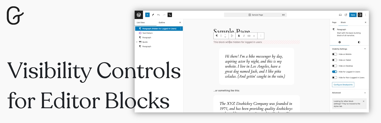
Visibility Controls for Editor Blocks is a powerful and user-friendly WordPress plugin that allows you to easily control the visibility of Gutenberg blocks across different devices, such as mobile phones, tablets, and desktop computers. With this plugin, you can manage how and when blocks are displayed based on customizable breakpoints, ensuring that your content is perfectly optimized for any screen size.
Whether you want to hide certain blocks on smaller screens, display specific content only to desktop users, or fine-tune your layout for tablets, this plugin gives you full control over your Gutenberg blocks’ visibility. The intuitive settings allow you to configure custom breakpoints for mobile and tablet devices, making it easy to adapt your content for a responsive and user-friendly design.
Now, you can also hide blocks specifically for logged-in users or non-logged-in (guest) users, making it easy to customize the user experience for different types of visitors.
Key Features:
New: Hide blocks based on user login status — show or hide content specifically for logged-in or guest users.
Device-Specific Block Visibility: Hide or show blocks specifically on mobile, tablet, or desktop devices.
Custom Breakpoints: Set your own breakpoints to define what counts as mobile, tablet, or desktop.
Simple and Intuitive Interface: Easily manage visibility settings directly in the block editor without needing to touch any code.
Seamless Gutenberg Integration: Fully integrated into the Gutenberg editor, making it easy to control visibility settings for any block.
Responsive Content: Ensure that your content looks great and functions smoothly across all device types.
Ideal For:
Bloggers and content creators who want to deliver tailored experiences for different devices.
Website owners looking to optimize page layouts based on screen sizes.
Developers and designers who need an easy-to-use solution for responsive design without custom code.
With Visibility Controls for Editor Blocks, you can ensure that your WordPress website delivers the best user experience, regardless of the device your visitors are using.
Video tips for using the Visibility Controls for Editor Blocks plugin:
License
This plugin is licensed under the GPLv2 or later. You can find more information at https://www.gnu.org/licenses/gpl-3.0.html.