
內容簡介
若要在文章或頁面中新增分頁標籤,請添加以下 shortcode:
[tabs]
[tab title="title1"] tab 內容
tab 內容
[/tab]
[tab title="title2"]
其他內容標籤
[/tab]
[/tabs]
以下為 shortcode 其他可接受的屬性:
// 預設屬性
[tabs collapsible=true selected=’0′ event=’click’ position=’top’ ]
[tab title=”title1″]
tab 內容
[/tab]
[tab title=”title2″]
其他內容標籤
[/tab]
[/tabs]
collapsible = true 或 false - 是否允許折疊標籤 - 對 Twitter Bootstrap 無效
selected = 整數,例如 - 預設開啟哪個標籤頁,0 代表第一頁,1 代表第二頁,依此類推
event = 'click' 或 'mouseover' - 用戶需點擊標籤頁面或只需將滑鼠移至標籤上即可觸發內容切換。提示:如關心行動裝置體驗,請不要使用 mouseover
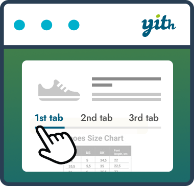
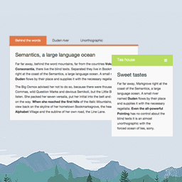
position = 'top'、'bottom'、'left' 或 'right' - 將標籤標示在哪一側,詳見螢幕快照中範例。
vertical_tabs = true 或 false - 已停用,與 position = left 相同
樣式 CSS
若要以不同方式設計分頁標籤,可使用下列樣式 CSS 改變樣式:
您也可以參考 http://jqueryui.com/themeroller/。
該 shortcode 使用 jQuery UI 產生標籤,但如果您使用的是 Twitter Bootstrap 框架,請參閱 FAQ。
/* =tabs
-------------------------------------------------------------- */
.tabs-shortcode.ui-tabs {
padding:.2em;
zoom:1;
clear:both;
background:#FFF;
padding:0;
margin:0;
}
.tabs-shortcode.ui-tabs-nav {
list-style:none!important;
padding:.2em 0 0!important;
margin: 0!important;
}
.tabs-shortcode .ui-tabs-nav:after{
visibility: hidden;
display: block;
font-size: 0;
content: " ";
clear: both;
height: 0;
}
* html .tabs-shortcode .ui-tabs-nav { zoom: 1; } /* IE6 */
*:first-child+html .tabs-shortcode .ui-tabs-nav { zoom: 1; } /* IE7 */
.tabs-shortcode .ui-tabs-nav li {
position:relative;
float:left;
border:1px solid #CCC;
background:#EEE;
list-style:none!important;
z-index: 100;
padding:0;
}
.tabs-shortcode.ui-tabs .ui-tabs-nav li.ui-tabs-active,
.tabs-shortcode.ui-tabs .ui-tabs-nav li.ui-tabs-selected {
background:#FFF;
color:#111;
}
.tabs-shortcode .ui-tabs-nav li:before {
content:"";
}
.tabs-shortcode .ui-tabs-nav li a {
float:left;
text-decoration:none;
padding:2px 1em;
color:#333;
border:none!important;
}
.tabs-shortcode.ui-tabs .ui-tabs-nav li.ui-tabs-active a,
.tabs-shortcode.ui-tabs .ui-tabs-nav li.ui-tabs-selected a,
.tabs-shortcode.ui-tabs .ui-tabs-nav li.ui-state-disabled a,
.tabs-shortcode.ui-tabs .ui-tabs-nav li.ui-state-processing a {
cursor: default;
}
.tabs-shortcode .ui-tabs-nav li a,
.tabs-shortcode.ui-tabs-collapsible .ui-tabs-nav li.ui-tabs-active a,
.tabs-shortcode.ui-tabs-collapsible .ui-tabs-nav li.ui-tabs-selected a {
cursor:pointer;
}
外掛標籤
開發者團隊
原文外掛簡介
To add tabs to you post or pages just add this shortcode:
[tabs]
[tab title="title1"] tab content
tab content
[/tab]
[tab title="title2"]
another content tab
[/tab]
[/tabs]
Here are the some attributes that the shortcode also excepts
// default attributes
[tabs collapsible=true selected=’0′ event=’click’ position=’top’ ]
[tab title=”title1″]
tab content
[/tab]
[tab title=”title2″]
another content tab
[/tab]
[/tabs]
collapsible = true or false – weather the tabs should be allowed to be collapsed – this doesn’t work with twitter bootstrap
selected = integer for example – what tab should be selected. 0 means the first tab. 1 means the second tab etc.
event = ‘click’ or ‘mouseover’ – does do you user need to click on the tab or just mouse over to get to the content. Tip: Don’t use mouseover if you are concerned with mobile.
position = ‘top’ , ‘bottom’ , ‘left’, ‘right’ on what side do you want the tabs to appear. See screenshots for an example.
vertical_tabs = true or false – depreciated is the same as position = left
Sample CSS
Want to style the tabs a different way.
Here is some sample css to get you started.
Another place to look for it would be the http://jqueryui.com/themeroller/,
The shortcode used the jQuery UI to generate the tabs unless you are using the twitter bootstrap framework.
See the FAQ on how to deal with that case.
/* =tabs
-------------------------------------------------------------- */
.tabs-shortcode.ui-tabs {
padding:.2em;
zoom:1;
clear:both;
background:#FFF;
padding:0;
margin:0;
}
.tabs-shortcode.ui-tabs-nav {
list-style:none!important;
padding:.2em 0 0!important;
margin: 0!important;
}
.tabs-shortcode .ui-tabs-nav:after{
visibility: hidden;
display: block;
font-size: 0;
content: " ";
clear: both;
height: 0;
}
* html .tabs-shortcode .ui-tabs-nav { zoom: 1; } /* IE6 */
*:first-child+html .tabs-shortcode .ui-tabs-nav { zoom: 1; } /* IE7 */
.tabs-shortcode .ui-tabs-nav li {
position:relative;
float:left;
border:1px solid #CCC;
background:#EEE;
list-style:none!important;
z-index: 100;
padding:0;
}
.tabs-shortcode.ui-tabs .ui-tabs-nav li.ui-tabs-active,
.tabs-shortcode.ui-tabs .ui-tabs-nav li.ui-tabs-selected {
background:#FFF;
color:#111;
}
.tabs-shortcode .ui-tabs-nav li:before {
content:"";
}
.tabs-shortcode .ui-tabs-nav li a {
float:left;
text-decoration:none;
padding:2px 1em;
color:#333;
border:none!important;
}
.tabs-shortcode.ui-tabs .ui-tabs-nav li.ui-tabs-active a,
.tabs-shortcode.ui-tabs .ui-tabs-nav li.ui-tabs-selected a,
.tabs-shortcode.ui-tabs .ui-tabs-nav li.ui-state-disabled a,
.tabs-shortcode.ui-tabs .ui-tabs-nav li.ui-state-processing a {
cursor: default;
}
.tabs-shortcode .ui-tabs-nav li a,
.tabs-shortcode.ui-tabs-collapsible .ui-tabs-nav li.ui-tabs-active a,
.tabs-shortcode.ui-tabs-collapsible .ui-tabs-nav li.ui-tabs-selected a {
cursor:pointer;
}
.tabs-shortcode .ui-tabs-panel {
display:block;
border-width:0;
background:none;
}
.tabs-shortcode .ui-tabs-hide {
display:none!important;
}
.tabs-shortcode.ui-tabs-panel {
clear:both;
}
/* Position Top and Bottom */
.tabs-shortcode-top .ui-tabs-nav,
.tabs-shortcode-bottom .ui-tabs-nav{
margin-left:0!important;
}
.tabs-shortcode-top .ui-tabs-nav li,
.tabs-shortcode-bottom .ui-tabs-nav li{
position:relative;
float:left;
position:relative;
float:left;
}
/* Position Top */
.tabs-shortcode-top .ui-tabs-nav{
border-bottom: 1px solid #CCC;
}
.tabs-shortcode-top .ui-tabs-nav li.ui-tabs-active,
.tabs-shortcode-top .ui-tabs-nav li.ui-tabs-selected {
padding-bottom:1px!important;
border-bottom:0;
margin:1px .3em -1px 0!important;
}
.tabs-shortcode-top .ui-tabs-nav li {
border-bottom-width:0!important;
margin:1px .3em 0 0!important;
}
/* Position Bottom */
.tabs-shortcode-bottom .ui-tabs-nav{
border-top: 1px solid #CCC;
}
.tabs-shortcode-bottom .ui-tabs-nav li.ui-tabs-active,
.tabs-shortcode-bottom .ui-tabs-nav li.ui-tabs-selected {
padding-top:1px!important;
border-top:0;
margin:-1px .3em 1px 0!important;
}
.tabs-shortcode-bottom .ui-tabs-nav li {
border-top-width:0!important;
margin:0 .3em 1px 0!important;
}
/* Position Left and Right */
.tabs-shortcode-left .ui-tabs-nav,
.tabs-shortcode-right .ui-tabs-nav{
width: 150px;
margin: 0!important;
}
.tabs-shortcode-left .ui-tabs-nav li,
.tabs-shortcode-left,
.tabs-shortcode-right .ui-tabs-nav li,
.tabs-shortcode-right{
position: relative;
overflow: hidden;
}
.tabs-shortcode-left .ui-tabs-nav li,
.tabs-shortcode-right .ui-tabs-nav li{
margin:0 0 0.3em 0;
width: 100%;
}
.tabs-shortcode-left .ui-tabs-nav li a,
.tabs-shortcode-right .ui-tabs-nav li a{
width: 100%;
}
.tabs-shortcode-left .ui-tabs-panel,
.tabs-shortcode-right .ui-tabs-panel{
margin-left: 165px;
}
/* Position Left */
.tabs-shortcode-left .ui-tabs-nav{
border-right: 1px solid #CCC;
padding: 0 1px 10px 0!important;
}
.tabs-shortcode-left .ui-tabs-nav,
.tabs-shortcode-left .ui-tabs-nav li{
float: left;
}
.tabs-shortcode-left .ui-tabs-nav li.ui-tabs-active,
.tabs-shortcode-left .ui-tabs-nav li.ui-tabs-selected {
padding-right:1px;
border-right:0;
margin:0 1px 0.3em 0;
}
/* Position Right */
.tabs-shortcode-right .ui-tabs-nav{
border-left: 1px solid #CCC;
padding: 0 0 10px 1px!important;
}
.tabs-shortcode-right .ui-tabs-nav,
.tabs-shortcode-right .ui-tabs-nav li{
float: right;
}
.tabs-shortcode-right .ui-tabs-nav li.ui-tabs-active,
.tabs-shortcode-right .ui-tabs-nav li.ui-tabs-selected {
padding-left:1px;
border-left:0;
margin:0 0 0.3em 1px;
}