內容簡介
SQL Chart Builder 外掛能根據使用者的 SQL 查詢創建美觀的圖表,並可在網站的任何部分使用這些圖表。它支援原生 WordPress 及非 WordPress 的 MySQL 資料表,提供多種圖表類型以滿足各種需求。
【主要功能】
• 支援 11 種圖表類型
• 全新設計的圖表建構器介面
• 即時 SQL 自動完成建議
• 點擊式查詢工具列
• 無需程式碼的輸入過濾器
• 下拉式欄位映射功能
外掛標籤
開發者團隊
📦 歷史版本下載
原文外掛簡介
The plugin creates beautiful charts based on your SQL queries, then you can use those charts in any part of your website.
You can use both native wp and non-wp mysql tables in your queries.
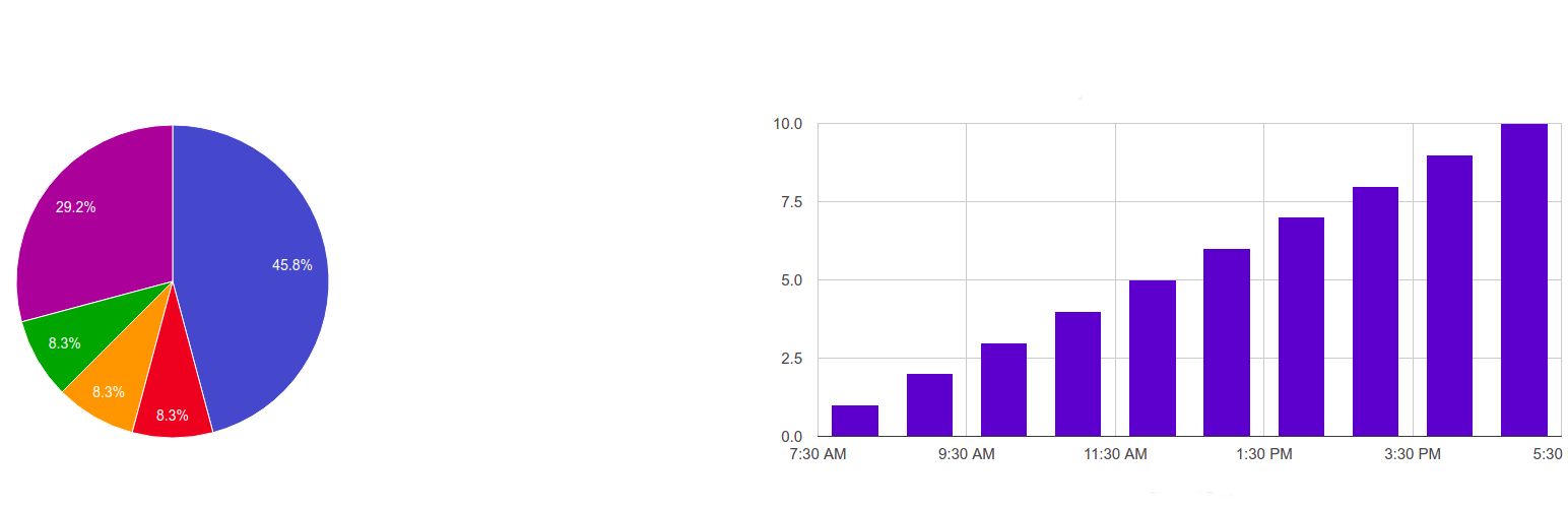
11 chart types: Pie, Doughnut, Polar Area, Radar, Line, Area, Stepped Line, Bar, Horizontal Bar, Stacked Bar, Scatter
What’s new in 3.0
A completely redesigned chart builder. No more “nerd-only” settings page: a clean, tabbed UI walks you through Chart & Data → Dynamic Filters → Style → Advanced.
Visual chart type picker with built-in guides. Every chart type shows a short “when to use it” guide plus a working example query you can insert with one click.
Live SQL autocomplete. Start typing and the editor suggests SQL keywords (type “S” — get SELECT), your real database table names and real column names. Type tablename. to see that table’s columns. Press Ctrl+Space for suggestions at any time.
Click-to-build query toolbar. SELECT / COUNT(*) / FROM / WHERE / GROUP BY / ORDER BY / LIMIT buttons plus “Insert table”, “Insert column” and “Insert dynamic tag” dropdowns filled with your actual database schema — build a best-practice query without typing a single word.
No-code input filters. Add date/number/text filters as simple rows (tag, type, label, default) — the tag dropdown suggests {tags} already used in your query and columns from its WHERE part. No more memorizing the ~ / | syntax (a raw editor is still available for pros). One click inserts the {tag} into your query.
Dropdown column mapping. The X/Y axis fields are dropdowns filled with the columns detected in your SQL query — no more guessing column names.
Color pickers instead of typing hex codes, and a fixed professional default palette instead of random colors.
Latest Chart.js v4, bundled inside the plugin — no third-party CDN calls, GDPR-friendly.
4 new chart types: Radar, Stepped Line, Stacked Bar and Scatter.
Better front-end design: modern table view, restyled filter form and datepicker.
Full legacy support: charts created with 2.x keep working unchanged. Deprecated Google-Chart types are automatically mapped to modern equivalents when you open/save the chart.
How to use
Go to Dashboard → My SQL Charts → Add New and give any name to your report.
Pick a chart type — read the short guide shown under the type cards, or click “Use this example” to start from a working query.
Build your SQL query with the toolbar buttons and autocomplete (real table and column names are suggested), then map the X and Y columns.
You can use multiple SQL queries too — just split them with the “;” sign to get comparison charts. You can also pass shortcode arguments into the query: with “select * from wp_posts where ID>{arg1}” the shortcode [gvn_schart_2 id=”2″ arg1=”11″] passes the value in (the builder’s live preview runs without arguments, so test such charts on a page).
After Publish/Update you will see the shortcode below the builder. Use it anywhere on your website: pages, posts, widgets, or the “My SQL Charts” Gutenberg block.
Check “Show table-view data below the graph” to also render the data as a styled table.
In the Input Filters tab, add filters by clicking “+ Add filter” — each one becomes an input (with a datepicker for date types) above the chart at the front-end.
Chart type mini-guide
Pie / Doughnut — how a total splits into a few parts. One query: label column + numeric column.
Polar Area — like a pie, but the value controls the radius; great for cyclic data (months, weekdays).
Radar — compare one or more series across categories arranged in a circle (profiles, ratings).
Line — trends over time; add more “;”-separated queries for comparison lines.
Area — a line with the region filled; emphasizes volume.
Stepped Line — values that change at discrete moments (prices, stock levels).
Bar / Horizontal Bar — compare categories; horizontal is best for long labels.
Stacked Bar — how each category total is composed; each “;”-separated query becomes one segment.
Scatter — correlation between two numeric columns (both X and Y must be numeric).
Input filters (dynamic variables)
Use the visual rows in the Input Filters tab, or the raw format:
variable_name~default_value~variable_label~variable_type | variable_name~default_value~variable_label~variable_type
variable_name – any single name you want.
default_value – default value when no variable is chosen by the user
variable_label – label visible on the form above the chart
variable_type – number, text or date
~ separates variable elements, | separates variables
Example: with the filters “limit_tag~10~Count~number | post_date_tag~2010-07-05~Date Published~date”
you can use “select * from wp_posts where post_date<{post_date_tag} limit {limit_tag}” as the SQL code —
the plugin renders the corresponding inputs above the chart automatically.
Supported built-in dynamic tags: {current_user_id}, {current_user_login}, {current_user_email}, {current_user_display_name}.
Caching
Use [gvn_schart_2_cached id=”1″ expire=”3600″] to cache the rendered chart in a transient. Add &force_sql_cache_reload=1 to the URL to bypass it once (e.g. right after upgrading).
Website
https://guaven.com/my-sql-charts/
Documentation
https://guaven.com/my-sql-charts/#docs
Bug Submission and Forum Support
Contact Page
Please Vote if you liked our plugin
Your votes really help us. Thanks.
Available Filters
apply_filters( ‘guaven_sqlcharts_table_empty_cell’);
apply_filters(‘guaven_sqlcharts_pre_print_vars’);
apply_filters( ‘guaven_sqlcharts_final_output’);
apply_filters(‘guaven_sqlcharts_rendered_sql’);