
內容簡介
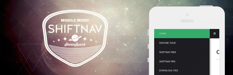
ShiftNav 是 WordPress 的一個很棒的行動裝置選單外掛程式。它的外觀和操作方式與像 Facebook、Gmail 等受歡迎的應用程式的本機 App 側邊拉出式選單非常相似。
ShiftNav Demo – 看看它如何運作
開始使用:ShiftNav 快速安裝指南
功能概觀
本機 App 樣式選單
自動整合
亮色和暗色外觀
支援 WordPress 3 選單系統
支援觸控裝置
CSS3 轉換可產生在行動裝置上的平滑動畫
可配置
知識庫
想把您的選單提升到更高的層次?升級至專業版
瀏覽器相容性
支援 CSS3 轉換的瀏覽器將會使用滑動效果開關選單。對於不完全支援 CSS3 轉換的瀏覽器,該選單將降回至非動畫式的開啟/關閉功能。
外掛標籤
開發者團隊
② 後台搜尋「ShiftNav – Responsive Mobile Menu」→ 直接安裝(推薦)
📦 歷史版本下載
原文外掛簡介
ShiftNav is an awesome mobile menu for WordPress. It looks and acts like native app off-canvas slide-out menus for popular apps like Facebook, Gmail, etc.
ShiftNav Demo – see how it works
Get started: ShiftNav Quick Setup Guide
Feature Overview
Native App-Style Menus
Automatic Integration
Light & Dark Skins
Works with the WordPress 3 Menu System
Touch-enabled
CSS3 Transitions produce smooth animations on mobile devices
Configurable
Knowledgebase
Want to take your menu to the next level? Go Pro
Browser Compatibility
ShiftNav will open with a slide transition with browsers that support it. For browsers that don’t fully support CSS3 transforms, the menu will fall back to non-animated open/close functionality.