內容簡介
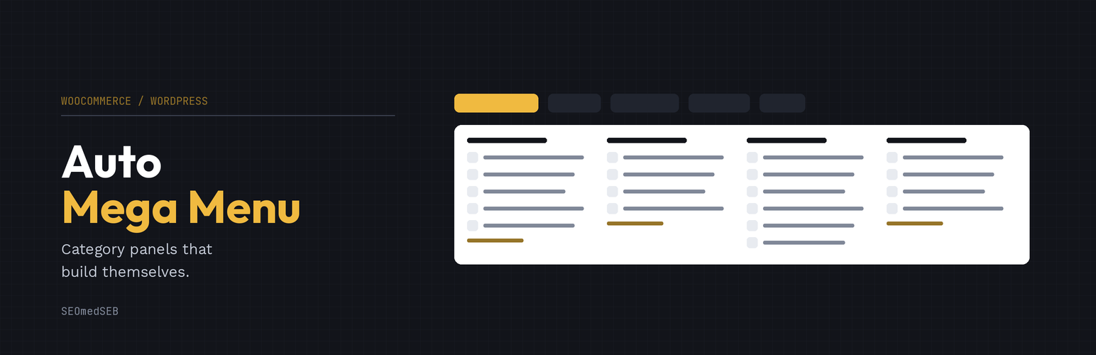
SEOmedSEB Auto Mega Menu 自動生成導航菜單,根據現有的產品類別自動填充子類別及其圖片和鏈接。此外掛可自動更新,讓 WooCommerce 商店的菜單隨時保持最新,提升使用者體驗。
【主要功能】
• 自動從 WooCommerce 類別生成菜單
• 支援自定義顏色標籤(如「熱門」、「特價」)
• 提供超過 230 種樣式設定選項
• 行動裝置專屬設計,方便操作
• 完整的鍵盤導航和可及性支援
外掛標籤
開發者團隊
原文外掛簡介
SEOmedSEB Auto Mega Menu builds your navigation from the categories you already have. Point a menu item at a
product category and the panel fills itself with that category’s sub-categories, their images and
their links. Add a category in WooCommerce and it appears in the menu on its own. Rename one and the
menu follows.
The panel works out its own shape. Two sub-categories give two columns, not four with gaps. Many
short lists spread wide; a few long ones go taller instead. Columns pack rather than lining up in
rows, so a short category never leaves a hole beneath it.
Built for real shops
Panels fill from WooCommerce categories and stay current
Category thumbnails are used automatically, with a per-item override or none at all
Coloured badges (“POPULAR”, “SALE”) on any item, with your own text and colours
A “See all 18” link when a list is capped, so nothing is silently hidden
Panels never grow past the screen: they scroll, with a soft edge marking there is more
Designed, not just configured
Over 230 style settings across 20 areas, each available globally, per area, per item, and per
breakpoint. Set a typeface and colour once under Global typography and the whole menu follows.
Seven hamburger animations, nine arrow shapes, four panel layouts, seven opening animations, and
four mobile opening effects.
Mobile is its own design, not a squeezed desktop
The drawer opens full width with your shop logo. Tapping a category opens the level below rather
than navigating away, so sub-categories are reachable on a phone. The default pattern is hybrid: the
first tap moves to a screen for that department, and everything inside opens in place.
Accessible
Full keyboard navigation, a focus trap in the mobile drawer, correct ARIA state, visible focus rings
for keyboard users only, and 44px touch targets. Touch devices are handled properly: the first tap
opens, the second follows the link.
Works with your builder
Shortcode, Gutenberg block, Elementor widget, a Breakdance element, or by taking over one of your
theme’s menu locations. Menus export and import between sites, matching categories by slug rather
than by database id.