

300+
安裝啟用
★★☆☆☆
2.2/5 分(6 則評價)
4145 天前
最後更新
—
問題解決
WordPress 4.0+ v1.0.2 上架:2014-12-02
內容簡介
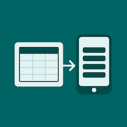
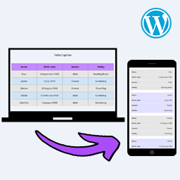
讓您的行動裝置中不再出現捲軸,並將您的表格轉換為具有響應式行動裝置設計的表格。
當屏幕分辨率低於 767px 時,表格將更改其布局以實現響應式設計,從而使表格容易閱讀,無需滾動。
可用的短碼:
[responsivetable]
外掛標籤
開發者團隊
原文外掛簡介
Say goodbye to the scrollbar in mobile device and transform your table to responsive mobile design table.
When a screen resolution is below 767px table will change its layout to responsive design allowing the table to easyly read without the scroll
shortcode to use
[responsivetable]