

內容簡介
工具提示用於顯示少量的隱藏內容(主要是解釋性提示),當用戶移動光標到或點擊(較少用)特定目標時會彈出。
主要特點
它是靈敏的。當在大屏幕上查看時,它依賴最大寬度值,在狹窄的環境中採用適當的相對目標位置(上、下;左邊、中間、右邊)。
它適用於移動設備。當點擊呼叫到操作按鈕時會彈出,當在工具提示本身上點擊時會消失。
它支持 HTML 格式化。需要將一些文字格式化為斜體或其他格式?沒問題,這可以完成。
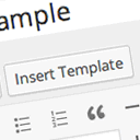
使用方法非常簡單:在預設的 WordPress 編輯器中添加了一個工具提示按鈕,您只需單擊並填寫彈出對話框,其餘內容將自動處理。
進階
如果您希望提示內容使用 HTML 格式(避免使用塊級元素),可以在 tinyMCE 中使用 [tooltip tip=””] 包裝它,按鈕會添加 WordPress 短代碼。
您還可以將屬性 rel=”tooltip” 和 title=”在這裡輸入您的提示” 指定給 HTML 文件中的任何 body 標記,當調用時,工具提示將在其中彈出。
您可以通過編輯 responsive-tooltip.css 更改彈出提示的外觀,變得更適合您的網站!
外掛標籤
開發者團隊
② 後台搜尋「Responsive Mobile-Friendly Tooltip」→ 直接安裝(推薦)
原文外掛簡介
tooltips are used to present a tiny amount of hidden content (mainly explanatory, so-called tips), that pops up when user moves a cursor over or clicks (less common) on a special target.
Key Features
It’s responsive. It relies on a maximum width value when viewed on large screens, adopts to narrow environments and picks the best viewable position relatively to the target (top, bottom; left, center, right).
It’s mobile-friendly. It pops up when a call-to-action button is tapped and disappears when tapped on the tooltip itself.
It’s HTML formatting capable. Need to write some words in italic or so? No problem, this will work out.
It’s extremely easy to use: A tooltip button in added to the default WordPress editor, all you have to do it click it and fill the pop-up dialog, the rest is taken care of automatically.
Advance
The button adds a WordPress short-code, if you want the tip to be HTML formated (avoid block level elements) you can just wrap it with [tooltip tip=””][/tooltip] in tinyMCE.
You can also assign the attribute rel=”tooltip” and title=”Enter your tip here” to any of body tags in HTML file where you want the tooltip to pop up when called.
You can change the pop-up look by editing responsive-tooltip.css. change it to what ever suits your website best!