內容簡介
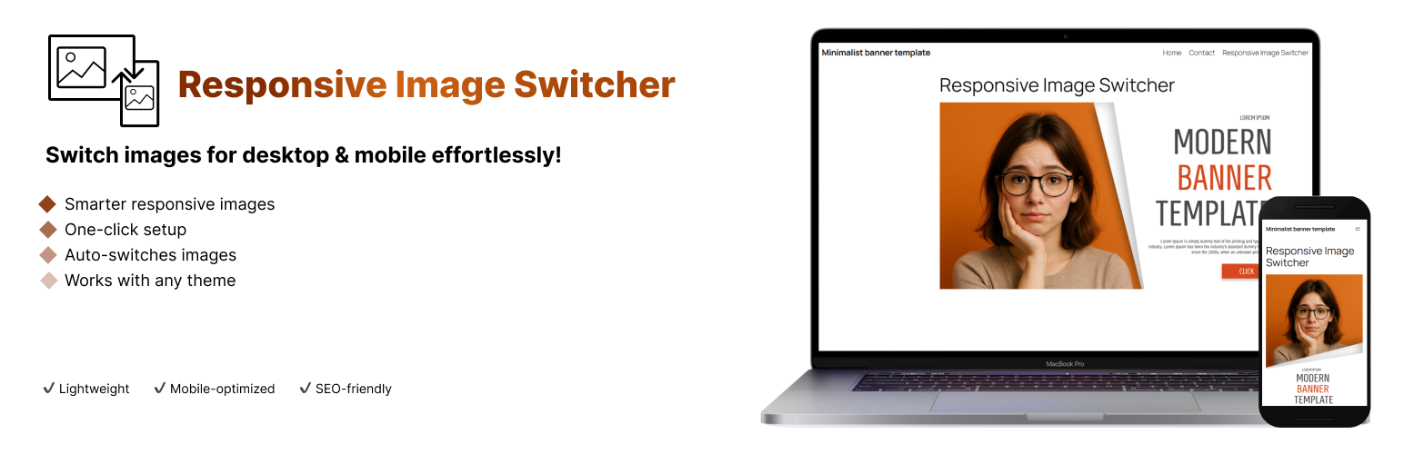
Responsive Image Switcher 是一款輕量級的 Gutenberg 區塊外掛,簡化了 WordPress 中的響應式圖片管理。使用者只需上傳桌面和行動裝置的圖片,外掛會自動生成 HTML5 的 <picture> 標記,確保根據螢幕寬度加載適當的圖片,提升載入速度和使用者體驗。
【主要功能】
• 裝置專屬圖片:桌面和行動裝置顯示不同圖片
• 輕量解決方案:使用標準 HTML5 <picture> 標籤
• 更佳效能:優化 Core Web Vitals,減少不必要的圖片加載
• SEO 友好:改善行動使用者體驗和頁面速度
• 簡單介面:Gutenberg 編輯器中的易用區塊控制
外掛標籤
開發者團隊
原文外掛簡介
Responsive Image Switcher is a lightweight Gutenberg block that simplifies responsive image management in WordPress. Add the block, upload a desktop image (for screens ≥768px) and a mobile-optimized image (for screens <767px), and the plugin generates clean HTML5
Key Features:
– Device-Specific Images: Show different images on desktop (≥768px) and mobile (<767px)
– Lightweight Solution: Uses standard HTML5
– Better Performance: Optimized for Core Web Vitals by reducing unnecessary image loading
– SEO Friendly: Improves mobile user experience and page speed
– Simple Interface: Easy-to-use block controls in the Gutenberg editor
Why Choose Responsive Image Switcher?
With over 60% of web traffic coming from mobile devices, delivering the right image for each screen size is critical. This plugin eliminates the need for complex CSS media queries or CDN setups, making responsive images accessible to everyone.