
內容簡介
使用圖片 srcset 在 Divi 主題中讓你的網站更快加載。
問題 – Divi 網頁上的圖片僅顯示單一大小的圖片,而不管裝置大小
你的 Divi 網頁速度緩慢嗎?
對裝置大小不管不顧的圖片標籤是否只顯示一種圖片大小?
網站速度減緩了銷售,因為跳出率增加。
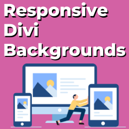
在網頁上使用響應式圖片可以提供相同圖片的不同大小。瀏覽器決定最佳圖片大小以渲染。
Divi 包含全尺寸和常規圖片模組。它們不提供響應式圖片。它們是一個「一個尺寸適用於所有」的模板。
非響應式圖片只有一種圖片大小。相同的圖像會加載到大型桌面、平板和移動裝置上。
假設您使用本機的 divi 圖片模組,圖片大小為 2000px。在裝置寬度為 400px 的裝置上提供 2000px 寬的圖像沒有任何意義,除了減慢網頁速度之外。
解決方案 – Divi 響應式圖片大小外掛
Divi 響應式圖片大小 外掛有兩個模組。
響應式圖片 divi 模組–它在常規 divi 部分中可用。
全寬響應式圖片 divi 模組–它在全寬 divi 部分中可用。
這兩個模組都有助於創建具有響應式圖片大小的圖片標籤。
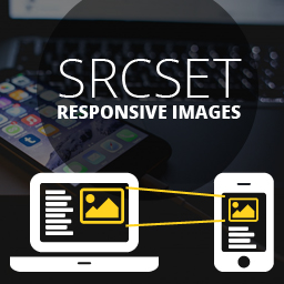
響應式圖片會在圖像標記中添加 srcset 和 sizes 屬性。
srcset 和 sizes 做什麼?
考慮一個 <img> 標籤的例子
<img alt="Divi responsive image sizes" src="default.jpg" srcset="small.jpg 240w, medium.jpg 300w, large.jpg 720w" sizes="(max-width: 360px) 300px, 100vw">
讓我們逐一解釋每個屬性。
alt=”Divi responsive image sizes”
alt 屬性描述圖片的替代文字。當瀏覽器無法找到圖片時,會載入此文字。
src=”default.jpg”
src 屬性為不支援 srcset 和 sizes 屬性的瀏覽器定義備用圖像路徑
srcset=”small.jpg 240w, medium.jpg 300w, large.jpg 720w”
srcset 屬性以不同大小的圖像列表。與每個圖像路徑一起,我們指定它的寬度(以像素為單位)
sizes=”(max-width: 360px) 300px, 100vw”
sizes 屬性根據視口(設備)大小指示瀏覽器如何從 srcset 中選擇合適的圖像。
根據上面的例子,
對於 360px 以下的視窗大小,瀏覽器顯示中間圖像(300px)medium.jpg。
對於大於 360px 的視窗大小,瀏覽器顯示寬度為 720px 的 large.jpg。
Divi 圖片大小
Divi 支援以下 CSS 媒體斷點。
大螢幕(1405 像素以上)
筆記型電腦和桌面電腦(1100 像素至 1405 像素之間)
橫向平板電腦(981 像素至 1100 像素之間)
直向平板電腦(768 像素至 980 像素之間)
橫向智能手機(480 像素至 768 像素之間)
直向智能手機(0 至 479px 之間)
對於每個斷點,響應式 Divi 模組有相應的字段來設置圖像寬度。
提高圖像 SEO 分數
圖像 SEO 非常重要。響應式 Divi 模組遵循最佳做法,為每個圖像添加 alt 和 title 屬性。
外掛標籤
開發者團隊
原文外掛簡介
Make your website load faster in Divi Theme using image srcsets.
The Problem – Images on divi webpage serving single image size irrespective of devices sizes
Is your divi webpage slow?
Do the tags serve a single size irrespective of the device size?
A slower website causes decrease in sales due to increase in bounce rate.
A responsive image offers different sizes of the same image. The browser decides the best image size to render.
Divi includes a fullsize and regular image module. They don’t serve a responsive image. It’s a one-size-fits-all.
The non-responsive image have a single image size. The same image loads on large desktop, tablet and mobiles.
Let’s say you use the native divi image module with image of size 2000px. Serving the 2000px wide image on a device with width 400px serves no purpose other than to slow down the webpage.
The Solution – Divi responsive image size plugin
The Divi Responsive Image Size plugin has two modules.
Responsive Image divi module – It’s available in regular divi section.
Fullwidth Responsive Image divi module – It’s available in fullwidth divi section.
Both the modules help creates a image tag with responsive image sizes.
A responsive image adds the srcset and sizes attributes to the image markup.
What does srcset and sizes do?
Consider the example of an tag

Let’s go over each attribute.
alt=”Divi responsive image sizes”`
The alt attribute describes the alternative text for the image. Browser loads this text when it can’t find the image.
src=”default.jpg”
The src attribute defines a fallback image path for browsers that don’t support srcset and sizesattributes
srcset=”small.jpg 240w, medium.jpg 300w, large.jpg 720w”
The srcset attribute lists images at different sizes. Along with each image path we specify it’s width in pixels.
sizes=”(max-width: 360px) 300px, 100vw”
The sizes attribute instructs the browser on how to pick the right image from the srcset based on the viewport (device) size.
Going by the above example,
For viewport size 360px and below, browser displays medium.jpg (300px) image.
For viewport size above 360px, browser displays large.jpg image that is 720px wide.
Divi image sizes
Divi supports following css media breakpoints.
Large screens (1405px upwards)
Laptops and desktops (between 1100px and 1405px)
Tablets in landscape mode (between 981px and 1100px)
Tablets in portrait mode (between 768px and 980px)
Smart phones in landscape mode (between 480px and 768px)
Smart phones in portrait mode (between 0 and 479px)
For every breakpoint, the responsive divi modules has a corresponding field to set the image width.
Improve image SEO score
Image SEO is important. The responsive divi modules follows google recommendations for image SEO
The responsive divi modules wraps the image in a figure tag.
It can display a caption for the image using the figcaption tag.
The alt attribute text is got from the WordPress media attachment or custom text.
Full divi frontend builder support
The Responsive Image and Fullwidth Responsive Image divi modules provide full divi frontend builder support. Add custom styles to the image and caption text via the modules Design tab.
Divi Responsive Image Sizes Module Settings – See screenshot 1.
Image section – Upload/select an image, set alt and figcaption tags. If alt and caption values are empty, it uses corresponding values from WordPress media attachment.
Responsive Image Width section – Define the image sizes at different media breakpoints.
Caption Text section – Add custom style to the caption text.
Sizing section – Change the max and standard width for the figure element.
Spacing section – Set the padding and margin values for the figure
Border section – Set border styles for the img tag.
Box shadow section – Set box shadow styles for the img tag.
Filters section – Set filters for the figure element.
Transform section – Set transforms for the figure element
CSS ID & Classes section – Set css id and classes for figure element
Custom CSS section – Add custom css for figure, img and figcaption tags
Visibility section – Set visibility for the figure tag on desktop, tablet and mobile.
Divi Premium Plugin
We offer other divi premium plugins. Each of them have a 7-day FREE trial, no upfront payment details required.
Gravity Forms Divi Module
FAQ Plugin For Divi
Image Carousel For Divi
Product Carousel For Divi
Contact Form 7 Grid & Styler For Divi
Blog Carousel For Divi