

內容簡介
使用 Widget 在文章中顯示具有響應式欄位
您想要將 Widget 水平排列嗎?如果是,這個外掛程式可能是您的解決方案。
將想要的 Widget 加入外掛程式建立的自訂側邊欄,然後設定自動插入。
如果您是開發人員,並且正在尋找一種簡單的方式來在響應式欄位中呈現一些輸出,那麼這個外掛程式會很方便。將您的陣列傳遞給外掛程式篩選器。然後外掛程式會為您處理。
工作原理
步驟
加入 Widget。
輸入每列中的欄位數。
啟用自動插入或插入短代碼。
顯示 Widget 於欄位中
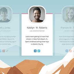
這個外掛程式讓您使用網格系統以水平方式顯示 Widget。這是這個外掛程式的主要功能。
針對行動裝置的響應式設計
當瀏覽器寬度變化時,它會自動調整佈局。這對於平板電腦和行動裝置的訪客非常重要。
設定每列中的欄位數
您可以靈活地設定每行中的欄位數。
根據螢幕寬度設定欄位數
根據瀏覽器寬度靈活設定欄位數。換句話說,您可以控制特定螢幕寬度的欄位數。
在所有地方顯示具有響應式欄位
自動插入
利用自動插入功能,自動將定義的 Widget 方塊插入到您想要的位置。您不必使用短代碼。
PHP 代碼和短代碼
在佈景主題模板中使用 PHP 代碼或在文章中使用短代碼。
預設側邊欄集成
由您的佈景主題定義的側邊欄也可以以欄位顯示。
創建複雜欄位
利用外掛程式提供的選項,實現更高級的複雜設計。
嵌套側邊欄
這是 Widget 中的 Widget 功能。使用插件提供的 Widget,可以將整個側邊欄內容嵌入到另一個側邊欄的 Widget 項目中。
欄位範圍
欄位範圍是可配置的,因此您可以設定更寬的 Widget 區域。
針對開發人員
自訂陣列
如果您會編碼,則可以將陣列傳遞到外掛程式的篩選器,以便將您的陣列內容呈現在多個欄位中,而不是在 Widget 中。
查看 更多。
基本三個步驟
前往外觀 > Widget。您會看到一個名為 Responsive Custom Widgets 的新自訂側邊欄方塊。
將 Widget 加入其中。
要在文章中顯示添加的 Widget,主要有兩種不同的方法。
選項 A:在文章中添加短代碼。
[responsive_column_widgets]
選項 B:使用自動插入功能,在外掛程式設定頁面 New / Edit 啟用「啟用自動插入」選項。
指定每列中不同的欄位數
預設情況下,Widget 會以 3 欄顯示。可以通過設置欄位參數來更改。
[responsive_column_widgets columns="4"] 會以 4 欄顯示 Widget。
可選地,如果您想要更改每行中的欄位數,可以使用逗號分隔的連續數字。
例如:
[responsive_column_widgets columns="3,2,5"] 會在第一行顯示 3 欄 Widget,在第二行顯示 2 欄,並顯示 5 欄在第三行。根據需要更改數字。
要將每個螢幕最大寬度的欄位數設定為最大值,請使用媒體查詢。
外掛標籤
開發者團隊
📦 歷史版本下載
原文外掛簡介
Show Responsive Columns in Posts with Widgets
Do you want to arrange widgets horizontally? If so, this plugin may be the solution for you.
Add desired widgets to the custom sidebar the plugin creates and set up an auto-insert.
If you are a developer and looking for an easy way to render some outputs in responsive columns, this plugin will be handy. Pass your arrays to the plugin filter. Then the plugin will take care of it for you.
How It Works
Steps
Add widgets.
Enter the number of columns.
Enable Auto-insert or insert the shortcode.
Displays Widgets in Columns
The plugin will let you display widgets horizontally with a grid system. This is the main feature of the plugin.
Responsive Design for Mobile Visitors
When the browser width changes, it automatically adjusts the layout. This is important for tablet and mobile visitors.
Set Number of Columns per Row
You can flexibly set the number of columns in each row.
Set Number of Columns by Screen Width
Flexibly set the number of columns by browser width. In other words, you can control the number of columns for particular screen widths.
Show Responsive Columns Everywhere
Auto-insert
Take advantage of the Auto-insert feature which automatically inserts the defined widget box to your desired location. You don’t have to use the shortcode.
PHP code and Shortcode
Use PHP code in the theme template or the shortcode in posts.
Default Sidebars Integration
Sidebars defined by your theme also can be displayed in columns.
Create Complex Columns
Achieve more advanced complex design by taking advantage of the options that the plugin provides.
Nesting Sidebars
This is widgets in widget functionality. With the widget that the plugin provides, the whole sidebar contents can be embedded as a widget item into another sidebar.
Column Span
Column spans are configurable so that you can set wider widget areas.
For Developers
Custom Array
If you can code, you can pass an array to the plugin’s filter so that your array contents can be rendered in multiple columns instead of widgets.
See more.
Basic Three Steps
Go to Appearance > Widgets. You’ll see a new custom sidebar box named Responsive Custom Widgets.
Add widgets to it.
To display the added widgets in a post, there are mainly two different means.
Option A: add the shortcode in the post.
[responsive_column_widgets]
Option B: use the auto-insert feature by enabling the Enable Auto-insert option in the plugin setting page, New / Edit.
Specify Different Number of Columns in Each Row
By default, the widgets are displayed in 3 columns. It can be changed by setting the columns parameter.
[responsive_column_widgets columns="4"] will display the widgets in 4 columns.
Optionally, if you like to change the number of columns in each row, use sequential numbers separated by commas.
For instance,
[responsive_column_widgets columns="3,2,5"] will show the widgets in 3 columns in the first row, 2 columns in the second, and 5 to the third. Change the numbers accordingly for your needs.
To set the number of columns for each screen max-width, use the pipe (|) character as the delimiter and place the width in pixel followed by a colon (:). Omit the width for no limitation. For instance,
[responsive_column_widgets columns="5 | 800: 4 | 600 : 2 | 480: 1"] will show the widgets in 5 columns when the browser widths is greater than 800, and 4 when the browser width is 800 to 601, and 2 when the browser width is 600 to 481, and 1 when the browser width is less than or equal to 480.
Use PHP code for Themes
The widget box can be displayed outside post/pages. Putting a PHP code into the theme is one way of doing it. Use the ResponsiveColumnWidgets() function.
For instance,
5 ) ); ?> will display the widgets in 5 columns.
Parameters
There are other parameters besides columns.
columns – the number of columns to show. Default: 3. If you want to specify the number of columns in each row, put the numbers separated by commas. For instance, 3, 2, 4 would display 3 columns in the first row and 2 columns in the second row and four columns in the third row and so on. The rest rows follow the last set number. To set the number of columns by screen max-width, use the colon(:) character after the width, and use the pipe (|) character to delimit each set of number of columns. If the pixel is omitted, it is considered no limit. If the pipe delimiter is not present, the plugin will add 600: 1 internally by default.
Format:
column value | pixel: column value | pixel: column value | ...
The following example displays widgets in 5 column when the browser width is greater than 800, and four when the width is 601 to 800, and three when the width is 481 to 600, and one when the width is 1 to 480.
5 | 800: 4 | 600: 3 |480: 1
sidebar – the ID of the sidebar to show. Default: responsive_column_widgets. For the twenty-twelve theme, sidebar-1, would show the default first sidebar contents.
maxwidgets – the allowed number of widgets to display. Set 0 for no limitation. Default: 0.
maxrows – the allowed number of rows to display. Set 0 for no limitation. Default: 0.
omit – the numbers of the widget order of the items to omit, separated by commas. e.g. 3, 5 would skip the third and fifth registered widgets.
showonly – the numbers of the widget order of the items to show, separated by commas. e.g. 2, 7 would only show the second and seventh registered widgets. Other items will be skipped.
label – the label name of the widget box. Default: Responsive Column Widgets.
colspans – the column spans. This determines how wide the specified widget item is.
Format:
widget index - column span, widget index - column span, widget index - column span, ...
The following parameter value of colspans will set the first widget with 3 column space and the fourth widget with two column space and the seventh takes four column space. Unspecified widget items will have one column span.
1-3, 4-2, 7-4
To set them by screen max-width, like the columns parameter, use the colon(:) character after the width in pixel, and use the pipe (|) character to delimit each set of column spans. If the pixel is omitted, it is considered no limit. These widths need to correspond to the value passed to the columns parameter. e.g.
1-3, 4-2, 7-4 | 600: 1-2, 3-2, 7-3 | 480: 1-2
If the column span exceeds the set number of max column, the column span will follow the max column. Note that the widget index of omitted widgets will not be considered(counted) in the widget index of this parameter.
cache_duration – the cache lifespan in seconds which determines how long the cache remains. Default: 0. e.g. 3600
call_id – this is for developers. This is used to identify the callback when a plugin hook is used so that the callback method assigned to the hook can know if it is theirs or not. This parameter does not affect the style based on the parameter values.
Render Custom Array in Multiple Columns
If you are a developer, you can render array contents that hold string values in multiple columns with responsive design.
Let’s take a look at an example. First, insert this shortcode in a post or a page.
[responsive_column_widgets call_id="days" columns="7"]
The value for the call_id parameter can be any string that identifies the call.
Now we need to hook into the RCW_filter_widget_output_array filter so that we can intervene the process of plugin’s rendering widgets. It accepts two parameters. The first one will be the output array and the second one is the parameter array.
In the callback function for the filter, we check if the parameter call_id holds the correct value. You should change the value to suite your needs, which should be unique and not conflict with others.
add_filter( 'RCW_filter_widget_output_array', 'RCW_CustomArrayOutput', 10, 2 );
function RCW_CustomArrayOutput( $aOutput, $aParams ) {
if ( ! isset( $aParams['call_id'] ) ) {
return $aOutput;
}
if ( 'days' === $aParams['call_id'] ) {
return array( 'Sunday', 'Monday', 'Tuesday', 'Wednesday', 'Thursday', 'Friday', 'Saturday' );
}
return $aOutput;
}
This will display the days in 7 columns. The plugin will generate the CSS rules based on the parameter values. And the rules will be inserted inside the body tag.
If you like to insert the style in the head tag, use the ResponsiveColumnWidgets_EnqueueStyle function. Tell the function that which parameters are going to be used.
add_filter( 'wp_loaded', 'RCW_CustomArrayAddStyle' );
function RCW_CustomArrayAddStyle() {
if ( function_exists( 'ResponsiveColumnWidgets_EnqueueStyle' ) ) {
ResponsiveColumnWidgets_EnqueueStyle( array( 'columns' => "7" ) );
}
}
Note that 'call_id' => 'days' can be omitted. The other parameters should not be omitted.
For cases that the shortcode is not used, you can use the ResponsiveColumnWidets() function.
$aYourArray = array( 'a', 'b', 'c', 'd' );
if ( function_exists( 'ResponsiveColumnWidets' ) ) {
ResponsiveColumnWidets(
array( 'columns' => 4 ),
$aYourArray
);
}
This will output a, b, c, d in four columns.
Video Tutorials
http://en.michaeluno.jp/responsive-column-widgets/tutorials/