
內容簡介
```html
<!DOCTYPE html>
<html>
<head>
<meta charset="UTF-8">
</head>
<body>
<h2>WordPress Flip Card Block Plugin 總結:</h2>
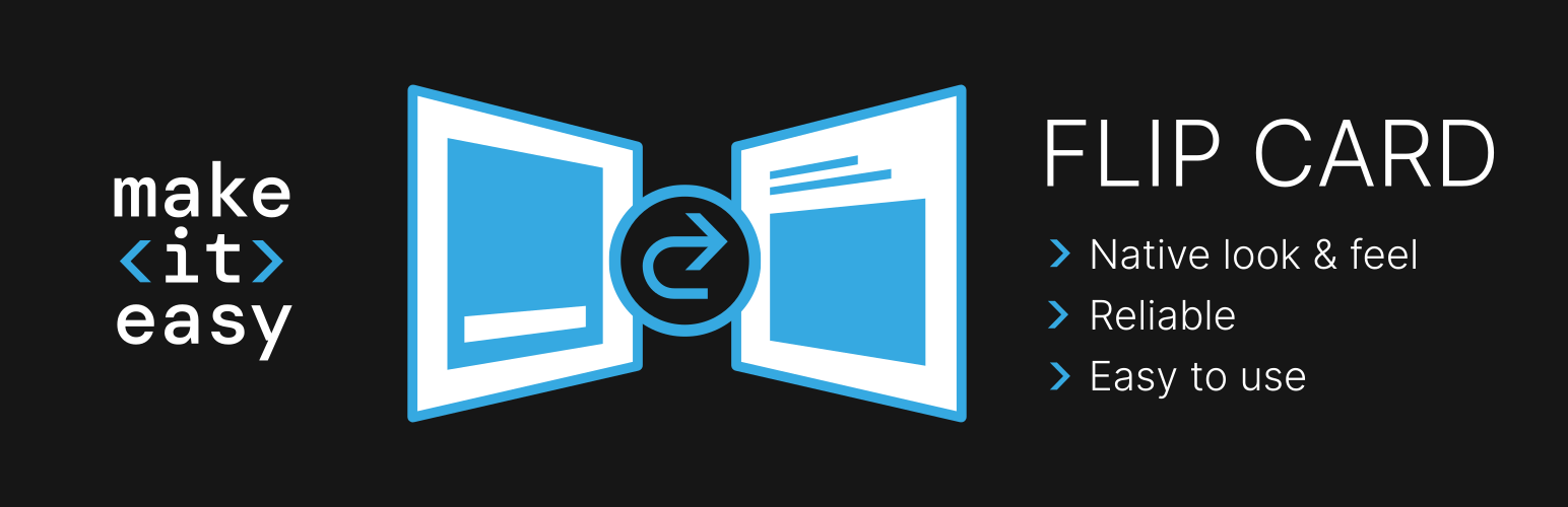
<p>這是一個互動式網頁元素,在滑鼠懸停或點擊時會顯示額外內容。Flip Card 區塊包括工具欄控制,可選擇背面是在懸停還是點擊時出現。當開啟模式設置為懸停時,也可以指定整張卡片的連結。</p>
<h3>主要特點:</h3>
<ul>
<li>🥇 功能豐富。</li>
<li>🥈 完全開源:包括區塊源代碼。可自行分叉並根據需要調整。</li>
<li>🥉 開發者友好:無偏見的開始 CSS - 通過主題樣式化。</li>
<li>⏲️ 未來兼容:使用建議的區塊編碼實踐,可保證與未來 WordPress 版本兼容。</li>
</ul>
<h3>開發者注意事項:</h3>
<ul>
<li>在 GitHub 上可以找到完整的源代碼。您可以檢視程式碼、根據需求進行調整、協作等。</li>
<li>開發:</li>
<ul>
<li>執行 npm install 以安裝相依性。</li>
<li>要進行開發,可以:</li>
<ul>
<li>刪除 webpack.config.json,然後執行 npm run start 以啟動沒有即時重新載入的開發伺服器。</li>
<li>保留 webpack.config.json,並設置 .env 檔案中的 host、cert_location 和 key_location 變數,然後執行 npm run start 以啟動帶有即時重新載入功能的開發伺服器。</li>
</ul>
<li>要建置用於生產環境,請執行 npm run build。</li>
</ul>
</ul>
</body>
</html>
```
外掛標籤
開發者團隊
原文外掛簡介
An interactive web element that reveals additional content on hover or click. The Flip Card block includes toolbar controls to choose whether the back side appears on hover or on click.
When the opening mode is set to hover, you can also assign a link to the entire card.
Key Features
🥇 Feature-Rich.
🥈 Fully Open Source: Including the block source code. Fork and adjust as needed.
🥉 Developer friendly: Unopinionated starting CSS – styled through theme.
⏲️ Future-Proof Compatibility: Guaranteed compatibility with future WordPress versions by using recommended block coding practices.
Developer Notes
There is a full source code on github. You can investigate code, adjust it to your needs, collaborate, …
Development:
– Run npm install to install dependencies.
– To develop, either:
– remove webpack.config.json and run npm run start to start a development server without live reloading.
– leave webpack.config.json and set .env file with host, cert_location and key_location variables and run npm run start to start a development server with live reloading.
– To build for production, run npm run build.