
內容簡介
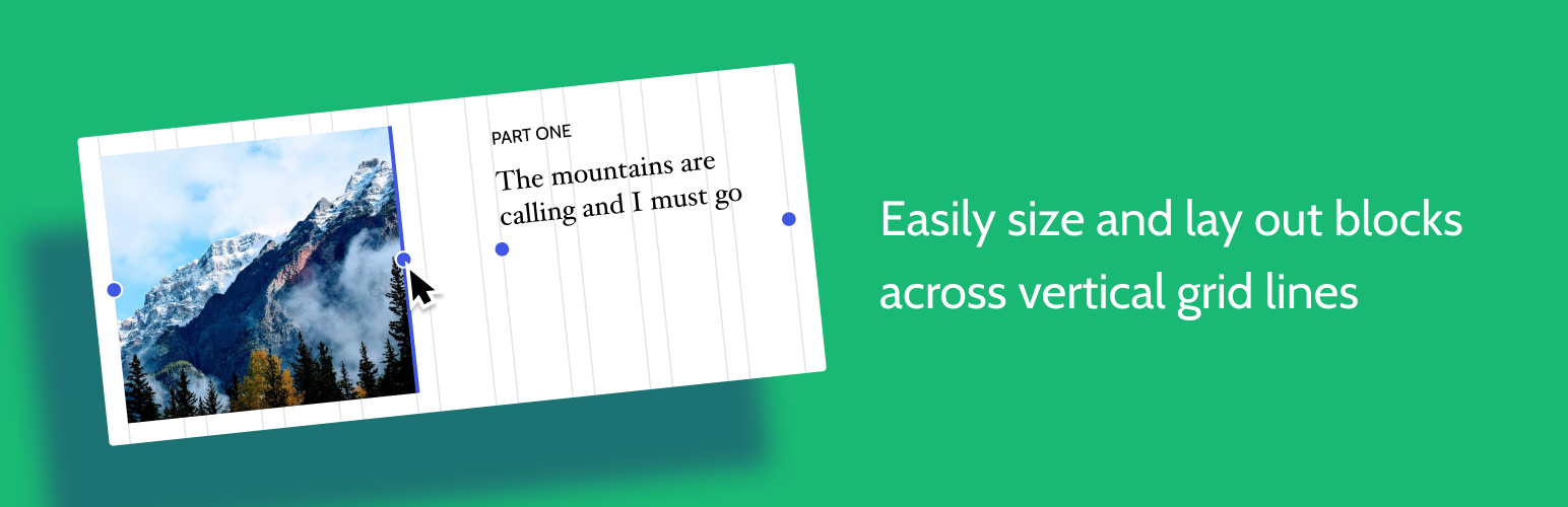
想要輕鬆設定自訂欄位寬度和位置的列排版嗎?也許您想要在文章中將內容對齊全局佈局網格。使用此佈局網格區塊,您可以實現以上兩個目標,或是其中一個。此外,也可以在手機或平板電腦斷點上提供特定的佈局選項。先選擇欄位數(1-4),然後調整每個欄位的大小和位置以符合任何螢幕尺寸。還可以選擇性地應用背景色和間距以突顯重點。
來源和支援
您可以在 Github 存儲庫中跟踪開發進度、提交問題、建議功能和查看原始碼:https://github.com/automattic/block-experiments
外掛標籤
開發者團隊
原文外掛簡介
Want to create a column-based layout with easily customizable column-width and positions? Or perhaps you want to align your content to a global layout grid across your post. With this Layout Grid block you can do both or either. There are also options to provide specific layouts to mobile or tablet breakpoints. Pick a number of columns (1-4), then go ahead and resize and position each column as you want them to look, for any screen. Optionally apply background colours and paddings to add emphasis.
Source and Support
You can follow development, file an issue, suggest features, and view the source at the Github repo: https://github.com/automattic/block-experiments