
內容簡介
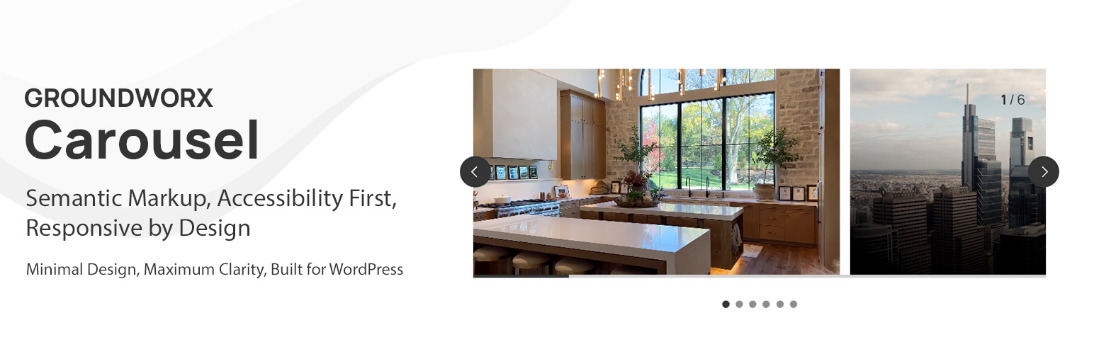
Groundworx Carousel 是一款靈活的 Gutenberg 區塊,能將任何 WordPress 內容轉換為美觀且具響應式的輪播。它基於輕量級的 Embla Carousel 引擎和 WordPress 互動 API,提供進階的響應式控制、多種設計範本及廣泛的自訂選項,讓使用者在原生區塊編輯器內輕鬆操作。
【主要功能】
• 九種專業範本供選擇
• 進階響應式控制設定
• 多種輪播類型與過渡效果
• 彈性顯示選項,支援自訂間距
• 完整的觸控與滑動手勢支援
外掛標籤
開發者團隊
原文外掛簡介
Groundworx Carousel is a flexible Gutenberg block that transforms any WordPress content into beautiful, responsive carousels. Built on the lightweight Embla Carousel engine and the WordPress Interactivity API, it offers advanced responsive controls, multiple design templates, and extensive customization options—all within WordPress’s native block editor.
Perfect For
Image galleries and photo carousels
Testimonial and review sliders
Product showcases and e-commerce displays
Hero sections and featured content
Client logo carousels
Team member presentations
Portfolio galleries
Content marketing sliders
Blog post carousels
Before/after comparisons
Key Features
🎨 Nine Professional Templates
Choose from carefully designed templates to match your content style:
* Default & Default Alt – Classic carousel layouts with external navigation
* Simple, Simple Left, Simple Right – Clean minimalist designs with flexible content positioning
* Overlay & Overlay Alt – Modern content overlaid on images with gradient backgrounds
* Partial Overlay & Partial Overlay Alt – Balanced layouts with partial content overlays
📱 Advanced Responsive Controls
* Configure carousel behavior per breakpoint (mobile, large-phone, tablet, laptop, desktop, large-desktop)
* Responsive grid fallback – destroy carousel at specific breakpoints to display slides as a grid
* Mobile-first breakpoint system with inheritance
* Full touch and swipe gesture support for mobile devices
* 6 total breakpoint levels for precise responsive control
🎯 Carousel Types & Transitions
* Slide mode – Classic horizontal sliding carousel
* Loop mode – Infinite continuous scrolling with clones
* Drag and swipe gesture support with momentum
⚙️ Flexible Display Options
* Multiple slides per page with responsive settings
* Variable slide width (auto) or fixed width options
* Start, center, or end alignment
* Customizable gap spacing between slides
* Autoplay
🎚️ Navigation & UI Controls
* 11 Arrow Styles: arrow, chevron, chevronRounded, halfArrow, play, playRounded, sharpChevron, thinChevron, thinChevronRounded, triangle, triangleRounded
* 9 Pagination Styles: circle, circleOutline, square, squareOutline, diamond, diamondOutline, rectangle, rectangleOutline, number
* Progress bar indicator
* Slide counter display (e.g., “3 / 10”)
* Hide/show controls per breakpoint
* Color customization for all UI elements
🎨 Advanced Color Controls
Customize every UI element with full WordPress color palette support:
* Arrows: text, background, border colors
* Active Pagination: text, background, border colors
* Inactive Pagination: text, background, border colors
* Progress Bar: foreground and background colors
* Counter: text color
* Uses WordPress preset color classes and custom inline styles (no CSS custom properties)
♿ Accessibility First
* ARIA labels and semantic HTML structure
* Keyboard navigation support (arrow keys, Enter, Space)
* Screen reader friendly with live regions
* WCAG compliant markup
* Focus management and visible focus states
🔧 Developer Features
* WordPress Interactivity API for reactive frontend behavior
* Block variations support via wp.blocks.registerBlockVariation()
* Carousel options via carouselOptions attribute (legacy splideOptions auto-migrated)
* Extensible template system with WordPress hooks
* Breakpoint configuration via JSON file
* React hooks for responsive state management
* Standard WordPress color classes for theme integration
* Well-documented, modular code structure
Works With Any Block
The Carousel block is a container that accepts any WordPress block as slides:
* Core Image block
* Core Paragraph block
* Core Heading block
* Core Group block
* Core Cover block
* Core Buttons block
* Custom blocks from other plugins
* Your own custom blocks
Each slide is fully customizable using WordPress’s native block editing tools.
Built on Embla Carousel
Powered by Embla Carousel 8.x – a lightweight, extensible, and performant carousel library. No jQuery required. Optimized for modern browsers with the WordPress Interactivity API for reactive state management.
Part of Groundworx Core
This carousel block is part of the Groundworx Block Suite—a modular collection of high-performance, design-focused blocks built for modern WordPress development. Uses Groundworx Foundation components for consistent, professional UI controls.
Need More? Check Out Groundworx Showcase
Groundworx Carousel is a self-contained carousel block — you add slides manually, and navigation (arrows, pagination, etc.) is built into the block itself. It’s a great fit for static content like testimonials, feature highlights, or image galleries where you control every slide.
Groundworx Showcase takes a fundamentally different approach: a modular block system where every piece — the carousel, the slides, and each navigation control — is its own independent block. 12 blocks, 4 flow types, and full query support.
Query & Content:
Query-driven carousels — Pull slides automatically from posts, pages, custom post types, or WooCommerce products. Filter by taxonomies, date, authors, keyword, and post formats. Set max items and sort order. Or switch to Curated mode to hand-pick specific posts.
Block pattern support — Design your slide layout with blocks (title, excerpt, image, buttons — whatever you want), and every queried post fills that pattern. Works just like WordPress’s Query Loop block — pick a pattern, change it later, every slide updates.
4 Flow types — Dynamic Flow (query carousel), Static Flow (manual carousel), Dynamic Content (query grid/flex), and Flow Template (reusable slide pattern). Dynamic Content outputs the same query to grid or flex layouts instead of a carousel.
Modular Controls:
Independent navigation blocks — Arrows, pagination, progress bar, and counter are separate blocks inside the carousel. Wrap them in groups, columns, or any container block to build your own layout — they’re not locked to fixed positions.
More control over every component — Each piece is its own block with its own settings, spacing, and layout options.
Carousel Options:
More modes — Fade transitions, vertical slides, auto-scroll (continuous scrolling), and RTL text direction — in addition to slide and loop.
Fine-grained timing — Customizable slide animation duration, autoplay with configurable interval, auto-scroll with configurable speed, and pause-on-hover for both autoplay and auto-scroll.
Video support — Videos automatically pause when their slide is not active.
Per-breakpoint layout switching — Switch between carousel, grid, and flex at every breakpoint independently. For example: carousel on mobile, grid on tablet, carousel again on desktop. Carousel only supports a one-way break to grid — once destroyed, it stays grid at all larger breakpoints.
Carousel vs. Showcase at a glance:
Carousel: One block, manual slides, built-in navigation, slide/loop modes, one-way grid fallback — simple and self-contained
Showcase: 12 modular blocks, query-driven or curated, slide/loop/fade/auto-scroll modes, vertical slides, RTL, per-breakpoint carousel/grid/flex switching — flexible and composable
Showcase is ideal when you need:
Carousels that populate automatically from your content
Block patterns applied to query-driven slides — like the Query Loop block, but for carousels
Full control over navigation layout — wrap controls in any block container
The same query powering both carousel and grid views
Learn more about Groundworx Showcase →
Developer Notes
Registering Custom Block Variations
You can register custom carousel variations using wp.blocks.registerBlockVariation() and pass carousel configuration options via the carouselOptions attribute.
Example: Carousel with Grid Fallback at Tablet
wp.blocks.registerBlockVariation('groundworx/carousel', {
name: 'carousel-to-tablet',
title: 'Carousel / Grid Tablet',
attributes: {
template: 'default',
carouselOptions: {
type: 'loop',
perPage: 1,
arrows: true,
pagination: true,
containScroll: 'trimSnaps',
breakpoints: {
tablet: {
destroy: true
}
}
},
breakpoints: {
tablet: {
layout: {
type: 'grid',
columnCount: 3
}
}
}
},
scope: ['block', 'inserter', 'transform']
});
Example: Auto-Width Carousel
wp.blocks.registerBlockVariation('groundworx/carousel', {
name: 'auto-width-carousel',
title: 'Auto Width Carousel',
attributes: {
carouselOptions: {
type: 'loop',
fixedWidth: '300px',
align: 'center',
gap: '1rem'
}
}
});
Adding Custom Templates
Use the groundworx.carousel.templates filter to add custom templates:
wp.hooks.addFilter(
'groundworx.carousel.templates',
'my-theme/add-custom-template',
(templates) => [
...templates,
{
label: 'My Custom Template',
value: 'my-custom'
}
]
);
Then add your template styles in your theme:
.wp-block-groundworx-carousel.template-my-custom .gwx-carousel__slide {
/* Your custom styles */
}
Supported Breakpoints
The carousel supports 5 configurable responsive breakpoints plus a mobile/default base, following a mobile-first approach:
Mobile/Default: 0-479px (base configuration)
large-phone: 480px and up
tablet: 680px and up
laptop: 1080px and up
desktop: 1280px and up
large-desktop: 1440px and up
Settings cascade from mobile to larger screens. Override at any breakpoint to change behavior.
Grid Fallback Breakpoints:
For grid fallback functionality, you can use any of the 5 breakpoints: large-phone, tablet, laptop, desktop, or large-desktop.
Carousel Options
Carousel options are configured via the carouselOptions attribute. Common options:
type: ‘slide’ or ‘loop’
perPage: Number of slides per page
slidesToScroll: Number of slides to scroll per action (default: 1)
fixedWidth: Fixed width for each slide (e.g., ‘300px’)
gap: Space between slides
align: Slide alignment — ‘start’, ‘center’, or ‘end’
containScroll: Trim empty scroll snaps — ‘trimSnaps’ or false
autoplay: Enable/disable autoplay
arrows: Show/hide arrows
pagination: Show/hide pagination
progressBar: Show/hide progress bar
counter: Show/hide slide counter
destroy: Disable carousel and display as grid
Breakpoint-specific overrides are supported via the breakpoints attribute. Legacy splideOptions are automatically converted on render.
Color System
All UI element colors use the standard WordPress color pattern:
Preset colors apply WordPress utility classes (has-text-color, has-{slug}-color, has-background, has-border-color)
Custom colors apply inline styles
Pagination dot colors toggle dynamically between active and inactive states using the WordPress Interactivity API (data-wp-class for presets, data-wp-style for custom colors).
Elements with color support:
Arrows: text, background, border
Pagination (active): text, background (number style), border (number style)
Pagination (inactive): text, background (number style), border (number style)
Progress bar: track background, bar foreground
Counter: text
Template Classes
Each template adds a class to the carousel wrapper:
.template-default
.template-default-alt
.template-simple
.template-simple-left
.template-simple-right
.template-overlay
.template-overlay-alt
.template-partial-overlay
.template-partial-overlay-alt
Use these for template-specific styling.
Privacy
This plugin does not collect, store, or transmit any user data. It operates entirely within your WordPress installation and does not make external API calls except for loading assets from your own server.
Credits
Built with Embla Carousel by David Jerleke – A lightweight, extensible carousel library
Developed by Groundworx Agency LLC
Created and maintained by Johanne Courtright
Part of the Groundworx Core framework
Website: https://groundworx.dev
Support: https://ko-fi.com/groundworx
Additional Resources
Full Documentation
Developer Guide
Block Variations Examples
Embla Carousel Documentation
Groundworx Core Framework
GitHub Repository
Report Issues