內容簡介
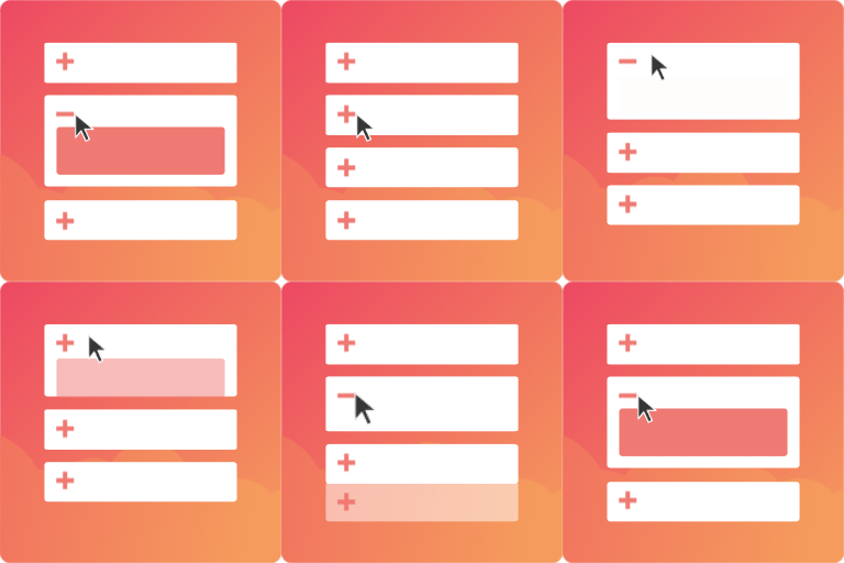
Good Accordion 是一款簡單易用的手風琴外掛,提供兩個區塊:Accordion 和 Accordion-pane。用戶可以輕鬆地將手風琴區塊拖入文章或頁面,並根據需要添加多個面板,提升內容的可讀性與互動性。
【主要功能】
• 支援「一次一個」模式,僅允許一個面板打開
• 使用 Tab 鍵聚焦面板,按 Enter 鍵開啟
• 可調整顏色、邊距和內距
• 具備無障礙功能,增加可訪問性
• 面板關閉時自動滾動到可見範圍
• 支援 CSS 和主題設定自訂樣式
外掛標籤
開發者團隊
原文外掛簡介
Simple and good accordion plugin providing 2 blocks: Accordion and Accordion-pane. Drag an Accordion block into your post, page or custom post type and hit the ‘Add pane’ button for as often as you need.
Features:
Setting for ‘One at a time’. Only one pane within an accordion can be opened. Uncheck this to allow for all panes to be opened simultaneously.
Use ‘Tab’ key to focus panes and hit ‘Enter’ to open
Extensive Use of Accessability attributes
Optionally choose for HTML and tags.
Panes scroll into view when a previous pane gets closed
Adjust colors, margins and padding in the block editor
Add styling via css, css-vars or theme.json
Use
Drag an Accordion block into a post or page or CPT and use the ‘Add pane’ button at the bottom of the block to add pane-blocks.
styling
At the root some basic styling variables are defined that can be overwritten by your theme. Some of these can be changed ad hoc by the user in de block-editor. These are:
--wp--custom--accordion--transition-time: 0.1s;
--wp--custom--accordion--margin-top: 0px;
--wp--custom--accordion--margin-right: 0px;
--wp--custom--accordion--margin-bottom: 0.1em;
--wp--custom--accordion--margin-left: 0px;
--wp--custom--accordion--header-padding-top: 0.5em;
--wp--custom--accordion--header-padding-right: 2em;
--wp--custom--accordion--header-padding-bottom: 0.5em;
--wp--custom--accordion--header-padding-left: 2em;
--wp--custom--accordion--content-padding-top: 0.5em;
--wp--custom--accordion--content-padding-right: 2em;
--wp--custom--accordion--content-padding-bottom: 0.5em;
--wp--custom--accordion--content-padding-left: 2em;
--wp--custom--accordion--header--text-color: #ffffff;
--wp--custom--accordion--header--background-color: #666666;
--wp--custom--accordion--header--active-text-color: #ffffff;
--wp--custom--accordion--header--active-background-color: #999999;
--wp--custom--accordion--body--text-color: #ffffff;
--wp--custom--accordion--body--background-color: #666666;
The default values can also be defined in the theme.json of your (child-) theme:
Add them to the theme.json like so:
{
"$schema": "https://schemas.wp.org/wp/6.7/theme.json",
"version": 3,
"settings": {
"custom": {
"accordion": {
"transitionTime": "0.1s",
"marginTop": "0px",
"marginRight": "0px",
"marginBottom": "0.1em",
"marginLeft": "0px",
"headerPaddingTop": "1em",
"headerPaddingRight": "1em",
"headerPaddingBottom": "1em",
"headerPaddingLeft": "1em",
"contentPaddingTop": "0.5em",
"contentPaddingRight": "2em",
"contentPaddingBottom": "0.5em",
"contentPaddingLeft": "2em",
"headerTextColor": "#ffffff",
"headerBackgroundColor" : "#666666",
"activeHeaderTextColor": "#ffffff"
"activeHeaderBackgroundColor": "#999999",
"bodyTextColor": "#000000",
"bodyBackgroundColor" : "#ffffff",
}
}
}
}
Accessability
The pane-headers have a tab-index. If the Enter-key is pressed while a pane-header has focus, a click-event is triggered on that pane-header thereby activating / opening it.