

內容簡介
總結:
這個外掛可以讓你根據螢幕大小在 WordPress 導覽區塊上顯示並應用不同樣式的替代導覽選單。
問題與答案:
1. 這個外掛的主要功能是什麼?
- 可以根據螢幕大小在 WordPress 導覽區塊上顯示並應用不同樣式的替代導覽選單。
2. 如何設定不同螢幕大小下的導覽選單?
- 安裝並啟用外掛後,可以建立兩個導覽區塊變化,分別代表「手機版」和「桌面版」,根據需求設定並配置各自的導覽選單。
3. 如果遇到問題該如何處理?
- 可以查看常見問題解答 (FAQ),如果問題仍然存在,請至 Github 查看是否有相關問題報告,如無則在 Github 上提交新問題。
4. 這個外掛的隱私聲明是什麼?
- Responsive Navigation 不使用 cookies,也不會將資料傳送給第三方,也不包含任何第三方資源。
5. 如何加入對這個外掛的貢獻?
- 歡迎進行貢獻,可以從 Github 存儲庫 fork 後提交 PR 進行審查。
外掛標籤
開發者團隊
② 後台搜尋「Responsive Navigation Block」→ 直接安裝(推薦)
原文外掛簡介
This Plugin allows you to display and apply alternative styling to different navigation menus based on the screen size using the WordPress Navigation block.
Video Walkthrough
Features
Two new Navigation Block (variations) for:
Mobile
Desktop
Style your menu differently depending on screen size.
Use a different menu for each screen size.
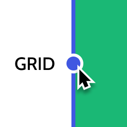
Customize the “breakpoint” (where you switch between mobile and desktop).
Automatically switch editor to “mobile” preview when editing the mobile navigation.
Usage
This Plugin creates two block variations from the Navigation block which will be automatically hidden/shown at the configured screensize (breakpoint):
Navigation (Mobile) – will be displayed only on smaller screen sizes.
Navigation (Desktop) – will be displayed only on larger screen sizes.
This affords the ability to independently style mobile vs desktop navigation and even allows for completely different menus to be used.
The Plugin should be used as follows:
Install and Activate the plugin – two new block variations will be automatically registered for “Mobile” and “Desktop”.
Go to the Editor and remove any existing Navigation block.
Add the “Desktop Navigation” block – style and configure the menu for “desktop” as required.
Add the “Mobile Navigation” block – style and configure the menu for “mobile” as required.
View the front of your website and resize your browser to see the navigations swap out at the appropriate breakpoint/screensize.
Alternatively you can transform the default Navigation block to either Mobile or Desktop variations via the block’s interface.
Support
Please see FAQs. If you still have an issue please:
check Github for existing Issue reports.
(if none) then file a new Issue on Github
Privacy Statement
Responsive Navigation does not:
use cookies.
send data to any third party.
include any third party resources.
Contributing
Contributions to this Plugin are welcome. Please fork the Github repository and submit a PR for review.
Development Setup
This Plugin uses the @wordpress/scripts package.
Check out the Github repo into the wp-content/plugins directory of a WordPress installation.
cd into the Plugin’s directory install the dependencies with npm i.
Running npm start will start the @wordpress/scripts package in watch mode ready to compile the JavaScript on modification.
PHP files can be edited in the usual manner.
Testing
The Plugin has e2e test coverage for the key features courtesey of @wordpress/scripts and Playwright.
To run the tests – in your terminal of choice:
npm run build.
npm run wp-env start.
Run the tests: npm run test:e2e
Releasing
Releasing the Plugin to the WordPress.org Plugin repo is the prerogative of the Plugin owner (@get_dave). The process is as follows:
Test the Plugin
Commit all changes to trunk branch.
Push changes to trunk (only) – git push origin trunk.
In Github:
Actions
Select the Build Release Zip action.
Select the Run workflow dropdown and run the workflow to generate a zip file.
When action completes download the generated Plugin zip artifact.
Manually install and test the .zip.
Deploy to WP.org
When ready to deploy.
Bump Plugin version and tag release – npm run bump-version.
Push trunk and tags – git push origin trunk --tags
Deployment to WP.org will be handled automatically.