
內容簡介
總結:Fluid Design System for Elementor是一個強大的小型附加元素,可直接將流體排版和間距預設引入Elementor界面,幫助您創建完全響應的設計,從小型手機到超寬桌面,都能自然地在每個屏幕尺寸上自動調整。
問題與答案:
1. 什麼是“Fluid”?
- 传统上在Elementor中,您需要为每个断点设置单独的值 — 例如,桌面端一个字体大小,平板端另一个,移动端另一个。
- 這樣做雖然給予一些控制,但有兩個主要缺點:
- 🧩 它是固定的:您僅為特定屏幕寬度定義樣式,使設計在中間可能無法流暢自動調整的尷尬間距。
- ⏱️ 它很費時:為每個區段和元素跨多個斷點更新樣式成為一個重複且手動的過程。
- Fluid Design System解決了這個問題,只需為每個斷點定義兩個值 — 最小值和最大值 — 外掛將自動在兩者之間生成平滑的縮放行為。這意味著:
- 一個預設值適用於所有屏幕尺寸。
- 您在整個網站上獲得一致的設計和間距。
- 您可以節省時間並減少手動工作。
外掛標籤
開發者團隊
② 後台搜尋「Fluid Design System for Elementor」→ 直接安裝(推薦)
📦 歷史版本下載
原文外掛簡介
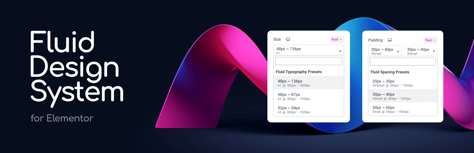
Design once. Scale everywhere.
Fluid Design System for Elementor is a small yet powerful add-on that brings fluid typography and spacing presets directly into Elementor’s interface — helping you create fully responsive designs that scale naturally across every screen size, from tiny phones to ultra-wide desktops.
🎯 Think of it like color presets — but for padding, font sizes, and layout gaps.
🎥 Video Tutorials
With just a few clicks, you can:
– Define minimum and maximum values for typography or spacing.
– Apply those values using a new “fluid” unit inside any Elementor control.
– Watch your design scale smoothly—no coding or media queries required.
– Organize your presets into custom groups (e.g. “Border Radius”, “Thumbnail Sizes”) for better management.
Say goodbye to manually tweaking every breakpoint. Say hello to automatic, intelligent design scaling with organized preset management.
How It Works
❓ What Does “Fluid” Mean?
Traditionally in Elementor, you need to set separate values for each breakpoint — for example, one font size for desktop, another for tablet, and another for mobile.
While this gives some control, it has two major downsides:
– 🧩 It’s rigid: You only define styles for specific screen widths, leaving awkward gaps in between where the design may not scale smoothly.
– ⏱️ It’s time-consuming: Updating styles across multiple breakpoints for every section and element becomes a repetitive, manual process.
💡 Fluid Design System solves this.
Instead of setting fixed values for each breakpoint, you define just two—a minimum and a maximum — and the plugin automatically generates a smooth scaling behavior in between. This means:
– One preset handles all screen sizes.
– You get consistent design and spacing across the entire site.
– You save time and reduce manual effort.
– You can organize presets into groups for different projects or design systems.
This plugin introduces Fluid Units, powered by CSS clamp() and custom presets, allowing your design to scale automatically across all screen sizes.
Here’s how it works in real scenarios:
✍️ Fluid Typography Example
Old way: 24px (mobile), 36px (tablet), 72px (desktop)
Fluid way: One preset: min = 24px, max = 72px
Result: Text scales smoothly and proportionally on all devices.
📦 Fluid Spacing Example
Old way: 40px (mobile), 80px (tablet), 160px (desktop)
Fluid way: One preset: min = 40px, max = 160px
Result: Section padding adjusts naturally without breakpoints.
🔗 Fluid Gaps Example
Gap between elements: 20px (mobile) to 60px (desktop)
Result: Even spacing between containers and widgets on any screen.
❓ Why not Just Use vw or vh Units?
While viewport units like vw can scale elements based on screen width, they often lack control — your text might become unreadably small or overly large. The Fluid Design System solves this by generating clamp() values behind the scenes, so your designs stay within defined min/max boundaries. This gives you the flexibility of responsive scaling, combined with the precision of design tokens.
👉 Behind the scenes, the plugin creates CSS variables like: clamp(24px, 5vw, 72px) which Elementor then uses across typography, spacing, padding, margin, and more.
How to Use
Follow these steps to set up and use the Fluid Design System in your Elementor projects.
📐 Step 1: Configure Fluid Breakpoints
Go to Elementor > Site Settings
Navigate to the “Fluid Typography & Spacing” tab
In the “Breakpoints” panel, set your:
Minimum Screen Width (e.g., 360px for mobile)
Maximum Screen Width (e.g., 1920px for desktop)
🧰 Step 2: Create Your Presets
In the same “Fluid Typography & Spacing” tab:
Go to “Typography Presets” to create fluid font size presets
Go to “Spacing Presets” to create fluid spacing presets
For each preset:
Give it a descriptive name
Set minimum and maximum values
Optionally set custom breakpoints for this preset
🎨 Step 3: Apply Your Presets
Edit any page with Elementor
In any control that supports custom units (typography, spacing, etc.):
Select “fluid” as the unit
Choose your preset from the dropdown
Watch your design smoothly adapt to different screen sizes
🔧 Step 4: Fine-tune Your Design
Use the live preview to see how your presets work
Adjust preset values if needed
Create additional presets for different design needs
Why Use Fluid Design System?
Perfect Responsiveness: Create websites that look flawless on every device, from mobile phones to large desktop screens including all intermediate sizes
Design Consistency: Maintain perfect spacing and typography harmony across your entire website
Time-Saving: Eliminate manual breakpoint adjustments with intelligent fluid scaling
Future-Proof: Seamlessly integrates with Elementor’s latest features and updates
User-Friendly: Manage everything through Elementor’s familiar interface – no coding or CSS knowledge required
Key Features
Inline fluid values – Set values directly in controls (“20px ~ 100px”) without visiting Site Settings
Save as Preset – Convert inline values into reusable presets with one click
Create unlimited fluid typography and spacing presets with custom minimum and maximum values
Define global breakpoints or set custom breakpoints for individual presets
Real-time preview of changes in the Elementor editor
Works with all Elementor widgets and elements
Compatible with any WordPress theme including Elementor’s Hello theme
Full support for Elementor’s responsive controls and additional breakpoints
Mix different units (px, em, rem) in your presets for ultimate flexibility
Common Use Cases
Fluid Typography: Create responsive headings and text that maintain perfect proportions across all devices
Consistent Spacing: Design section padding and margins that adapt smoothly to any screen size
Responsive Grids: Build fluid grid layouts with perfect spacing between elements
Typography Scale: Set up a complete typography system that works flawlessly everywhere
Container Spacing: Create fluid containers that maintain perfect proportions on all devices
Element Gaps: Design consistent gaps between elements that scale naturally