內容簡介
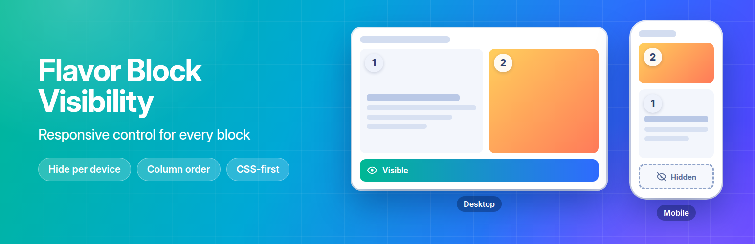
Flavor Block Visibility 外掛為區塊編輯器提供了兩個響應式工具,無需使用頁面建構器或額外的區塊,讓使用者能夠輕鬆控制區塊在不同裝置上的顯示與排列。
【主要功能】
• 響應式可見性控制
• 響應式欄位順序調整
• 支援所有核心與第三方區塊
• 直接在原生區塊設定中操作
• 自訂斷點設定
外掛標籤
開發者團隊
原文外掛簡介
Flavor Block Visibility adds two responsive tools to the block editor — without page builders, extra blocks or a build step.
Responsive visibility
Every block gets three toggles in its Advanced panel: Hide on Desktop, Hide on Tablet and Hide on Mobile. Hiding is done with CSS media queries — no JavaScript.
Responsive column order
The core Columns block gets a Responsive Column Order panel. Give each device its own order — for example, show the image above the text on mobile and next to it on desktop. Reorder by drag and drop or with the arrow buttons, or use Reverse and Reset.
The order is applied with CSS, so it is correct from the first paint. An optional tiny script also reorders the HTML, so keyboard navigation and screen readers follow what visitors see.
Features
Works with every core and third-party block
Controls live in the native block settings — no extra sidebars
Editor preview: blocks hidden on the current device are dimmed, and columns show the order of the current device preview
Hovering a column in the order list highlights it on the canvas
Column order follows columns when they are added, removed or moved
Customizable breakpoints in Settings → Block Visibility
CSS and scripts load only on pages that need them
No build step, no external requests
Clean uninstall — removes all plugin data
Default Breakpoints
Mobile: 0 – 767px
Tablet: 768px – 1024px
Desktop: 1025px and above
Breakpoints can be customized in Settings → Block Visibility.