
內容簡介
總結:WordPress 外掛Extra Block Layout引入了min-width設置和flex-grow切換以調整嵌套在行內的子區塊,讓您對佈局的響應性和靈活性具有精確控制。這個外掛讓您能夠為個別區塊定義最小寬度並調整它們所佔空間,更容易地直接在Gutenberg編輯器中創建動態、響應式和均衡的設計。適用於希望實現專業和可自定義佈局而無需額外編碼的使用者。
1. 使用情況
- 何時使用Gutenberg的Row區塊創建佈局時,Row的子區塊有三個選項:Fit、Fill和Fixed。
- 這些選項不足以創建具有特定區塊大小的響應式佈局。
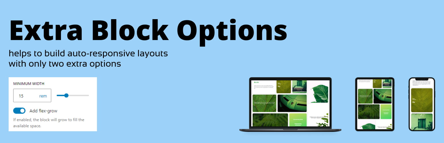
2. 例子
- 舉例來說,當其中一個子區塊過窄並且希望有選項為其設定最小寬度時。
- 當子區塊沒有足夠空間放置在同一行時,移至下一行時,它並未拉伸以填滿新行中的整個可用空間。
```html
<ul>
<li>使用情況:</li>
<ul>
<li>何時使用Gutenberg的Row區塊創建佈局時,Row的子區塊有三個選項:Fit、Fill和Fixed。</li>
<li>這些選項不足以創建具有特定區塊大小的響應式佈局。</li>
</ul>
<li>例子:</li>
<ul>
<li>舉例來說,當其中一個子區塊過窄並且希望有選項為其設定最小寬度時。</li>
<li>當子區塊沒有足夠空間放置在同一行時,移至下一行時,它並未拉伸以填滿新行中的整個可用空間。</li>
</ul>
</ul>
```
外掛標籤
開發者團隊
原文外掛簡介
The Extra Block Layout plugin introduces a min-width setting and a flex-grow toggle for child blocks within Rows, giving you precise control over your layout’s responsiveness and flexibility.
With this plugin, you can define minimum widths for individual blocks and adjust the space they occupy, making it easier to create dynamic, responsive, and well-balanced designs directly within the Gutenberg editor.
Perfect for users looking to achieve professional and customizable layouts without additional coding.
Use cases
When you create a layout using the Gutenberg’s Row block there are three options available for the Row’s child blocks: Fit, Fill and Fixed.
Those are not enough to create a responsive layout with specific blocks sizes.
For example, when you have one of the child blocks too narrow and would like to have an option to set a minimal width for it (see Screenshot-1).
When the child blocks don’t have enough space to fit and moves on the line below it does not stretch to fit the whole available space on the new line (see Screenshot-2).