內容簡介
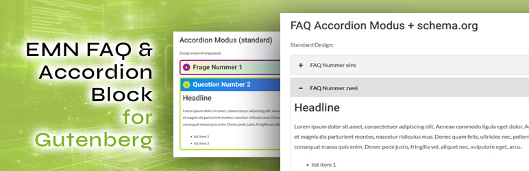
EMN FAQ & Accordion Block 是一款專為 Gutenberg 編輯器設計的外掛,能夠輕鬆建立可擴展的問答區塊,並自動生成符合 Schema.org FAQPage JSON-LD 的結構化標記,提升網站內容的可見性與可訪問性。
【主要功能】
• 自動生成 Schema.org FAQPage JSON-LD 結構化標記
• 可獨立切換問答與手風琴模式
• 輕量級設計,無需外部庫
• 完全符合 WCAG 2.1 Level AA 無障礙標準
• 支援 WPML,便於多語言翻譯
• 自由自訂外觀,無需編輯程式碼
外掛標籤
開發者團隊
原文外掛簡介
Developed by Engelhardt Medien, a digital webdesign and graphics agency based in Nuremberg, Germany.
Why this plugin?
Schema.org FAQPage JSON-LD is generated automatically and tied directly to the block’s mode — no separate schema plugin needed. This structured markup helps AI systems and assistants (ChatGPT, Perplexity, Gemini, and others) understand and surface your content, and gives search engines clean, standards-based context about your page — increasingly important as more traffic is driven by AI-powered search and answers. (Note: Google discontinued its visual FAQ rich-result snippet in Google Search in May 2026; the underlying structured data is still valid, standard, and used elsewhere, e.g. by AI assistants.)
FAQ and Accordion mode are switchable independently per block instance.
Fast and lightweight — no external libraries, and assets only load on pages that actually contain the block.
Fully accessible, matching WCAG 2.1 Level AA for this interaction pattern — particularly relevant for websites operating in the European Union, where the European Accessibility Act has required many businesses to meet digital accessibility standards since June 2025.
WPML-compatible; translation-ready with translations delivered via translate.wordpress.org.
Works with your active theme’s own color palette and gradient presets.
Freely customizable — every visual aspect can be adjusted in the block editor sidebar, without touching any code.
EMN FAQ & Accordion Block adds a native Gutenberg block for building expandable question/answer sections. It works in two modes, switchable per block instance (Accordion mode is the default for new blocks):
Accordion mode (default) – the same expandable UI without structured data, for general-purpose content (services, features, steps, etc.).
FAQ mode – automatically outputs valid Schema.org FAQPage JSON-LD structured data alongside the visible content. This structured data helps AI systems and assistants (such as ChatGPT, Perplexity, and Gemini) understand and surface your content when answering questions related to it, and provides search engines with clean, standards-based context about the page (note: Google discontinued the visual FAQ rich-result snippet in Google Search in May 2026).
By default, opening one item automatically closes any other open item in the same block — this can be turned off per block (under the “Type” panel) to allow multiple items to stay open at once. The first item can also be set to already be expanded when the page loads, again on a per-block basis (also in the “Type” panel).
Want to point someone straight to one specific question instead of making them scroll through the whole list? Give that question a short link name (the “HTML anchor” field, under “Advanced” in its block settings), and the plugin immediately shows you the finished, ready-to-share link right underneath. Anyone who opens that link arrives with exactly that question already expanded and scrolled into view — handy for emails, chat support, or linking from another page straight to the answer.
Design controls
Every visual aspect can be adjusted directly in the block editor sidebar, without touching any code:
Solid color or two-stop gradient backgrounds for both the question and the answer, including separate hover colors/gradients.
Border color, hover border color, border width, and border radius.
Independent top/right/bottom/left padding for both the question and the answer, and independent top/right/bottom/left icon padding — using WordPress’s own native “Dimensions” spacing control (including your theme’s own spacing presets, if defined), with the same unit choices as WordPress itself (px, %, em, rem, vw, vh).
One shared border color and width for all four sides. Border radius can be set per corner (using WordPress’s own native corner-radius control) or all at once.
All of the above native WordPress controls automatically and invisibly fall back to this plugin’s own equivalent, simpler control if a given native component isn’t available on a specific WordPress version.
Padding and border settings each have a compact “⋮” reset-to-default menu.
Normal/hover color pairs (question background, question text, icon color, icon background) are grouped into a compact two-way switch instead of being listed one below the other.
Choice of icon: plus/minus, chevron, or arrow — freely selectable per block (the chevron and arrow rotate when an item is opened; the plus turns into a minus).
Icon color, icon background color (with separate hover colors), icon size, icon background radius, icon padding, and the spacing between the icon and the question text.
Icon position: left (default) or right of the question text.
Choice of HTML element for the question (div, p, or h2–h6), so it can match your document heading structure — with an optional custom font size override, set independently for desktop, tablet, and mobile (any breakpoint left empty automatically falls back to the next larger breakpoint, and ultimately to your theme’s own default size for that element).
Any color or gradient field can also use your active theme’s own color palette (e.g. Astra, or any theme that registers editor-color-palette / editor-gradient-presets), exactly like core WordPress blocks.
The answer area accepts any block available in your WordPress installation — not just text: paragraphs, lists, images, headings, quotes, tables, galleries, columns, buttons, embeds, and any block added by other plugins/addons.
Lightweight & fast
Built with no external libraries or frameworks: a small, dependency-free editor script and a compact vanilla-JS frontend script. Nothing is loaded on pages that don’t contain the block, and all output is plain HTML/CSS — no heavy runtime, no bloat, and virtually no impact on page load time. All CSS and JavaScript ships pre-minified and is served minified by default, keeping the amount of data sent to visitors as small as possible (the original, readable source files are also included for transparency and are used automatically instead when SCRIPT_DEBUG is enabled).
Images, iframes (e.g. video embeds), and self-hosted videos placed inside a collapsed answer are automatically served with native lazy-loading attributes (loading="lazy" / preload="none") as a reliable fallback, on top of WordPress core’s own automatic lazy-loading — so media inside FAQ/accordion items that aren’t visible on load don’t block the page. Existing loading/decoding/preload attributes (yours or another plugin’s) are always left untouched. Media inside an item that is set to be open by default is deliberately excluded, so it loads immediately like any other above-the-fold content.
Accessibility
The expand/collapse interaction is built to be fully keyboard-operable and screen-reader-friendly, in line with WCAG 2.1 Level AA for this type of disclosure widget:
Each question is reachable via Tab and operable with Enter or Space, in addition to mouse/touch.
Correct ARIA semantics are used throughout: role="button" and aria-expanded on the question, aria-controls linking it to its answer, and role="region" with aria-hidden and aria-labelledby (pointing back to its own question) on the answer — all written directly into the server-rendered HTML, not added as an afterthought by JavaScript.
Decorative icons (plus/minus, chevron, arrow) are hidden from assistive technology via aria-hidden, since the open/closed state is already announced through aria-expanded.
A visible focus indicator is shown for keyboard users.
If an item is set to be open by default, it is rendered already expanded (correct aria-expanded/aria-hidden state and focusable content) directly in the initial HTML — no reliance on JavaScript running first.
No plugin can honestly certify a page as “100% accessible” on its own, since real-world accessibility also depends on the content and colors you choose. What this plugin guarantees on its own is the interaction pattern itself: correct roles/states, full keyboard operability, a visible focus indicator, and screen-reader-friendly markup, matching WCAG 2.1 Level AA for this type of disclosure widget. Final color contrast (text against background, icon against its background) depends on the colors you choose in the block settings — pick sufficiently contrasting colors (a ratio of at least 4.5:1 for normal text) to keep the result compliant with WCAG AA.
Security
All styling attributes are re-validated and rebuilt on the server on every page load — via strict allow-lists for colors, gradients, numeric ranges, and HTML tags — regardless of what is stored in the post content. This prevents malicious or malformed attribute values from ever reaching the page’s HTML or CSS.
Multilingual
The plugin’s source strings are in German; fully translation-ready, with translations delivered automatically per-locale via translate.wordpress.org once contributed there — no bundled .po/.mo files, in line with how WordPress.org-hosted plugins handle translations.
Includes a wpml-config.xml for WPML compatibility, so only the question text itself is offered for translation — all styling attributes are copied as-is across languages.