

內容簡介
Components Blocks 是一個使用 Bootstrap 框架建立的自訂 Gutenberg 區塊集合。所有區塊設計均取自 Bootstrap 元件。
目前已包含以下區塊:
Bootstrap 容器區塊:可讓您建立容器區域,可以設定盒裝容器或流動容器。此區塊包含以下主要功能:
背景顏色或背景圖片
具透明度控制的背景疊加
允許所有內部區塊
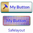
Bootstrap 按鈕區塊:一整組不同類型的按鈕,例如主要、次要、資訊、成功、危險等。
Bootstrap 警示區塊:一整組不同類型的警示框,例如主要、次要、資訊、成功、危險等。
Bootstrap 進度條區塊:一整組不同類型的進度條,例如主要、次要、資訊、成功、危險等。還有可設定動畫和條紋的進度條可使用。
[-] 更多區塊即將推出...
關於作者
此外掛程式由全端開發者 Zakaria Binsaifullah 開發,並可接受任何自由工作。
外掛標籤
開發者團隊
② 後台搜尋「Components Blocks with Bootstrap」→ 直接安裝(推薦)
原文外掛簡介
Components Blocks is a collection of Custom Gutenberg Blocks built with Bootstrap Framework. All blocks designs are taken from Bootstrap Components.
Right Now, the following blocks are included-
Bootstrap Container Block: It allows you to create a container section. You can set either Boxed Container or Fluid Container. This block includes the following key features:-
Background Color or Background Image
Background Overlay with Opacity Control
Allow All Inner Blocks
Bootstrap Button Block: A complete set of Buttons with different types e.g Primary, Secondary, Info, Success, Danger, etc.
Bootstrap Alert Block: A complete set of Alerts with different types e.g Primary, Secondary, Info, Success, Danger, etc.
Bootstrap Progress Bar Block: A complete set of Alerts with different types e.g Primary, Secondary, Info, Success, Danger, etc. Animated and Striped Bars are also available to set.
[-] More Blocks are coming soon……
About Author
The plugin is Developed by Zakaria Binsaifullah, a full stack developer. Available for any freelance work.