

內容簡介
透過 WordPress Gutenberg 編輯器的現代拖放和可調整大小介面,輕鬆建立複雜的 Bootstrap 網格,只需點擊滑鼠即可支援從手機螢幕到大型電視的各種主要螢幕大小的佈局。
特色:
使用現代 GUI 可調整大小的 Bootstrap 欄位
支援 Bootstrap v5 和 v4
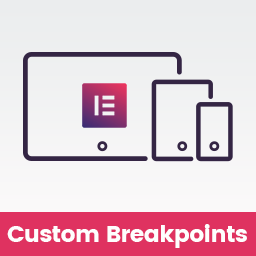
5 個斷點 (XS、SM、MD、LG、XL)
Bootstrap 色彩
液體容器
每個斷點欄位的檢視/隱藏
3 個區塊 (容器、列、欄)
需求:
WordPress 5.0 及以上版本
Bootstrap 4.0 及以上版本
安裝:
在 WordPress 外掛頁面添加免費的 Bootstrap Grid Builder 外掛:
在「外掛」頁面上:點擊「新增」
搜尋「Bootstrap Grid Builder」
點擊「立即安裝」
在「外掛」頁面上啟用 Bootstrap Grid Builder
或在 WordPress 外掛頁面上下載並手動安裝:
在「外掛」頁面上:點擊「新增」
點擊「上傳外掛」
選擇您硬碟上已下載的檔案
點擊「立即安裝」
外掛標籤
開發者團隊
② 後台搜尋「Blocks Grid Builder For Bootstrap」→ 直接安裝(推薦)
原文外掛簡介
Build complex Bootstrap gird throw modern drag/drop and resizable interface throw WordPress Gutenberg editor, With just few clicks from your mouse you can build complex layouts with support for all major screens starting from mobile screen to large tv
Features
Resizable Bootstrap columns using modern GUI
Bootstrap v5 and v4 Support
5 Break points ( XS, SM, MD, LG, XL )
Bootstrap Colors
Fluid container
Columns view/hide per breakpoint
3 blocks ( Container, Row, Column )
Requirements:
WordPress 5.0 and up
Bootstrap 4.0 and up
Installation:
Add the free Bootstrap Grid Builder plugin via your WordPress plugins page:
On the ‘Plugins’ page: click on “add new”
Search “Bootstrap Grid Builder”
Click “install now”
Activate Bootstrap Grid Builder on the ‘Plugins’ page
Or download it on the WordPress Plugins page and install manually:
On the ‘Plugins’ page: click on “add new”
Click on “Upload Plugin”
Choose the downloaded file on your hard drive
Click “install now”