內容簡介
Block Responsive 是一款專為 Gutenberg 區塊設計的 WordPress 外掛,能輕鬆創建適合行動裝置的響應式網站。此外掛提供全面的響應式設計工具,讓使用者無需編碼知識即可控制內容在各種設備上的顯示效果。
【主要功能】
• 顯示控制:可隱藏/顯示特定設備上的區塊
• 響應式樣式選項:針對不同螢幕尺寸的對齊和顏色設置
• 設定控制面板:集中管理所有外掛設定
外掛標籤
開發者團隊
② 後台搜尋「Block Responsive – Make Editor Blocks Responsive Easily」→ 直接安裝(推薦)
原文外掛簡介
Block Responsive is the ultimate WordPress plugin for creating mobile-friendly, responsive websites with Gutenberg blocks. This comprehensive responsive design tool gives you complete control over how your content appears across all devices, making it easy to build responsive layouts without any coding knowledge.
Perfect for creating mobile-responsive websites, this plugin automatically adds responsive breakpoints and device-specific styling options to every core WordPress block. Whether you’re optimizing for mobile SEO, improving tablet user experience, or fine-tuning desktop layouts, Block Responsive provides the responsive web design tools you need.
Key Features
📱 Display Controls
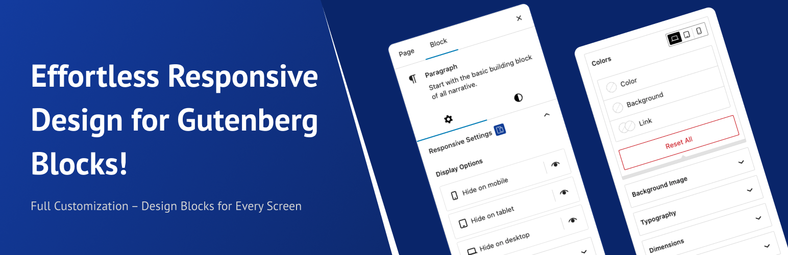
Hide/show blocks on specific devices (mobile, tablet, desktop)
Simple toggle controls with device-specific icons
Visual feedback for hidden blocks
🎨 Responsive Styling Options
Alignment Controls: Block alignment settings for different screen sizes
Colors Controls: Text color, background color, and link color with device-specific settings
Background Image Controls: Responsive background image settings
Typography Controls: Font size, line height, letter spacing, and text transform for each device
Dimensions Controls: Padding, margin, width, and height controls for responsive layouts
Border & Shadow Controls: Border radius, border width, and shadow effects per device
⚙️ Settings Dashboard
Manage the whole plugin from the new dashboard under Settings > Block Responsive:
Custom breakpoints – define your own mobile and tablet breakpoints (defaults: 767px / 1024px) so your responsive design matches your theme perfectly.
Per-block control – enable or disable the responsive controls for individual block types.
User role permissions – choose which user roles are allowed to customize blocks.
Import & export – move your plugin settings between sites with a JSON file.
How It Works
Block Inspector Integration: Responsive controls appear in the block inspector panel
Device-Specific Settings: Configure different styles for mobile, tablet, and desktop
Real-time Preview: See changes immediately in the editor
Frontend Rendering: Automatically generates and applies responsive CSS
Have feedback, suggestions, or feature ideas?
Feel free to share them with me at [email protected]. I’d love to hear your thoughts!