
內容簡介
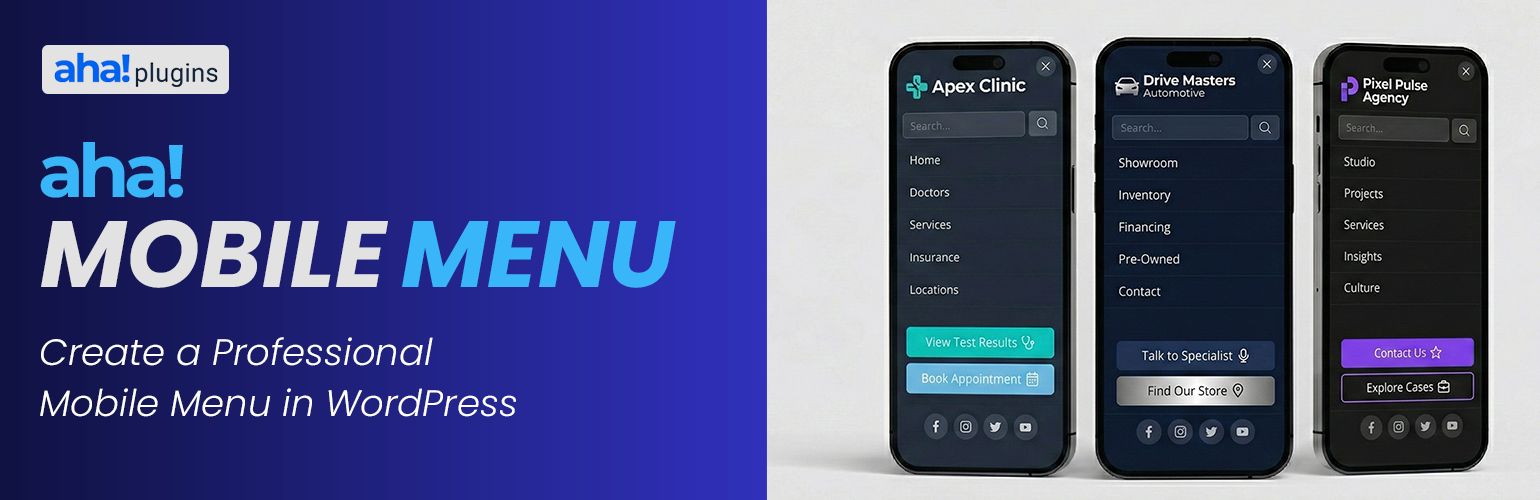
Aha Mobile Menu 是一款輕量級的 WordPress 行動選單外掛,提供簡單、快速且可自訂的側邊選單。它支援桌面與行動裝置,並具備滑入或淡入的動畫效果,提升網站的使用體驗。
【主要功能】
• 啟用/停用選單並選擇位置(左或右)
• 滑入或淡入動畫效果
• 可選擇僅在行動裝置顯示
• 選單頂部顯示標誌
• 內建搜尋框
• 自動社交連結圖示(如 Facebook、Instagram 等)
外掛標籤
開發者團隊
原文外掛簡介
Lightweight mobile menu (off-canvas) for WordPress. Works on desktop too. Aha Mobile Menu adds a simple, fast, and customizable off-canvas menu to your site: it slides in from the left or right with slide or fade animation, and can be shown on mobile only or on desktop as well.
Product page | Documentation | Support | Pro add-on
Features:
Enable/disable the menu and choose position (left or right)
Slide or fade animation
Optional: show only on mobile (viewport < 768px) or on all devices
Logo at the top of the menu
WordPress navigation menu selection
Built-in search box
Social links with automatic icons (Facebook, Instagram, Twitter/X, LinkedIn, YouTube, WhatsApp, and more)
Color customization: background, text, close button, search, menu links, social icons
Color palettes for quick styling (default, dark, light, purple, blue, green, etc.)
Close on click outside and on navigation
Configurable trigger: default class aha-open-sidebar or custom CSS selectors
Page and post type exclusions so the menu is not loaded where you don’t need it
Hooks for customization
Uninstall tab: choose whether to remove plugin options from the database when the plugin is deleted from Plugins → Installed Plugins (not on deactivate alone). If you use Aha Mobile Menu Pro, the same preference applies when removing the Pro add-on’s license option.
Demo, documentation & addons
Watch a demo, read the full documentation, and learn about available addons on the Aha Mobile Menu Product Page.
Video tutorial
Step-by-step setup: Aha Mobile Menu tutorial on YouTube.
Requirements
Your theme must provide a button or element with the trigger class (e.g. aha-open-sidebar) to open the menu. Add this class to your hamburger icon or menu toggle.
Discover more WordPress plugins: Visit Aha Plugins