內容簡介
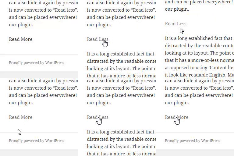
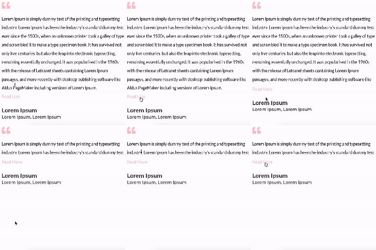
AddonCraft Read More Show Less 外掛為 WordPress 提供一個乾淨且易於存取的「閱讀更多 / 顯示較少」切換功能,適用於長篇內容。使用者可輕鬆展開或收起文章,讓頁面更整潔,同時保持內容的完整性,對於 SEO 也友好。
【主要功能】
• 自動應用 – 自動收起長篇內容,無需短碼
• 自訂收起高度 – 可選擇顯示的內容高度
• 漸層效果 – 收起的文字可漸變為單色或雙色
• 按鈕樣式預設 – 提供多種按鈕顯示樣式
• 自訂按鈕文字 – 可全局或按區塊修改按鈕文字
• SEO 友好 – 內容視覺上收起,實際上不會移除
外掛標籤
開發者團隊
② 後台搜尋「AddonCraft Read More Show Less」→ 直接安裝(推薦)
原文外掛簡介
AddonCraft Read More Show Less adds a clean, accessible Read More / Show Less toggle to long content in WordPress. Long posts, pages, descriptions and text blocks are cut to a height you choose, with an optional fade at the bottom. Visitors click Read more to expand the full text and Show less to collapse it again.
Use it to tidy up long articles, FAQ answers, author bios, service descriptions, reviews and landing pages without deleting a word or splitting content across pages.
The hidden text stays in the page HTML, so search engines can still read and index all of it.
Three ways to add Read More
Automatic (no code) – turn on Auto-apply to post content and every long single post and page gets a Read More button.
Shortcode – wrap any content in [addoremo_read_more]…[/addoremo_read_more], with optional per-block height and button text.
CSS class – add the read-more class to any block or element. Works with the block editor (Gutenberg), Elementor, Divi, Beaver Builder and other page builders that let you set a CSS class.
Features
Auto-apply – collapse long post and page content automatically, no shortcode needed.
Custom collapsed height – choose how much content shows before the Read More button.
Fade effect – fade collapsed text into a solid color or a two-color gradient.
Button style presets – show the toggle as a text link, a solid button or an outline pill.
Custom button text – change “Read more” and “Show less” globally or per block (e.g. “Show more”, “Continue reading”, “See less”).
Arrow icons – built-in chevron with adjustable size, or upload your own up and down icons from the Media Library.
Full styling controls – text color, button color, hover color, alignment, font family, font weight and italic.
Smooth animation – set the expand and collapse speed in milliseconds. Respects the visitor’s reduced-motion setting.
Mobile or desktop only – show the toggle on all devices, only on mobile, or only on desktop, with a custom breakpoint.
Remember open state – keep a section expanded after the visitor reloads the page.
Short content left alone – content shorter than the collapsed height shows normally, with no button.
Multiple sections per page – every matching block gets its own independent toggle.
Live preview – see your changes on the settings page before you save.
SEO friendly – content is only visually collapsed, never removed from the page.
Accessible – a real button element with aria-expanded, keyboard support and visible focus styles.
Lightweight – one small script and one small stylesheet, loaded only when the plugin is enabled.
Translation ready – includes a POT file.
Shortcode example
[addoremo_read_more height="200" more="Read more" less="Show less"]Your long content here.[/addoremo_read_more]
height – collapsed height in pixels.
more – text for the expand button.
less – text for the collapse button.
All attributes are optional. Anything you leave out uses the global settings.
Using Read More with the block editor or Elementor
Block editor (Gutenberg): select a block, open Advanced → Additional CSS class(es) and enter read-more.
Elementor: select a widget or container, open Advanced → CSS Classes and enter read-more.
You can change the target class or selector under Read More → General.