

內容簡介
這個外掛主要是設計為行動版菜單,但它同時支持桌面和觸控設備,並可設定顯示在特定解析度下,如平板電腦、手機、桌面等。設置起來只需要不到一分鐘,只需點擊啟用並選擇要顯示的設備即可。
前往外觀 -> 反應式菜單並進行設置!
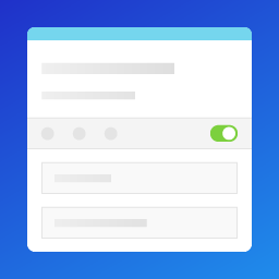
啟用外掛只需選擇偏好設備,然後按“更新”即可
如需要幫助或有疑問,請通過[email protected]與我聯繫
注意事項:
該外掛只能顯示1個菜單
您可以選擇僅在手機、平板電腦、筆記型電腦或桌面上顯示菜單
如果菜單圖標無法顯示,請查看常見問題解答
尺寸:手機:768、平板電腦:992、筆記型電腦:1200、桌面:1200或更高。
常見問題解答:
菜單圖標無法顯示
在菜單按鈕選項下,您需要使用正確的類選擇器或ID選擇器,包括對應的“.”點號作為類選擇器以及“#”井號作為ID選擇器。
類選擇器在一個或多個字符串之前加上一個點號“.”宣告。 字符串由開發人員定義。
ID選擇器使用井號“#”進行宣告。與類選擇器一樣,開發人員定義字符串。
安裝:
在WordPress的“外掛”菜單下的“新增”部分,您可以找到不同選項以添加反應式手機菜單外掛。
在WordPress中,搜尋“反應式手機菜單”並點擊安裝
使用FTP可以將responsive-mobile-menu上傳到/wp-content/plugins/目錄
更改:
2017年5月1日:更新UI
2017年5月1日:修復了菜單在啟用時沒有水平滾動條的問題
2017年5月3日:更新動畫
2017年5月5日:增加更多自定義選項
2017年5月6日:清理和最小化代碼
2017年5月6日:更新按鈕設計
2017年5月6日:更新設置UI
2017年5月7日:重寫動畫功能
2017年5月7日:更新圖像
2017年5月10日:更新觸控功能
2017年5月11日:更新回返/關閉導航設計
2017年5月11日:現在如果有足夠的內容,您可以在側邊欄中滾動
2017年5月11日:改進說明和整體解釋
授權:
感謝Pluto提供CSS動畫
感謝Colorzilla提供的CSS工具:http://colorzilla.com
Responsive Mobile Menu使用https://www.iconfinder.com中的免費圖標,它是GPL許可下的//https://www.gnu.org/copyleft/gpl.html
Responsive Mobile Menu受Responsive Menu By Peter Featherstone啟發//捐款鏈接:https://responsive.menu/donate//插件鏈接:https://wordpress.org/plugins/responsive-menu/
Responsive Mobile Menu是WBB Off Canvas Menu By Webberty的分支,該菜單已經有2年未更新//捐款鏈接:https://pledgie.com/campaigns/30022//插件鏈接:https://wordpress.org/plugins/wbb-off-canvas-menu/
Responsive Mobile Menu使用Dave Gandy的Font Awesome //http://fontawesome.io/
外掛標籤
開發者團隊
原文外掛簡介
While designed primarily as a mobile menu, this plugins works on both desktop and touch devices and can be set to be shown at specified resolutions such as tablet, mobile phone, desktop and more. It takes less than a minute to setup, literally all you have to do is click activate and choose devices to show on.
Go to Appearance -> Responsive Menu and make your settings!
To activate the plugin, all you have to do is pick your prefered devices and click “Update”
If you need help or have questions please contact me at [email protected]
NOTES:
You can only show 1 menu with this plugin
You can choose to only show the menu on mobile, tablet, laptop or desktop
If the menu icon won’t show up, look under fequently asked questions
Sizes: Mobile: 768, tablet: 992, laptop: 1200, desktop: 1200 and up.
FREQUENTLY ASKED QUESTIONS:
Menu icon will not show up
Under the menu button options you need to use the correct class selector or id selector including the corresponding dot “.” for class selector and the hash “#” for the ID selectors.
Class selectors are declared with a dot “.” preceding a string of one or more characters. The string of characters is defined by the developer.
ID selector is declared using a hash, or pound symbol “#”. Just as is the case with an Class selector, this string of characters is defined by the developer.
INSTALLATION:
In WordPress under the plugin menu > “add new” section you can find different options to add the responsive mobile menu plugin.
In WordPress under plugins search for “responsive mobile menu” and click install
Using FTP you can upload the responsive-mobile-menu to the /wp-content/plugins/ directory.
CHANGES:
1th May 2017: Updated UI
1th May 2017: Fixed so menu doesn’t have horizontal scroll on activation
3th May 2017: Updated animations
5th May 2017: Added more customization
6th May 2017: Cleaned and minified code
6th May 2017: Updated button design
6th May 2017: Updated Settings UI
7th May 2017: Rewrote animation features
7th May 2017: Updated images
10th May 2017: Updated touch functions
11th May 2017: Updated back/close navigation design
11th May 2017: You can now scroll in the sidebar if there is enough content
11th May 2017: Improved descriptions and overall explanations
LICENSES:
Thank you to Pluto for the CSS animations
Thank you to Colorzilla for your CSS tools: http://colorzilla.com
Responsive Mobile Menu uses free icons from https://www.iconfinder.com which is under the GPL license // https://www.gnu.org/copyleft/gpl.html
Responsive Mobile Menu is inspired by Responsive Menu By Peter Featherstone // Donation link: https://responsive.menu/donate // Plugin link: https://wordpress.org/plugins/responsive-menu/
Responsive Mobile Menu is a fork of WBB Off Canvas Menu By Webberty which sadly has not been updated for 2 years // Donation link: https://pledgie.com/campaigns/30022 // Plugin link: https://wordpress.org/plugins/wbb-off-canvas-menu/
Responsive Mobile Menu uses Font Awesome by Dave Gandy // http://fontawesome.io/