

內容目錄
內容簡介
Responsify WP 是關心響應式圖片的 WordPress 外掛程式。
功能
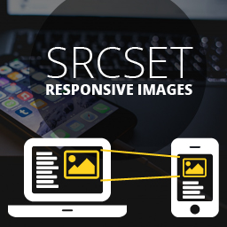
使用帶有 srcset/sizes 屬性的 img 標籤。
... 或者是 picture 元素。
支援使用或不使用 Picturefill。
支援高解析度圖片(Retina)。
自訂媒體查詢。
挑選要使用的圖片尺寸。
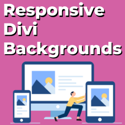
響應式背景圖片。
展示
Responsify WP 可找到特色圖片和內容中的所有圖片,使它們具有響應式特性。
例如,您可能會有一個長得像這樣的模板:
<article>
<h1><?php the_title();?></h1>
<?php the_content();?>
</article>
這會輸出像這樣:
<article>
<h1>Hello world</h1>
<p>Lorem ipsum dolor sit amet...</p>
<img src="large.jpg" alt="圖片描述">
</article>
但在啟用外掛程式後,它會變成以下這樣:
<article>
<h1>Hello world</h1>
<p>Lorem ipsum dolor sit amet...</p>
<img sizes="(min-width: 300px) 1024px, (min-width: 150x) 300px, 150px"
srcset="thumbnail.jpg 150w,
medium.jpg 300w,
large.jpg 1024w"
alt="圖片描述">
</article>
您也可以選擇通過 picture 元素來使用它:
<article>
<h1>Hello world</h1>
<p>Lorem ipsum dolor sit amet...</p>
<picture>
<source srcset="full-size.jpg" media="(min-width: 1024px)">
<source srcset="large.jpg" media="(min-width: 300px)">
<source srcset="medium.jpg" media="(min-width: 150px)">
<img srcset="thumbnail.jpg" alt="圖片描述">
</picture>
</article>
它也可用於高解析度(Retina)圖片:
<article>
<h1>Hello world</h1>
<p>Lorem ipsum dolor sit amet...</p>
<picture>
<source srcset="full-size.jpg" media="(min-width: 1024px)">
<source srcset="large.jpg, large_retina.jpg 2x" media="(min-width: 300px)">
<source srcset="medium.jpg, medium_retina.jpg 2x" media="(min-width: 150px)">
<img srcset="thumbnail.jpg, thumbnail_retina.jpg 2x" alt="圖片描述">
</picture>
</article>
上述示例的不同圖像版本的標準尺寸為 thumbnail、medium、large 和 full。
媒體查詢是基於「前一個」圖像的寬度。
任何圖像的自訂尺寸也會被找到並使用。
設定
您可以從 RWP 設定頁面選擇外掛程式應使用哪些圖像尺寸。
這些設置可以在範本中被覆寫。
<?php
// 使用 get_posts()
$posts = get_posts( array(
'post_type' => 'portfolio',
'rwp_settings' => array(
'sizes' => array('large', 'full')
)
) );
foreach( $posts as $post ) {
// ...
}
// Using WP_Query()
$query = new WP_Query( array(
'post_type' => 'portfolio',
'rwp_settings' => array(
'sizes' => array('large', 'full')
)
) );
while( $query->have_posts() ) {
$query->the_post();
// ...
}
?>
外掛標籤
開發者團隊
📦 歷史版本下載
原文外掛簡介
Responsify WP is the WordPress plugin that cares about responsive images.
Features
Use img with srcset/sizes attributes.
…or the picture element.
Works with or without Picturefill.
Supports high resolution images (retina).
Custom media queries.
Handpick which image sizes to use.
Responsive background images.
Demo
Responsify WP finds featured images and all images inside the content and makes them responsive.
For example, you might have a template that looks like this:
That will output something like this:
Hello world
Lorem ipsum dolor sit amet...

But once you have activated the plugin, it will look like this instead:
Hello world
Lorem ipsum dolor sit amet...
You can also choose to use the picture element instead:
Hello world
Lorem ipsum dolor sit amet...

It also works with high resolution (retina) images:
Hello world
Lorem ipsum dolor sit amet...

The different versions of the image in the examples above is in the standard thumbnail, medium, large and full sizes.
The media queries are based on the width of the “previous” image.
Any custom sizes of the image will also be found and used.
Settings
You can select which image sizes that the plugin should use from the RWP settings page.
These settings can be overwritten from your templates.
'portfolio',
'rwp_settings' => array(
'sizes' => array('large', 'full')
)
) );
foreach( $posts as $post ) {
// ...
}
// Using WP_Query()
$query = new WP_Query( array(
'category_name' => 'wordpress',
'rwp_settings' => array(
'sizes' => array('large', 'full')
)
) );
if ( $query->have_posts() ) {
// ...
}
?>
Available settings:
Select which image sizes to use.
Set/override attributes.
Set custom media queries.
Turn on/off retina.
Ignore image formats.
Functions
RWP provides a number of functions that can generate responsive images in your templates.
Let’s say that you have the following markup for a very large header image:
As you probably know, the_post_thumbnail() will create a regular tag with the full-size image in this case.
But you don’t want to send a big 1440px image to a mobile device. This can easily be solved like this:
// Generate an tag with srcset/sizes attributes.
echo rwp_img( $thumbnail_id );
// Generate a
echo rwp_picture( $thumbnail_id );
?>
Website
http://responsifywp.com.
Demo
http://responsifywp.com/demo.
Documentation and examples
https://github.com/stefanledin/responsify-wp.
Requirements
PHP 5.3